Developing custom storefront components
During the development process, it is normal to face critical questions regarding performance and internationalization, among other issues that directly affect the shopping experience.
Although VTEX does not offer any support for custom projects, we have put together the guidelines adopted by our own product team to help your development journey using Store Framework, VTEX IO, and the React technology.
Below you can find the best practices for tooling, features, flexibility, scalability, performance, accessibility, internationalization, and styling that you can adopt when creating your storefront component.
Before applying the settings below, it is highly recommended that you understand how VTEX IO, Store Framework, and React work since the guidelines assume previous knowledge. You can dive deeper in VTEX IO learning course and the React official documentation for help.
Tooling
When creating a custom component, use tools to facilitate code development by automatically formatting and testing it.
Features such as ESLint, Typescript, and Prettier are not mandatory for project deployment, but they help development, code maintenance, and testing.
The React App repository is the go-to model template for tooling since it provides formatting features alongside the VTEX Test Tool, a native VTEX testing tool that leverages Jest.
Use Typescript types as an ally in your development journey since they provide autocomplete tools that can be used when developing and importing a new component. To have them handy, run the following command in your terminal:
_10vtex setup --typings
The above command will install all Typescript types from the apps listed in the app
dependencieslist in your project. Whenever you add a new dependency, the command must be run again.
Feature development
Store-specific
In an attempt to reuse code, one common mistake is to design a component that tries to perform multiple tasks.
Ensure you maintain a clear focus on the primary objective of the component. It is crucial to be as precise as possible in defining this goal.
Keep it simple. Components with several functionalities tend to mislead users in the interface and translate to a lot of code to manage behind the scenes, especially when handling APIs.
Native-first
Before developing a custom component from scratch, make sure VTEX does not already offer the same feature natively through the Store Framework native components.
Create your component importing and combining native components to achieve a better result. For example:
_17import React from 'react'_17import { ProductSummaryList } from 'vtex.product-summary'_17_17interface Props {_17 title?: string_17}_17_17function Shelf({ title }: Props) {_17 return (_17 <div>_17 <h3>{title}</h3>_17 <ProductSummaryList />_17 </div>_17 )_17}_17_17export default Shelf
Notice how the Store Framework solution relies on specific apps for integrations with third-party solutions and layout structuring, besides having template components that play a particular role once rendered to the end users, such as the Product Identifier app. When developing your storefront component, remember that segmentation is key to light code and a successful component.
Flexibility and scalability
Rendering
Your component should have the flexibility to handle all possible scenarios once rendered.
Be careful not to get hyperfocused on its appearance when fully rendered. It is important to consider all other possible statuses during the rendering process, such as:
Loading- When the component is already visible to users but not fully rendered due to data loading.Error- When the component cannot be rendered due to an error.Empty- When the component cannot fetch data and is rendered with empty content.
Render Runtime is the VTEX app that renders the storefront. Read the app documentation and get to know some valuable variables for your project.
Also, be careful when using browser variables, such as window and document, since they only exist in the browser context and may affect your component display when opting for server-side rendering.
Before implementing your component, check which variables are available on the browser using the Render Runtime canUseDom variable.
Browser compatibility
The VTEX IO platform automatically provides JavaScript polyfills for implementing features on web browsers that cannot do that.
Although this practice ensures the good performance of your component in several user agents, you may be working with NPM libraries that cannot be implemented in old web browsers.
Check which web browsers are more common among your audience and focus on those when developing your storefront component. For example, some stores are still IE11-oriented, even though it is not as widely used anymore.
Prop substitution
The simplicity of boolean props, with switch component behaviors true and false, makes them easy to use in React projects.
However, they do not offer great scalability when taking into account that the component evolution may require a third (or more) behavior to be enabled.
Boolean props, therefore, demand creating brand-new props whenever unprecedented use cases are introduced to your component.
Once the component is deployed, avoid modifying its props (creating, removing, and/or updating them). Modifying props can be costly because it can directly impact API maintenance and affect other developers working with it.
With that in mind, replace the boolean props with enum props. The latter has a broader range and is more adapted to keep up with the component evolution and the several behaviors it may have to handle.
For example:
| Do not use | Use | |
|---|---|---|
| Prop name | show | visibility |
| Values | true or false | visible or none |
To ensure long-term compatibility and resilience of the component, it is recommended to use enum props during development.
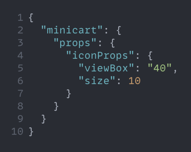
Responsive values
One of the critical points of flexibility and scalability is having a component that is ready to be displayed on any possible device.
Instead of creating specific props to handle typical device scenarios, leverage the VTEX Responsive Values app to enable the component props to accept different values from devices, such as desktop and mobile.
| ✅ Do | ❌ Don't |
|---|---|
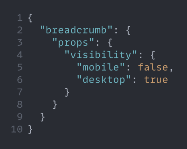 | 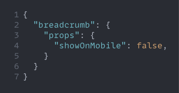 |
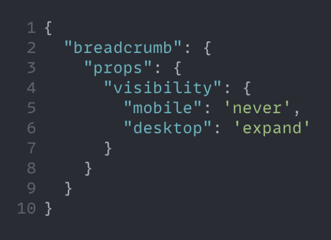
Combine enum props with responsive values, as shown below, and enhance code quality with highly optimized props!
Slots
Slots allow you to render components through props instead of declaring an array of blocks in the Store Theme. Its simplicity removes the need for the allowed property in the interface file and lightens your code, increasing flexibility when developing a new storefront component.
You can learn more about Slots here.
| ✅ Use | ❌ Do not use |
|---|---|
 |  |
If you are not using Slots, we recommend using the
childrencomposition.
Performance
In the digital world, store website performance plays an essential role in the user experience, directly impacting the sales conversion rate and user session time, among other important metrics.
In addition to the practices listed below, do not forget to read our documentation on optimizing performance to enable advanced configurations and boost the performance of your store.
NPM libraries
Avoid using heavy npm libraries because they negatively impact page loading time and can affect the user experience.
Choose light libraries to support your code and optimize performance.
Evaluate the impact of npm libraries on user experience at bundlephobia.com.
Data sharing
Use the React context to share data between components and avoid over-fetching at all costs.
The Dispatcher and State patterns, as well as the useMemo feature, are powerful resources that can be made available by the context and used by your component.
Read the article on using the React context effectively for a detailed explanation about how the React context can work in your favor.
Media upload
Using media in storefront components can be tricky if you do not think about performance critically.
When uploading the desired media assets to the VTEX File Server, clearly define height and width parameters to avoid data over-fetching and resizing on the client-side. This way, you can set up your component to request media assets based on the required size per breaking point.
Rendering
Performance can be optimized during component rendering as well.
When declaring the interface of a block, set the Hydration attribute and pass on-view as its value to only load and correctly render your component once users find it on the interface.
The Footer is a good example of a Store Framework native component that uses this attribute.
The default value for
Hydrationisalways, meaning that the component will be loaded and rendered as expected, regardless of the user's view.
Accessibility
Prioritizing accessibility leads to an excellent opportunity to bring more users closer to the store's shopping experience.
Adopt the following practices to promote inclusion:
- Enable user interactivity through the keyboard.
- Bet on color contrast when defining the component style. You can use the ChromeLens extension to help you with that.
- Avoid the usage of HTML div to enhance accessibility for screen readers and improve search engine optimization.
Internationalization
Your component should be ready to be displayed worldwide if store globalization is a goal.
In terms of content internationalization, be cautious with string text translations. You can leverage the Messages app, a native VTEX IO service for automatic translations, and have manual translations as well.
Remember that internationalization can mean more than string text translations. Consider interpolation, pluralization, price, and percentage formatting, among other differences that may come your way when crossing borders.
Read the Translating the component article and the multi-language store documentation to understand how you can make these adjustments in your component!
Styling
Style customization is one of the main steps when building a page template and developing storefront components.
Use Tachyons instead of CSS Modules whenever possible when applying CSS to your project. The Tachyons solution is usually better for different storefront scenarios. CSS Modules, on the other hand, have use restrictions depending on the component behavior.
Get acquainted with the particularities of both tools to make the best decision for the component style without wasting development efforts.
Also, do not forget to make CSS handles available to your component users if distribution at the VTEX App Store is a goal. Through CSS handles, future developers can style your storefront component based on their specific needs.
Read the documentation on Defining styles to learn about Tachyons, CSS Modules, and CSS handles, as well as their use cases.
Another good styling tip is to be careful with the breakpoints on the screen for different devices. Remember to set the component style for every possible scenario on the interface!
The VTEX Styleguide is a go-to document during style customization. Our team constantly updates the guide and provides valuable design guidelines.
Engagement
Finally, the best practice you can adopt is keeping up with the VTEX IO platform! Engage with us:
- Follow the Developer Portal's release notes feed.
- Subscribe to the VTEX Developer Newsletter.
- Follow our YouTube channel for developers.
- Join the Community.