Making a custom component available in Site Editor
Learn how to allow component customization directly in Site Editor.
To allow component customization in Site Editor, you need to define the schema for each editable property and reference these definitions in the interfaces.json file.
In this guide, you will learn how to configure the schema definitions in your components, allowing users to customize them directly in Site Editor.
Explore practical examples of using schemas to configure custom components in Site Editor schema examples.
Before you begin
- Ensure your store has a Store Theme developed with VTEX IO and Store Framework, following the Storefront guide.
- Check if the Builders are properly installed in your Store Theme. You must have at least the following builders configured:
- Store builder: Enables the development of Store Framework storefronts.
- React builder: Used to develop apps with React when your project requires customized frontend solutions.
Instructions
Step 1 - Creating the files for your custom component
For your block to accept user customizations, export the React component responsible for the block. This component should include a schema that allows editing directly in Site Editor.
-
Create a new folder in the
/reactroot directory. Follow thereact/components/{ComponentName}/index.tsxpattern. See alongside a folder structure example for a component namedCustomComponent. -
Open the
index.tsxfile and define your custom component.
_10 react_10 ┣ 📂 components_10 ┣ 📂 CustomComponent_10 ┗ 📄 index.tsx
Step 2 - Defining the component interface
The CustomComponentProps defines the type for the component’s props, specifying title and subtitle as the expected string props.
Step 3 - Declaring the component
The functional component CustomComponent takes an object with title and subtitle props as its argument, allowing easy access to these props.
Step 4 - Defining the component props
The defaultProps specifies the default values for the props of the CustomComponent. If the user does not define props in Site Editor, the defaultProps values are returned.
Step 5 - Configuring the Site Editor schema
The schema defines the structure and types of the props, allowing the component to be customized in Site Editor.
Ensure you define the
defaultPropsandschemaobjects for the component in JSON Schema format, a declarative language that provides a standardized way to describe and validate JSON data.
Step 6 - Exporting the component
By setting CustomComponent as the default export, you can import it into other parts of the app or other apps. For better organization and management, especially for apps with many custom components, we recommend creating separate folders for each component within react/components and then exporting them from individual files in the /react root directory.
In the /react root directory, create a new file to export your component:
Step 7 - Updating the interfaces.json file
Now, you need to reference your custom component in the interfaces.json file within the /store folder. This file establishes the relationship between a block and a React component, allowing the store builder to build the store's frontend.
In the app repository where you are developing your custom component, open the interfaces.json file within the /store folder. Declare the schema definitions for your component as follows:
In this schema, the block identifier is named
custom-component. Choose a name that clearly describes the component it references.
Step 8 - Using the component in a store page
To use the new component, declare it in the desired page template. For example, to use the CustomComponent on the store’s main page, the custom-component block must be declared within the home block:
By linking the app, your component will be available for visualization and test in Site Editor within the corresponding development workspace.
Step 9 - Making your component available in the live store’s Site Editor
After configuring and testing your component, deploy the new version of your app to make it available in the live store’s Site Editor.
Learn how to make it available in the Deploying a new app version guide.
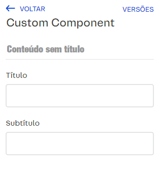
When the process is finished, the component will appear as follows in the live account’s Site Editor:
Step 1 - Creating the files for your custom component
For your block to accept user customizations, export the React component responsible for the block. This component should include a schema that allows editing directly in Site Editor.
-
Create a new folder in the
/reactroot directory. Follow thereact/components/{ComponentName}/index.tsxpattern. See alongside a folder structure example for a component namedCustomComponent. -
Open the
index.tsxfile and define your custom component.
Step 2 - Defining the component interface
The CustomComponentProps defines the type for the component’s props, specifying title and subtitle as the expected string props.
Step 3 - Declaring the component
The functional component CustomComponent takes an object with title and subtitle props as its argument, allowing easy access to these props.
Step 4 - Defining the component props
The defaultProps specifies the default values for the props of the CustomComponent. If the user does not define props in Site Editor, the defaultProps values are returned.
Step 5 - Configuring the Site Editor schema
The schema defines the structure and types of the props, allowing the component to be customized in Site Editor.
Ensure you define the
defaultPropsandschemaobjects for the component in JSON Schema format, a declarative language that provides a standardized way to describe and validate JSON data.
Step 6 - Exporting the component
By setting CustomComponent as the default export, you can import it into other parts of the app or other apps. For better organization and management, especially for apps with many custom components, we recommend creating separate folders for each component within react/components and then exporting them from individual files in the /react root directory.
In the /react root directory, create a new file to export your component:
Step 7 - Updating the interfaces.json file
Now, you need to reference your custom component in the interfaces.json file within the /store folder. This file establishes the relationship between a block and a React component, allowing the store builder to build the store's frontend.
In the app repository where you are developing your custom component, open the interfaces.json file within the /store folder. Declare the schema definitions for your component as follows:
In this schema, the block identifier is named
custom-component. Choose a name that clearly describes the component it references.
Step 8 - Using the component in a store page
To use the new component, declare it in the desired page template. For example, to use the CustomComponent on the store’s main page, the custom-component block must be declared within the home block:
By linking the app, your component will be available for visualization and test in Site Editor within the corresponding development workspace.
Step 9 - Making your component available in the live store’s Site Editor
After configuring and testing your component, deploy the new version of your app to make it available in the live store’s Site Editor.
Learn how to make it available in the Deploying a new app version guide.
When the process is finished, the component will appear as follows in the live account’s Site Editor:
_10 react_10 ┣ 📂 components_10 ┣ 📂 CustomComponent_10 ┗ 📄 index.tsx