Site Editor schema examples
Explore practical schema examples for configuring custom components in Site Editor.
When configuring a custom component, you need to define a schema within it to make it editable by user administrators directly in Site Editor. Learn how to configure the schema definitions in the Making a custom component available in Site Editor guide.
To create your schemas, use the JSON Schema format, a declarative language that provides a standardized way to describe and validate JSON data.
You can use the following data types to configure your schemas:
In this guide, you will learn how to use each data type effectively.
String
Alongside, you can see the HeaderComponentProps interface, which specifies the types of the title and subtitle props. This interface is used to type-check the props passed to the HeaderComponent.
The HeaderComponent is a functional component that accepts title and subtitle as props, which are destructured from the props object defined by the interface.
Below are additional examples of content schemas using String for image and date fields.
Images
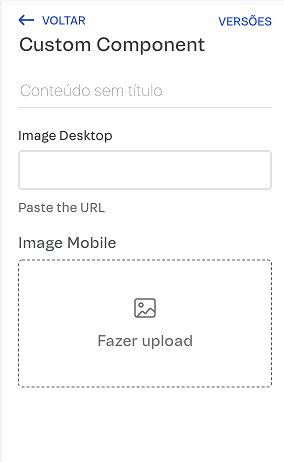
Consider a component that displays different images based on device type (desktop or mobile) (e.g., ImageComponent.tsx).
To enable users to select an image from their computer or paste an image URL link, provide options for both methods in your component’s schema object.
In Site Editor, this custom component will look like this:
Dates
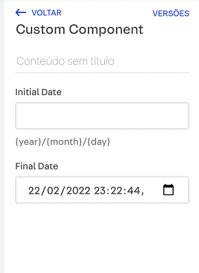
Consider a component that allows users to input a start and end date (e.g., DateComponentProps.tsx).
In the schema, the initialDate and finalDate props define the configuration for date input fields.
The initialDate prop has an empty string as its default value and a description indicating the expected date format '{year}/{month}/{day}'. The finalDate prop has the default value set to the current date and time in ISO 8601 format. It includes a custom UI widget for a date-time picker, streamlining the selection of both date and time.
In Site Editor, this component will look like this:
Boolean
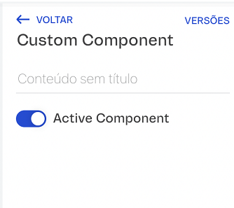
Consider a component that allows users to toggle its active or inactive state. To allow users to activate or deactivate the component, define the schema as follows.
The active prop is a boolean, meaning it can be either true or false. The default value set as true ensures that the component starts in an active state unless specified otherwise.
In Site Editor, this custom component will look like this:
Object
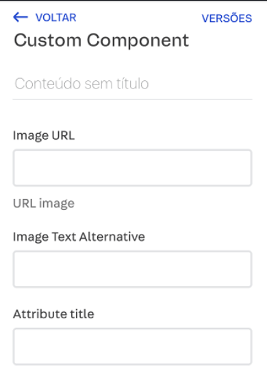
Consider a component that renders an image, taking an image prop, which includes the URL, alt text, and title.
The schema below defines the structure of the component, specifying that it expects an image prop, which is an object containing url, alt, and title props.
In Site Editor, this component will look like this:
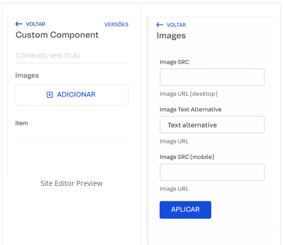
Array
Consider a component where the displayed images adapt to the screen size.
The component checks if the viewport width is less than 768 pixels to determine if it is a mobile view and selects the appropriate image source. It then renders the images inside a div, with each img element receiving the correct source and alt text based on the viewport size, ensuring each image has a unique key.
In the schema, the images prop is specified as an array of objects, ensuring it will hold multiple items. Each item within the images array is defined as an object with three specific props, src, alt, and mobileSrc.
In Site Editor, this component will look like this:
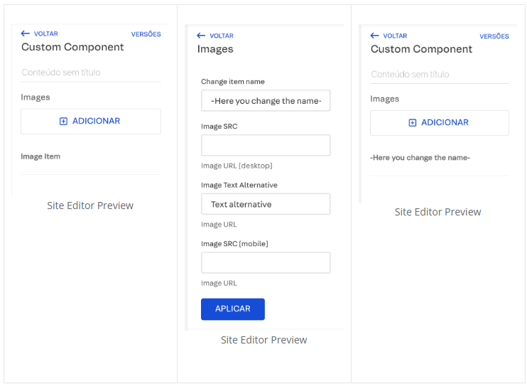
Making the item name editable
If you want to allow users to change the name of each item in the images array within Site Editor, add the __editorItemTitle prop to the item configuration.
In Site Editor, this component will look like this:
enum and enumNames props
Some props are used to define a set of allowed values for a particular prop, such as enum and enumNames.
When using enum, the prop's value must be one of the values in the array.
The enumNames prop is used in conjunction with enum to provide a set of human-readable names for the values specified in the enum array. This is particularly useful in UI components, such as dropdowns and radio buttons, where you want to display a user-friendly name instead of the actual value.
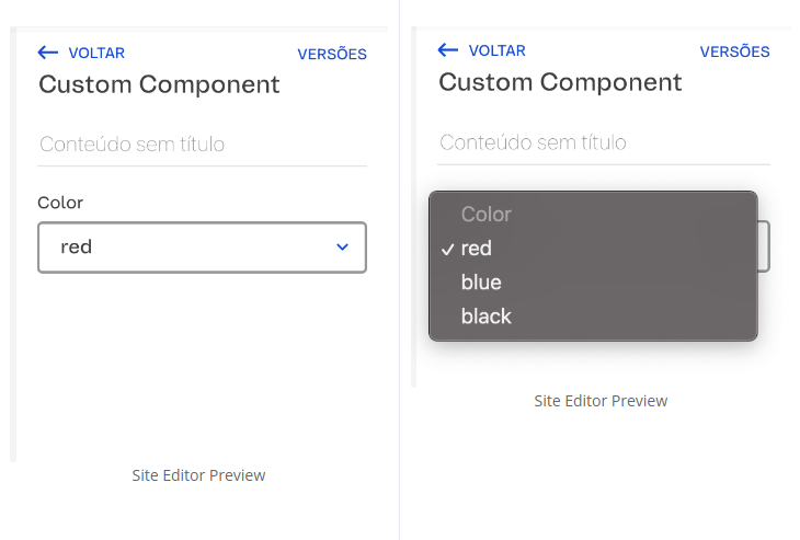
enum example
Imagine you have a schema with colors as a prop, and the possible values are red, blue, or black.
In Site Editor, you will see the component like this:
enumNames example
Imagine you have a schema with colors as a prop, and the possible values are #0ff102, #1038c9, or #000000. However, for the user, you need to show the names green, blue, or black, respectively.
In Site Editor, you will see this component like this:
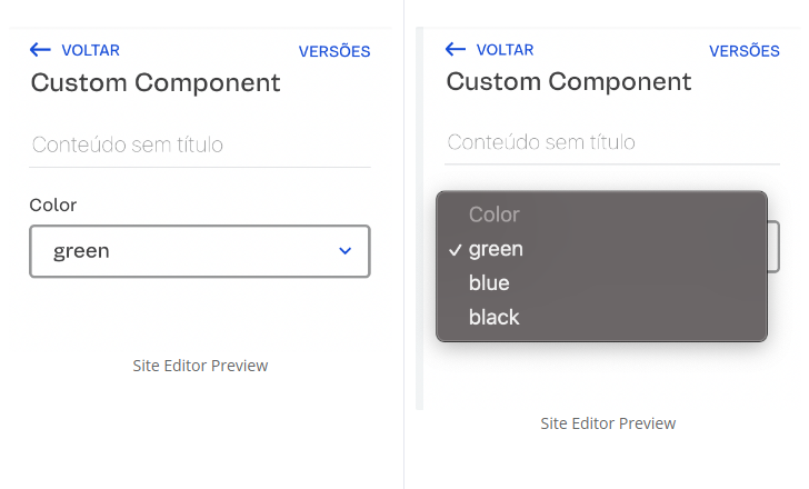
If the user selects the value green, for example, the prop returns #0ff102.
String
Alongside, you can see the HeaderComponentProps interface, which specifies the types of the title and subtitle props. This interface is used to type-check the props passed to the HeaderComponent.
The HeaderComponent is a functional component that accepts title and subtitle as props, which are destructured from the props object defined by the interface.
Below are additional examples of content schemas using String for image and date fields.
Images
Consider a component that displays different images based on device type (desktop or mobile) (e.g., ImageComponent.tsx).
To enable users to select an image from their computer or paste an image URL link, provide options for both methods in your component’s schema object.
In Site Editor, this custom component will look like this:
Dates
Consider a component that allows users to input a start and end date (e.g., DateComponentProps.tsx).
In the schema, the initialDate and finalDate props define the configuration for date input fields.
The initialDate prop has an empty string as its default value and a description indicating the expected date format '{year}/{month}/{day}'. The finalDate prop has the default value set to the current date and time in ISO 8601 format. It includes a custom UI widget for a date-time picker, streamlining the selection of both date and time.
In Site Editor, this component will look like this:
Boolean
Consider a component that allows users to toggle its active or inactive state. To allow users to activate or deactivate the component, define the schema as follows.
The active prop is a boolean, meaning it can be either true or false. The default value set as true ensures that the component starts in an active state unless specified otherwise.
In Site Editor, this custom component will look like this:
Object
Consider a component that renders an image, taking an image prop, which includes the URL, alt text, and title.
The schema below defines the structure of the component, specifying that it expects an image prop, which is an object containing url, alt, and title props.
In Site Editor, this component will look like this:
Array
Consider a component where the displayed images adapt to the screen size.
The component checks if the viewport width is less than 768 pixels to determine if it is a mobile view and selects the appropriate image source. It then renders the images inside a div, with each img element receiving the correct source and alt text based on the viewport size, ensuring each image has a unique key.
In the schema, the images prop is specified as an array of objects, ensuring it will hold multiple items. Each item within the images array is defined as an object with three specific props, src, alt, and mobileSrc.
In Site Editor, this component will look like this:
Making the item name editable
If you want to allow users to change the name of each item in the images array within Site Editor, add the __editorItemTitle prop to the item configuration.
In Site Editor, this component will look like this:
enum and enumNames props
Some props are used to define a set of allowed values for a particular prop, such as enum and enumNames.
When using enum, the prop's value must be one of the values in the array.
The enumNames prop is used in conjunction with enum to provide a set of human-readable names for the values specified in the enum array. This is particularly useful in UI components, such as dropdowns and radio buttons, where you want to display a user-friendly name instead of the actual value.
enum example
Imagine you have a schema with colors as a prop, and the possible values are red, blue, or black.
In Site Editor, you will see the component like this:
enumNames example
Imagine you have a schema with colors as a prop, and the possible values are #0ff102, #1038c9, or #000000. However, for the user, you need to show the names green, blue, or black, respectively.
In Site Editor, you will see this component like this:
If the user selects the value green, for example, the prop returns #0ff102.