User Experience guidelines
Before you begin developing your App, you must first decide on the UX flows and interfaces that will make it accessible and intuitive to use.
Refer to the best practices listed below when designing your app.
Visual consistency
The apps available through the VTEX App Store must be consistent with:
-
VTEX brand manual: The VTEX set of rules or visual guidelines to be followed.
-
VTEX brand colors: The VTEX color brand palette to uniform an app with VTEX standards.
-
VTEX Styleguide for Admin apps: a Design System with a set of reusable patterns, components, and materials for VTEX app development.
Take a look at the following example of an Admin app using some of the VTEX Styleguide components.
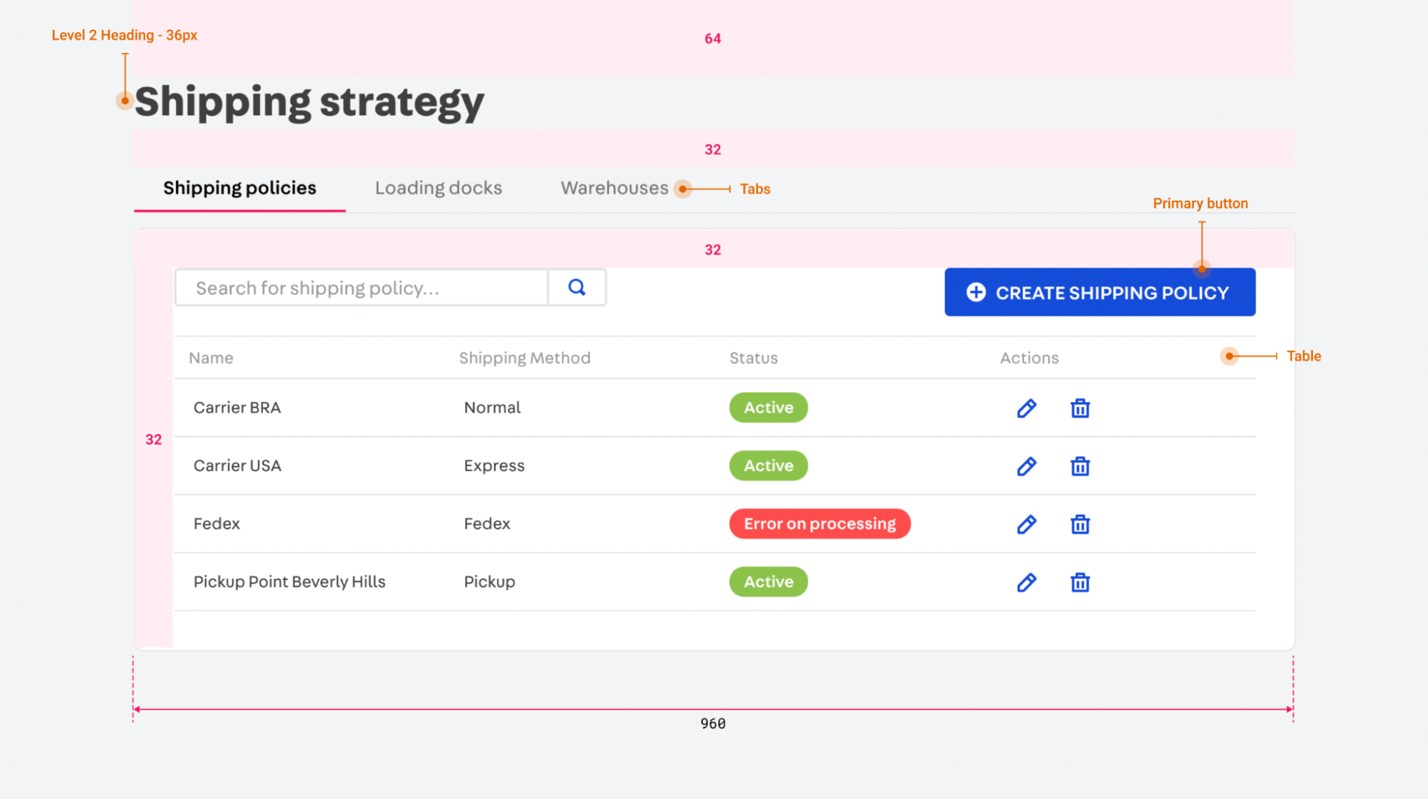
Check out some of our most-used components listed on VTEX Styleguide:
| Component Name | Usage |
|---|---|
| Layout | Displays an empty standard Admin page. Refer to the Layout guidelines for more details. |
| PageBlock | Displays an empty container. Refer to the PageBlock guidelines for more details. |
| PageHeader | Displays a standard header used in Admin pages. Refer to the PageHeader guidelines for more details. |
| Styles | The Styles configure your app's layout's colors, spacing, and typography. Refer to the Styles guidelines for more details. |
| Tabs | Displays a navigation tab that allows alternating between content in the same level of hierarchy Refer to the Tabs guidelines for more details. |
| Button | Displays a button that trigger actions and/or redirects users to another page. Refer to the Button guidelines for more details. |
| Alerts | Displays short notifications to users about an issue or a new feature. Refer to the Alert guidelines for more details. |
| Table | Displays structured data and offers controls to navigate, search, and filter through it. Refer to the Table guidelines for more details. |
| Modal | Displays a dialog window on top of a page content. Once a Modal opens, the user can not interact with the content behind it. Refer to the Modal guidelines for more details. |
Identify potential
Besides adhering to interface consistency standards, you must design your app experience to be fluid, simple, and accessible. Hence, before submitting your app to the homologation process, we recommend that you:
- Run usability tests with users.
- Identify potential friction points and implement solutions to any issues that may arise.
The homologation process is when our team review and test your app before making it public on the VTEX App Store. Apps that are difficult to configure, have confusing guidelines, or break the user journey critically will not be approved in our homologation process.
User journey
User journeys in the application should be linear and complete, indicating a path with a beginning, middle, and end. They should:
- Allow merchants to go back to previous steps when setting up and using your app.
- Provide clear directions on how to proceed from a certain point.
System status and feedback
To guarantee that your users understand and effectively finish their journeys in your app, you must provide status and feedback on their actions:
-
Make it clear when a configuration is incorrect, completed, or pending authorization. For example, you can use Alerts or a TextArea to display a message.
-
Use short and actionable notifications to eliminate any friction in the app configuration. For example, you can use Modals.
Even if your UI is consistent and provides clear feedback messages, users may still experience difficulties installing and using your app, especially during their first contact. Hence, to avoid mistakes and errors:
- Include mechanisms that offer confirmation messages when the user attempts to conduct undesired operations such as registry removal, app uninstallation, or resumption of extensive configurations.
UX writing principles
It is important that you communicate with our users the same way VTEX communicate with them.
The writing of your app's instructions, actions, feedback, and settings must follow our UX Writing guidelines.