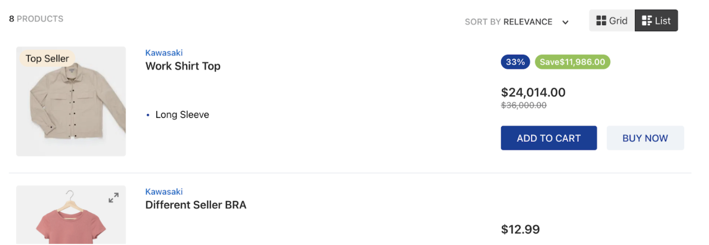
Building a search results page with multiple layouts
Creating a versatile search results page is crucial for providing a seamless user experience in your online store. In this guide, you will learn how to build a search results page with multiple layouts, allowing users to switch between grid and list views.
Before you begin
Before proceeding, ensure you are familiar with the Flex Layout and the Search Result apps. Also, check the Building a Horizontal Product Summary guide to understand how to create similar results on your search results page.
Instructions
-
Implement the Search Result app in your Store Theme according to the instructions in the Search Result guide.
-
Declare the
galleryblock responsible for structuring the page layout, and use itslayoutsprop to define the desired layouts for the search results page. For example:_22"gallery": {_22"props": {_22"layouts": [_22{_22"name": "grid",_22"component": "GridSummary",_22"itemsPerRow": {_22"(min-width:1008px)":4,_22"(min-width:623px) and (max-width:1007px)":3,_22"(max-width:622px)":2_22}_22},_22{_22"name": "list",_22"component": "ListSummary",_22"itemsPerRow": 1_22}_22],_22"ListSummary": "product-summary.shelf#listLayout",_22"GridSummary": "product-summary.shelf"_22}_22}All three of the
layoutsproperties are mandatory and must be provided for each layout.Property Description nameSpecifies the search result layout. It can be gridorlist.componentDefines the parent block responsible for defining the layout's components. For the gridlayout, we define the componentGridSummarythat will then present items vertically and horizontally from each other. For thelistlayout, we define theListSummaryto show a list of items below one another.itemsPerRowControls how many items per row will be displayed by each layout. You can use media queries to define the layouts' widths properties for desktop, tablet, and phone, such as min-widthandmax-width, or you can use the layouts' name, such asdesktop,tabletandphone.Choosing to use the layouts' name, such as
desktop,tablet, andphone, initemsPerRow, you should declare them as the example below:_10{_10"component":"GridSummary",_10"itemsPerRow":{_10"desktop":4,_10"tablet":3,_10"phone":2_10}_10}Once you define the
listandgridlayouts, declare which blocks you should use in the code to build the desired pages:Component Block ListSummaryproduct-summary.shelf#listLayoutblockGridSummaryproduct-summary.shelfblock -
Define the default layout, i.e., which layout will be first presented to customers, using the
defaultGalleryLayoutprop from thesearch-result-layout.mobileandsearch-result-layout.desktopblocks:_12"search-result-layout.desktop": {_12"children": [_12"flex-layout.row#searchbread",_12"flex-layout.row#searchtitle",_12"flex-layout.row#result"_12],_12"props": {_12"pagination": "show-more",_12"preventRouteChange": false,_12"defaultGalleryLayout": "grid"_12}_12} -
Declare the
gallery-layout-switcherblock in the search results template (store.search):_51"gallery-layout-switcher": {_51"children": [_51/*_51* For accessibility purposes, it is fundamental to define the layout options following the same ordering used to declare them in step 2._51*/_51"gallery-layout-option#grid",_51"gallery-layout-option#list"_51]_51},_51"gallery-layout-option#grid": {_51"props": {_51"name": "grid"_51},_51"children": [_51"icon-grid",_51"responsive-layout.desktop#textOptionGrid"_51]_51},_51"gallery-layout-option#list": {_51"props": {_51"name": "list"_51},_51"children": [_51"icon-inline-grid",_51"responsive-layout.desktop#textOptionList"_51]_51},_51"responsive-layout.desktop#textOptionGrid": {_51"children": [_51"rich-text#option-grid"_51]_51},_51"responsive-layout.desktop#textOptionList": {_51"children": [_51"rich-text#option-list"_51]_51},_51"rich-text#option-grid": {_51"props": {_51"text": "Grid",_51"textColor": "c-auto",_51"blockClass": "layout-option"_51}_51},_51"rich-text#option-list": {_51"props": {_51"text": "List",_51"textColor": "c-auto",_51"blockClass": "layout-option"_51}_51}Each
gallery-layout-optionblock receives thenameprop with the name of the layout it corresponds to. This is a mandatory prop. Additionally, you can declare other blocks as its children and customize the selected layout option using thegalleryLayoutOptionButton--selectedCSS Handle. -
Add the
gallery-layout-switcherblock as a child of thesearch-result-layout.mobileandsearch-result-layout.desktopblocks to display the switcher button on the page for both devices (mobile and desktop). For example:_18"flex-layout.row#searchinfo": {_18"children": ["flex-layout.col#productCount", "flex-layout.row#orderByAndSwitcher"]_18},_18"flex-layout.row#orderByAndSwitcher": {_18"children": ["order-by.v2", "gallery-layout-switcher"],_18"props": {_18"horizontalAlign": "right",_18"preventHorizontalStretch": true,_18"blockClass": "orderByAndSwitcher",_18"colGap": 3_18}_18}_18"flex-layout.col#switcherMobile": {_18"children": ["gallery-layout-switcher"],_18"props": {_18"verticalAlign": "middle"_18}_18}