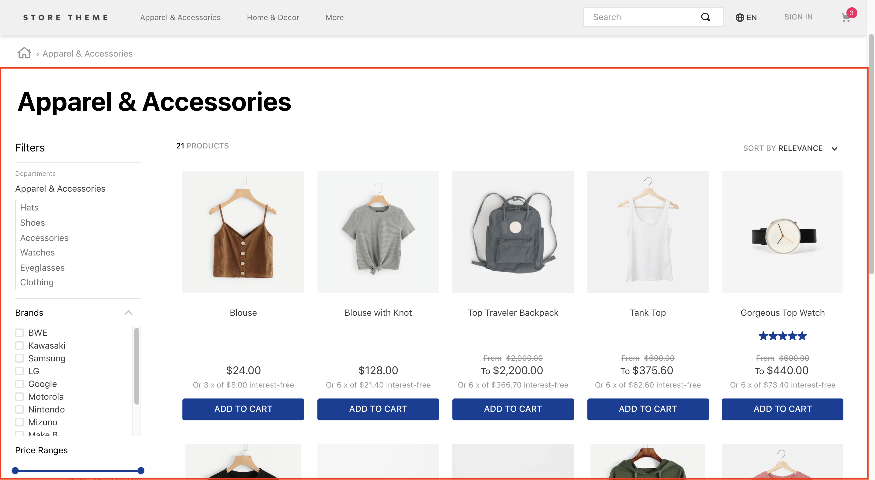
The Search Result app handles the results returned by the VTEX Search API and displays them to users.
The app exports all store blocks expected on a search results page, such as the filters and the product gallery.
Configuration
To configure the VTEX Search Result, follow the instructions below.
Adding the Search Result app to your theme's dependencies
In your theme's manifest.json, add the Search Result app as a dependency:
"dependencies": {
    "vtex.search-result": "3.x"
}
Now, you can use all the blocks exported by the search-result app. See the complete list below:
search-result blocks
| Block name | Description |
|---|---|
search-result-layout |  search-result-layout desktop, search-result-layout.mobile, and search-not-found-layout. Use it in the store.search template, as it uses context from the VTEX Search API. |
search-result-layout.customQuery | search-result-layout when the search result is declared in a template that doesn't fetch Search context, such as Home. It accepts a querySchema prop that executes search custom queries. It also supports three children blocks: search-result-layout.desktop, search-result-layout.mobile, and search-not-found-layout. |
search-result-layout.desktop | |
search-result-layout.mobile | Builds the search result page structure for mobile mode. If search-result-layout.mobile isn't provided, search-result-layout.desktop is used. |
search-layout-switcher | Enables mobile users to switch between layout modes. |
search-not-found-layout | Builds the entire search results page structure for scenarios where no result was found. It renders when users search for a term that doesn't return a product. |
gallery | |
gallery-layout-switcher | Allows users to switch between available gallery layouts. Learn more in the guide Building a search results page with multiple layouts. |
gallery-layout-option | Defines how each layout option renders for users. Learn more in the guide Building a search results page with multiple layouts. |
not-found | Contains text and a description for a page not found in the search. Declare it as a child of search-not-found-layout. |
search-content | gallery block (if products are found) or the not-found (if selected filters lead to an empty search results page). This means both gallery and not-found must be declared search-content children. |
store.not-found#search | When configured, it displays a 404 error message when the server can’t return what the browser's request is, or isn’t configured to handle that request. |
search-products-count-per-page | Displays the total number of products on the search results page. |
search-products-progress-bar | Displays a progress bar of products on the search results page. |
order-by.v2 | Allows users to choose the product order on the search results page. |
filter-navigator.v3 | Allows users to apply different filters to the search. On mobile, it renders a button that, when clicked, displays all available filters in a sidebar. |
total-products.v2 | Displays the total number of products found for that search. |
search-title.v2 | Displays a title for the performed search. |
search-fetch-more | Displays the Show more button. This button doesn't render when the user is on the last page. |
search-fetch-previous | Displays the Show previous button. This button doesn't render when the user is on the first page. |
sidebar-close-button | Displays an X button on the filter sidebar on mobile. |
Adding the Search Result to page templates
Search Result app data usually displays on search pages (store.search), but you can add it to any other page.
When adding to the search page, use the search-result-layout, which fetches data from the template's current search context. To add the app to another page, use the search-result-layout.customQuery block.
On the desired store page, add the search-result-layout block or the search-result-layout.customQuery to the correct template blocks list. Check both codes below as examples.
On search pages:
"store.search": {
 "blocks": ["search-result-layout"]
}
On other pages:
"store.home": {
    "blocks": [
        "carousel#home",
        "shelf#home",
   + "search-result-layout.customQuery#home"
    ]
}
Defining how the search query data should be fetched
Before declaring the blocks into the search results layout, define how the search results will be fetched.
You should define these results through a custom query on the homepage. On the search template, use the already provided context.
If you use search-result-layout, the blocks define the fetched data from the context. If you use search-result-layout.customQuery, send the props through the querySchema to configure the custom query.
Using search-result-layout:
{
  "store.search": {
    "blocks": ["search-result-layout"],
    "props": {
      "context": {
        "skusFilter": "FIRST_AVAILABLE",
        "simulationBehavior": "default"
      }
    }
  }
}
Using search-result-layout.customQuery:
{
  "store.home": {
    "blocks": [
      "carousel#home",
      "shelf#home",
      "search-result-layout.customQuery#home"
    ]
  },
  "search-result-layout.customQuery#home": {
    "props": {
      "querySchema": {
        "skusFilter": "FIRST_AVAILABLE",
        "simulationBehavior": "default"
      }
    }
  }
}
Check all props to configure your search data in the table below.
The context and querySchema props
| Prop name | Type | Description | Default value |
|---|---|---|---|
queryField | string | Blue. This prop only works if mapField is also declared. | undefined |
mapField | string | map parameter to define which results to fetch in the custom query. Example: specificationFilter_100. This prop only works if the queryField prop is also declared. | undefined |
maxItemsPerPage | number | Maximum number of items per search page. The maximum value of this prop is 50. If a higher number is added, the query will fail. | 10 |
orderByField | enum | Determines the order products follow when displayed. Possible values are named after the sorting type: OrderByReleaseDateDESC, OrderByBestDiscountDESC, OrderByPriceDESC, OrderByPriceASC, OrderByNameASC, OrderByNameDESC, or OrderByTopSaleDESC. ASC and DESC stand for ascending order and descending order, respectively, based on the position of each value's corresponding code in the ASCII table. OrderByTopSaleDESC considers the number of units sold of the product in the past 90 days, taking into account only ecommerce orders (no physical store orders) from order-placed events (Example: Without checking if the payment was approved). If the store has an app, it's possible to consider events from the app — provided they're implemented on the store's side, as they aren't enabled by default. If the shopper has an ad-blocking extension or a browser restriction that disables sending events, their navigation won't be counted.If not set to any of the mentioned values, the fallback behavior is sorting by relevance settings. OrderByScoreDESC is not a valid value for this prop. | "" |
hideUnavailableItems | boolean | Determines whether the search result should hide unavailable items (true) or not (false). This prop only hides items that are unavailable according to indexed information, without taking into account simulationBehavior. | false |
facetsBehavior | string | Defines the filters' behavior. When set to Dynamic, results are restricted according to the filters the user selected. If set to Static, all filters continue to display to the user, even if there are no results. | Static |
skusFilter | enum | Refines the SKUs returned for each product in the query. Fewer returned SKUs result in a more performant shelf query. Available value: FIRST_AVAILABLE (returns only the first available SKU), ALL_AVAILABLE (returns all available SKUs), and ALL (returns all product SKUs). | ALL_AVAILABLE |
simulationBehavior | enum | Defines whether the search data will be up-to-date (default) or fetched using the cache (skip). Use the last option only if you prefer faster queries over the most up-to-date prices or inventory. | default |
installmentCriteria | enum | Defines which price to display when different installments are available. Possible values: MAX_WITHOUT_INTEREST (displays the maximum installment option with no interest attached) or ´MAX_WITH_INTEREST` (displays the maximum installment option, whether it has interest attached or not). | "MAX_WITHOUT_INTEREST" |
excludedPaymentSystems | string | List of payment systems not to consider when displaying installment options to users. This prop works only if installmentCriteria is also declared. Otherwise, all available payment systems display regardless. | undefined |
includedPaymentSystems | string | List of payment systems to consider when displaying installment options to users. This prop works only if installmentCriteria is also declared. Otherwise, all available payment systems display regardless. | undefined |
Pagination doesn't display results after page 50. You can configure it to display more products per page by increasing the number of products on each page using the
maxItemsPerPageprop.
When the
simulationBehaviorprop is set asskip, it defines that the search data should only be fetched using the store's cache. This may impact the content displayed on store pages, as cache storage changes based on user interaction on each page.
You must define the query for the following search pages:
- Brand
- Department
- Category
- Subcategory
This allows you to define custom behaviors for your store's search pages. For example:
{
  "store.search": {
    "blocks": ["search-result-layout"],
    "props": {
      "context": {
        "skusFilter": "FIRST_AVAILABLE",
        "simulationBehavior": "default"
      }
    }
  },
  "store.search#category": {
    "blocks": ["search-result-layout"],
    "props": {
      "context": {
        "skusFilter": "FIRST_AVAILABLE",
        "simulationBehavior": "default"
      }
    }
  },
  "store.search#brand": {
    "blocks": ["search-result-layout"],
    "props": {
      "context": {
        "skusFilter": "FIRST_AVAILABLE",
        "simulationBehavior": "default"
      }
    }
  },
  "store.search#department": {
    "blocks": ["search-result-layout"],
    "props": {
      "context": {
        "skusFilter": "FIRST_AVAILABLE",
        "simulationBehavior": "default"
      }
    }
  },
  "store.search#subcategory": {
    "blocks": ["search-result-layout"],
    "props": {
      "context": {
        "skusFilter": "FIRST_AVAILABLE",
        "simulationBehavior": "default"
      }
    }
  }
}
Defining your search results page's layout and behavior
Now you can structure the search-result-layout or the search-result-layout.customQuery blocks. Both require the search-result-layout.desktop as a child. You can also provide props to other children, such as search-result-layout.mobile and search-not-found-layout.
Depending on your store's scenario, structure the search-result-layout or the search-result-layout.customQuery by declaring their children and then configuring them using the Flex Layout blocks and their props. For example:
{
  "search-result-layout": {
    "blocks": [
      "search-result-layout.desktop",
      "search-result-layout.mobile",
      "search-not-found-layout"
    ]
  },
  "search-result-layout.desktop": {
    "children": [
      "flex-layout.row#searchbread",
      "flex-layout.row#searchtitle",
      "flex-layout.row#result"
    ],
    "props": {
      "preventRouteChange": true
    }
  }
}
The search-result-layout.desktop, search-result-layout.mobile, and search-not-found-layout props
| Prop name | Type | Description | Default value |
|---|---|---|---|
hiddenFacets | object | Indicates which filters should be hidden. The possible values are in this table. | undefined |
showFacetQuantity | boolean | Determines whether the resulting amount in each filter should appear beside its name on the filter-navigator.v3 block (true) or not (false). | false |
showFacetTitle | boolean | Determines whether the facet title should appear on the selected filters section on the filter-navigator.v3 block (true) or not (false). | false |
blockClass | string | Unique block ID for CSS customization. | undefined |
trackingId | string | ID for Google Analytics to track store metrics based on the Search Result block. | Search result |
mobileLayout | object | Controls how the search results page displays to users using the mobile layout. Possible values are in this table. | undefined |
defaultGalleryLayout | string | Determines the default name of the gallery layout on the search results page. This prop is required when the gallery block explicitly defines several layouts. This prop's value must match the layout name defined in the name prop from layouts object. | undefined |
thresholdForFacetSearch | number | Specifies the minimum number of facets that must be displayed for the search bar to appear. If you declare 0, the search bar always displays. | undefined |
preventRouteChange | boolean | Keeps page customizations even when the user applies new filters. This prop only changes the URL's query string rather than the entire URL, preventing a full page reload when filters are applied. | false |
showShippingMethodFacet | boolean | Determines whether Shipping filters should display (true) or not (false). | false |
availableShippingValues | array | Controls which options appear inside the Shipping facet when showShippingMethodFacet is true. Accepts an array of string values from delivery, pickup-in-point, pickup-nearby, and pickup-all. When the array is empty, the default set ['delivery', 'pickup-in-point', 'pickup-nearby'] is used; passing a non-empty array replaces that list (e.g. add 'pickup-all' to expose the combined pickup option). | [] |
The mobileLayout object
| Prop name | Type | Description | Default value |
|---|---|---|---|
mode1 | enum | Defines the default layout for the mobile search results page. Possible values: normal, small, or inline. | normal |
mode2 | enum | Defines which layout sets for the mobile search results page when users click the layout selector button. Possible values are also normal, small, or inline. | small |
The hiddenFacets object
| Prop name | Type | Description | Default value |
|---|---|---|---|
brands | boolean | Determines whether Brand filters should be hidden (true) or not (false). | false |
categories | boolean | Determines whether Category filters should be hidden (true) or not (false). | false |
priceRange | boolean | Determines whether Price filters should be hidden (true) or not (false). | false |
specificationFilters | object | Indicates which specification filters should be hidden. Possible values are in this table. | undefined |
delivery-promise | object | Indicates which delivery-promise facet groups should be hidden (e.g. shipping method, dynamic estimate, delivery options). Possible values are in this table. | undefined |
The specificationFilters object
| Prop name | Type | Description | Default value |
|---|---|---|---|
hideAll | boolean | Determines whether specification filters should be hidden (true) or not (false). | false |
hiddenFilters | object | Object array of specification filters that should be hidden. Possible values are in this table. | undefined |
The hiddenFilters object
| Prop name | Type | Description | Default value |
|---|---|---|---|
name | string | Defines the name of the specification filter that you want to hide. | undefined |
The delivery-promise object
| Prop name | Type | Description | Default value |
|---|---|---|---|
hideAll | boolean | Determines whether every delivery-promise facet group should be hidden (true) or not (false). | false |
hiddenGroups | object | Object array of delivery-promise facet groups that should be hidden. Each entry matches a delivery group name returned by the search API (e.g. shipping, dynamic-estimate, delivery-options). Possible values are in this table. | undefined |
The Shipping method group (
shipping) is already hidden by default becauseshowShippingMethodFacetdefaults tofalse. UsehiddenFacets["delivery-promise"].hiddenGroups: [{ "name": "shipping" }]to keep it hidden even whenshowShippingMethodFacetis set totrue.
The hiddenGroups object
| Prop name | Type | Description | Default value |
|---|---|---|---|
name | string | Defines the name of the delivery group to hide. Valid values today are shipping (Shipping method), dynamic-estimate, and delivery-options. | undefined |
Using the Flex Layout to build your search results page
You can build your search results page with the Flex Layout app and the other blocks exported by the Search Results app, such as the gallery.
Below are the available blocks to build your store's search results page and their existing props.
The gallery block
The gallery block defines how fetched items display on the store's search results page.
When declared with no props, it expects the product-summary.shelf as a child and consequently the block structure inherited from it.
However, you can use the layouts prop to provide several layouts for the page, allowing your store to arrange items that best fit your users' needs.
In a scenario where multiple layouts are provided, your store users will be able to shift between them according to their needs using the gallery-layout-switcher block, described in the table below. The gallery will then render the component provided by the currently selected layout.
Learn more in Building a search results page with multiple layouts.
The gallery-layout-switcher props
| Prop name | Type | Description | Default value |
|---|---|---|---|
layouts | object | Arranges and displays items on the search results page. If no value is provided, the gallery block must receive a product-summary-shelf block as a child. Check this table for props of this block. | undefined |
undefined | block | Defines which blocks should reder per layout. The prop name is not undefined, you must include the value passed on the component prop. This prop's value must match the block name you choose to render in that specific layout. | undefined |
customSummaryInterval | number | Defines the item interval at which the Gallery should render a custom product-summary block. For example, declaring 5 renders a custom block at every four items rendered, as shown on this image. This prop doesn't support layouts yet. | undefined |
CustomSummary | block | Defines a block to render according to the interval defined by the customSummaryInterval prop. | undefined |
preferredSKU | PreferredSKUEnum | Controls which SKU will initially be selected in the product summary. | "FIRST_AVAILABLE" |
For PreferredSKUEnum:
| Name | Value | Description |
|---|---|---|
| First Available | FIRST_AVAILABLE | First available SKU in stock found or first SKU without stock. |
| Last Available | LAST_AVAILABLE | Last available SKU in stock found or last SKU without stock. |
| Cheapest | PRICE_ASC | Cheapest SKU in stock found or first SKU without stock. |
| Most Expensive | PRICE_DESC | Most expensive SKU in stock found or first SKU without stock. |
To select which SKU should take preference over this prop, you can create a product specification (field) and, for each product, assign the value of the desired SKU to be initially selected. If the specification doesn't exist or the value is empty, it will use the
preferredSKUprop as a fallback. Learn more in Recipes.
The layouts object
| Prop name | Type | Description | Default value |
|---|---|---|---|
name | string | gallery block. | undefined |
component | string | undefined prop from the gallery block, which declares the block to render in this layout. This prop's value can be anything as long as it's PascalCased, meaning the first letter of each word in its name is capitalized. Caution: For this to work, the chosen value must be named after the gallery block's undefined prop. Don’t use the component prop's value to directly pass the desired block name itself. See the example below to understand the underlying logic behind this prop. | undefined |
itemsPerRow | number / object | | undefined |
The itemsPerRow object
| Prop name | Type | Description | Default value |
|---|---|---|---|
desktop | number | Number of slides to show on desktop devices. | undefined |
tablet | number | Number of slides to show on tablet devices. | undefined |
phone | number | Number of slides to show on phone devices. | undefined |
Example of a gallery block
{
  "gallery": {
    "props": {
      "layouts": [
        {
          "name": "whole",
          "component": "OneOrTwoLineSummary",
          "itemsPerRow": 1
        },
        {
          "name": "two",
          "component": "OneOrTwoLineSummary",
          "itemsPerRow": 2
        },
        {
          "name": "many",
          "component": "ManyByLineSummary",
          "itemsPerRow": {
            "desktop": 5,
            "mobile": 1
          }
        }
      ],
      "OneOrTwoLineSummary": "product-summary.shelf",
      "ManyByLineSummary": "product-summary.shelf"
    }
  }
}
The gallery-layout-switcher block
The gallery-layout-switcher block is a logical block that allows users to switch between the available gallery layouts.
It receives no props and expects the gallery-layout-option block as a child. For the accessibility features to work correctly, define the options in the same order as the layouts.
The gallery-layout-option block
This block defines how each layout option renders for users.
| Prop name | Type | Description | Default value |
|---|---|---|---|
name | string | name prop. | undefined |
Example of the gallery-layout-switcher and the gallery-layout-option blocks
{
  "gallery-layout-switcher": {
    "children": [
      //It follows the same whole -> two -> many order
      "gallery-layout-option#whole",
      "gallery-layout-option#two",
      "gallery-layout-option#many"
    ]
  },
  "gallery-layout-option#whole": {
    "props": {
      "name": "whole"
    },
    "children": ["icon-single-grid", "rich-text#option-whole"]
  },
  "gallery-layout-option#two": {
    "props": {
      "name": "two"
    },
    "children": ["icon-inline-grid", "rich-text#option-two"]
  },
  "gallery-layout-option#many": {
    "props": {
      "name": "many"
    },
    "children": ["icon-menu", "rich-text#option-many"]
  }
}
filter-navigator.v3 block
This block renders a filter selector for the fetched results.
| Prop name | Type | Description | Default value |
|---|---|---|---|
categoryFiltersMode | enum | Determines whether the category filters use the href attribute with category page URLs (href) or not (default). By default, the filters use HTML divs with role="link". Setting this prop's value to href creates a link, which can improve the SEO ranking of your category pages. | default |
layout | enum | Determines whether the Filter Navigator layout is responsive (responsive) or not (desktop). You can use desktop when the Filter Navigator is configured to display in a drawer. | responsive |
maxItemsDepartment | number | Specifies the maximum number of departments to display before the See more button triggers. | 8 |
maxItemsCategory | number | Specifies the maximum number of category items to display before the See more button triggers. | 8 |
initiallyCollapsed | boolean | Makes the search filters start collapsed (true) or open (false). | false |
openFiltersMode | enum | Defines how many filters can open simultaneously on the Filter Navigator component. Possible values are many (more than one filter can open simultaneously) and one (only one filter can open). If one is declared, all filters collapse before user interaction, regardless of the initiallyCollapsed prop's value. | many |
filtersTitleHtmlTag | string | Specifies the HTML tag for the filter's title. | h5 |
scrollToTop | enum | Scrolls the page to the top (auto or smooth) or not (none) when selecting a facet. | none |
truncateFilters | boolean | Determines whether a filter selector with more than 10 filter options shortens the list and displays a See more button (true) or not (false). | false |
closeOnOutsideClick | boolean | Determines whether the Filter Navigator component closes when users click outside of it (true) or not (false). This prop only works if the openFiltersMode prop is set to one. | false |
appliedFiltersOverview | enum | Determines whether an overview of the applied filters displays (show) or not (hide). | hide |
totalProductsOnMobile | enum | Determines whether the Filter Navigator displays the total number of products on mobile devices (show) or not (hide). | hide |
fullWidthOnMobile | boolean | Determines whether the filter-navigator.v3 renders on mobile using the full screen width (true) or not (false). | false |
navigationTypeOnMobile | enum | Defines how mobile users should navigate on the filter selector component. Possible values are page (only one list of options can be seen at a time) or collapsible (all lists of options can be seen simultaneously). | page |
updateOnFilterSelectionOnMobile | boolean | Determines whether search results on mobile update based on the filter selection (true) or not (false). This prop only works if the preventRouteChange prop is declared as true. | false |
drawerDirectionMobile | Enum | Determines whether search filters on mobile open to the left (drawerLeft) or to the right (drawerRight). | drawerLeft |
showClearByFilter | boolean | Determines whether a clear button (which erases all selected filter options) displays alongside the filter name (true) or not (false). | false |
showClearAllFiltersOnDesktop | boolean | Determines whether a clear button displays (true) or not (false). This button resets all selected filters. | false |
priceRangeLayout | enum | Determines whether a text field for entering the desired price range displays (inputAndSlider) or not (slider). | slider |
facetOrdering | array | Applies custom sorting rules for filters. The default behavior sorts items by quantity, in descending order. | undefined |
showQuantityBadgeOnMobile | boolean | Displays a badge for mobile users indicating how many active filters there are. | false |
facetOrderingobject:
| Prop name | Type | Description | Default value |
|---|---|---|---|
key | string | Specifies the facet key to sort. Possible values are category-1, category-2, category-3 (for department, category, and subcategory), brand, or a product specification name. | undefined |
orderBy | enum | Specifies the field from facets to use when sorting entries. Possible values are name and quantity. | undefined |
order | enum | Determines whether the filter should sort by ascending (ASC) or descending (DESC) order. | ASC |
For example:
{
  "filter-navigator.v3": {
    "props": {
      "facetOrdering": [
        {
          "key": "brand",
          "orderBy": "name",
          "order": "ASC"
        }
      ]
    }
  }
}
The
facetOrderingprop conflicts with theenableFiltersFetchOptimizationflag onvtex.store, as it returns only the top filter values ordered by count. To achieve the desired outcome withfacetOrdering, setenableFiltersFetchOptimizationasfalsein yourvtex.storeAdmin settings.
The order-by block
The order-by block renders a dropdown button with sorting options to display the fetched results. See the block props in the table below.
The order-by props
| Prop name | Type | Description | Default value |
|---|---|---|---|
specificationOptions | [object] | Indicates which sorting options by specification will be displayed. This only works for stores using vtex.search-resolver@1.x | undefined |
hiddenOptions | [string] | Indicates which sorting options will be hidden. Example: ["OrderByNameASC", "OrderByNameDESC"] | undefined |
showOrderTitle | boolean | Determines whether the selected order value (example: Relevance) displays (true) or not (false). | true |
-
specificationOptionsObject:Prop name Type Description Default value value string Value sent for sorting in the API. It must be in the format {specification key}:{asc/desc}. Example:"size:desc"or"priceByUnit:asc".undefinedlabel string Label that displays in the sorting options. Example: "Price by unit, ascending"undefined
Sorting options for the order-by block
| Sorting option | Value |
|---|---|
| Relevance | "" |
| Top Sales Descending | "OrderByTopSaleDESC" |
| Release Date Descending | "OrderByReleaseDateDESC" |
| Best Discount Descending | "OrderByBestDiscountDESC" |
| Price Descending | "OrderByPriceDESC" |
| Price Ascending | "OrderByPriceASC" |
| Name Ascending | "OrderByNameASC" |
| Name Descending | "OrderByNameDESC" |
| Collection | "OrderByCollection" |
The search-fetch-more block
The search-fetch-more block renders a Show more button that loads the following search results page. See the block props in the table below.
This block doesn't render if there is no next page.
The search-fetch-more prop
| Prop name | Type | Description | Default value |
|---|---|---|---|
htmlElementForButton | enum | Specifies which HTML element displays for the Show more button component. Possible values: a (displays a <a> element with href and rel attributes) or button (displays a <button> element without href and rel attributes). | button |
The search-fetch-previous block
The search-fetch-previous block renders a Show previous button that loads the previous search results page. See the block props in the table below.
This block doesn't render if there is no previous page.
The search-fetch-previous prop
| Prop name | Type | Description | Default value |
|---|---|---|---|
htmlElementForButton | enum | Specifies which HTML element displays for Show previous button component. Possible values: a (displays a <a> element with href and rel attributes) or button (displays a <button> element without href and rel attributes). | button |
The search-products-count-per-page block
The search-products-count-per-page block shows the product count per search page. When declared, this block doesn't need any props.
The search-products-progress-bar block
The search-products-progress-bar block shows a progress bar of search results. When declared, this block doesn't need any props.
The sidebar-close-button block
The sidebar-close-button block is the Close button rendered on the top right of the mobile filter sidebar.
The sidebar-close-button props
| Prop name | Type | Description | Default value |
|---|---|---|---|
size | number | Size of the button icon. | 30 |
type | string | Type of the button icon. | line |
Customization
To apply CSS customization in this and other blocks, follow the instructions given in the recipe on Using CSS Handles for store customization.
| CSS handles |
|---|
accordionFilter |
accordionFilterContainer |
accordionFilterContent |
accordionFilterItemActive |
accordionFilterItemBox |
accordionFilterItemHidden |
accordionFilterItemIcon |
accordionFilterItemOptions |
accordionFilterItemTitle |
accordionFilterItem |
accordionFilterOpen |
accordionSelectedFilters |
border |
breadcrumb |
buttonShowMore |
categoriesContainer |
categoryGroup |
categoryParent |
clearAllFilters |
container |
dropdownMobile |
filter |
filterAccordionBreadcrumbs |
filterBreadcrumbsContent |
filterBreadcrumbsText |
filterBreadcrumbsItem |
filterBreadcrumbsItemName |
filterAccordionItemBox--{facetValue} |
filterApplyButtonWrapper |
filterAvailable |
filterIsOpen |
filterButtonsBox |
filterClearButtonWrapper |
filterContainer--{facetType} |
filterContainer--b |
filterContainer--c |
filterContainer--priceRange |
filterContainer--{selectedFilters} |
filterContainer--{title} |
filterContainer |
filterIcon |
filterItem--{facetValue} |
filterItem--selected |
filterItem |
filterMessage |
filterPopup |
filterPopupArrowIcon |
filterPopupButton |
filterPopupContent |
filterPopupContentContainer |
filterPopupContentContainerOpen |
filterPopupFooter |
filterPopupOpen |
filterPopupTitle |
filterSelected |
filterSelectedFilters |
filterTotalProducts |
filtersWrapper |
filtersWrapperMobile |
filterTemplateOverflow |
filterTitle |
filterTitleSpan |
footerButton |
galleryItem |
galleryItem--custom |
galleryItem--{displayMode} |
galleryTitle |
gallery |
galleryLayoutSwitcher |
galleryLayoutOptionButton |
layoutSwitcher |
loadingOverlay |
loadingSpinnerInnerContainer |
loadingSpinnerOuterContainer |
orderByButton |
orderByDropdown |
orderByOptionItem |
orderByOptionItem--selected |
orderByOptionsContainer |
orderByText |
orderBy |
productCount |
progressBarContainer |
progressBar |
progressBarFiller |
resultGallery |
searchNotFoundInfo |
searchNotFoundOops |
searchNotFoundTerm |
searchNotFoundTextListLine |
searchNotFoundWhatDoIDo |
searchNotFoundWhatToDoDotsContainer |
searchNotFoundWhatToDoDots |
searchNotFound |
searchResultContainer |
seeMoreButton |
selectedFilterItem |
showingProductsContainer |
showingProductsCount |
showingProducts |
switch |
totalProductsMessage |
totalProducts |