Building a horizontal Product Summary
The Product Summary is a VTEX native app responsible for displaying important product data in your store's components, such as the Shelf and the Minicart.
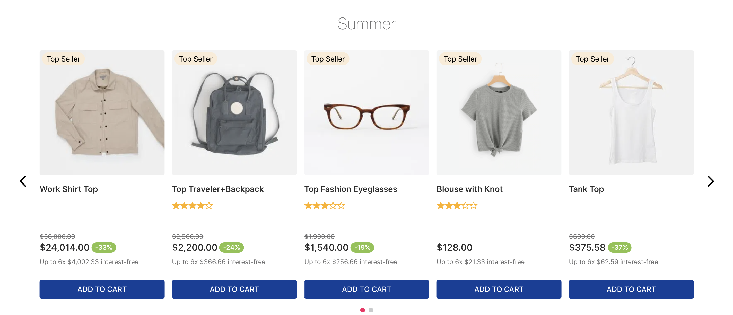
Thanks to the Flex Layout app, it is possible to customize the default presentation showed above and thereby display the Product Summary blocks in a horizontal alignment to your users:
Learn in the instructions below how to use the powerful combination between the Flex Layout and the Product Summary apps in order to display your product data horizontally.
Instructions
This recipe requires previous understanding of the Flex Layout app. It is strongly advised that you read the app documentation before performing the steps below!
- Make sure the Flex Layout app has been declared as a theme's dependency in the
manifest.jsonfile:
_10"dependencies": {_10 "vtex.flex-layout": "0.x"_10}
- Add the
flex-layout.rowblock as a child of theproduct-summary.shelfand/or theproduct-summaryblocks, according to the desired scenario:
_10"product-summary.shelf": {_10 "children": ["flex-layout.row#product-summary-mobile"]_10},
The
flex-layout.rowblock allows its children to be displayed side by side on the UI.
Notice that the block naming always depends on your store scenario. In the example above,
#product-summary-mobileis only being used for identification purposes.
- Add the
flex-layout.colblocks as children of theflex-layout.rowblock to define the desired disposition of elements on the screen - the firstflex-layout.col's children will be displayed on the left side of the horizontal Product Summary, whereas the second will be on the right side:
_10"flex-layout.row#product-summary-mobile": {_10 "children": [_10 "flex-layout.col#product-image",_10 "flex-layout.col#product-summary-details"_10 ],_10},
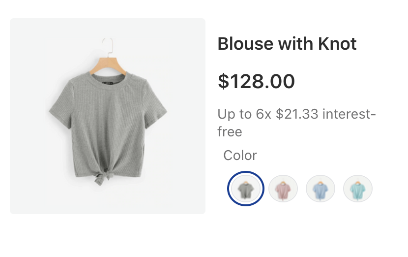
- Add the
product-summary-imageblock to theflex-layout.col#product-image's children list and then declare it as desired:
_10"flex-layout.col#product-image": {_10 "children": ["product-summary-image#shelf"]_10},_10"product-summary-image#shelf": {_10 "props": {_10 "showBadge": false,_10 "aspectRatio": "1:1",_10 "maxHeight": 300_10 }_10},
- Add the desired blocks responsible for displaying product data to the
flex-layout.col#product-summary-details's children list and then declare them as desired. For example:
_38"flex-layout.col#product-summary-details": {_38 "children": [_38 "product-summary-name",_38 "product-summary-space",_38 "product-list-price",_38 "flex-layout.row#selling-price-savings",_38 "product-installments",_38 "product-summary-sku-selector#buy-together"_38 ],_38 "props": {_38 "marginLeft": 4_38 },_38},_38"flex-layout.row#selling-price-savings": {_38 "children": [_38 "product-selling-price",_38 "product-price-savings#summary"_38 ],_38 "props": {_38 "colGap": 2,_38 "preserveLayoutOnMobile": true,_38 "preventHorizontalStretch": true,_38 "marginBottom": 4_38 },_38},_38"product-price-savings#summary": {_38 "props": {_38 "markers": ["discount"]_38 }_38},_38"product-summary-sku-selector#buy-together": {_38 "props": {_38 "thumbnailImage": "skuvariation",_38 "imageHeight": 28,_38 "blockClass": "buyTogether",_38 "visibility": "more-than-one"_38 }_38}