Setting up Delivery Promise components (Beta)
This feature is in closed beta, which means that only selected customers can access it. If you are interested in implementing it in the future, please contact our Support team.
The Delivery Promise (Beta) feature helps create a more accurate and reliable shopping experience by ensuring customers only see products that can be delivered to the provided address or picked up at available locations.
The availability is displayed following these rules:
- For pickup points selected in the header or a specific pickup point, the system displays all available pickup points within a 50 km pickup radius configured in Checkout. There is no limit to the number of pickup points displayed.
- For the nearby pickup filter, pickup points within a 10 km radius of the buyer's location are displayed, with a maximum of 40 pickup points.
Delivery Promise supports any seller architecture (franchise accounts, VTEX Sellers, Seller Portal, and external sellers).
If you're building your storefront with Store Framework, you can enable this experience using two key apps:
- Delivery Promise Components: Used to display blocks for postal code, delivery versus pickup, and pickup point selection.
- Search Result: Used to implement sidebar filters.
This guide walks you through the basic setup needed to implement these components in your store.
Explore the Delivery Promise Figma library to learn more about component specs, usage guidelines, reference use cases, and behavioral patterns.
Before you begin
To enable Delivery Promise (Beta) in your store, the following conditions must be met:
- The store must use Intelligent Search.
- Check if you have installed the
0.5.0or a later version of thesearch-sessionapp. To do this, run thevtex listcommand in your terminal and search for the app in the results. If you don’t have this app installed, run the commandvtex install vtex.search-session. - Your storefront must be built with Store Framework to enable the components in this guide. If you use FastStore, check the FastStore Delivery Promise implementation guide. If your store is headless, check Delivery Promise for headless stores.
Instructions
Step 1 - Requesting Delivery Promise activation
Contact our Support team to request the activation of Delivery Promise.
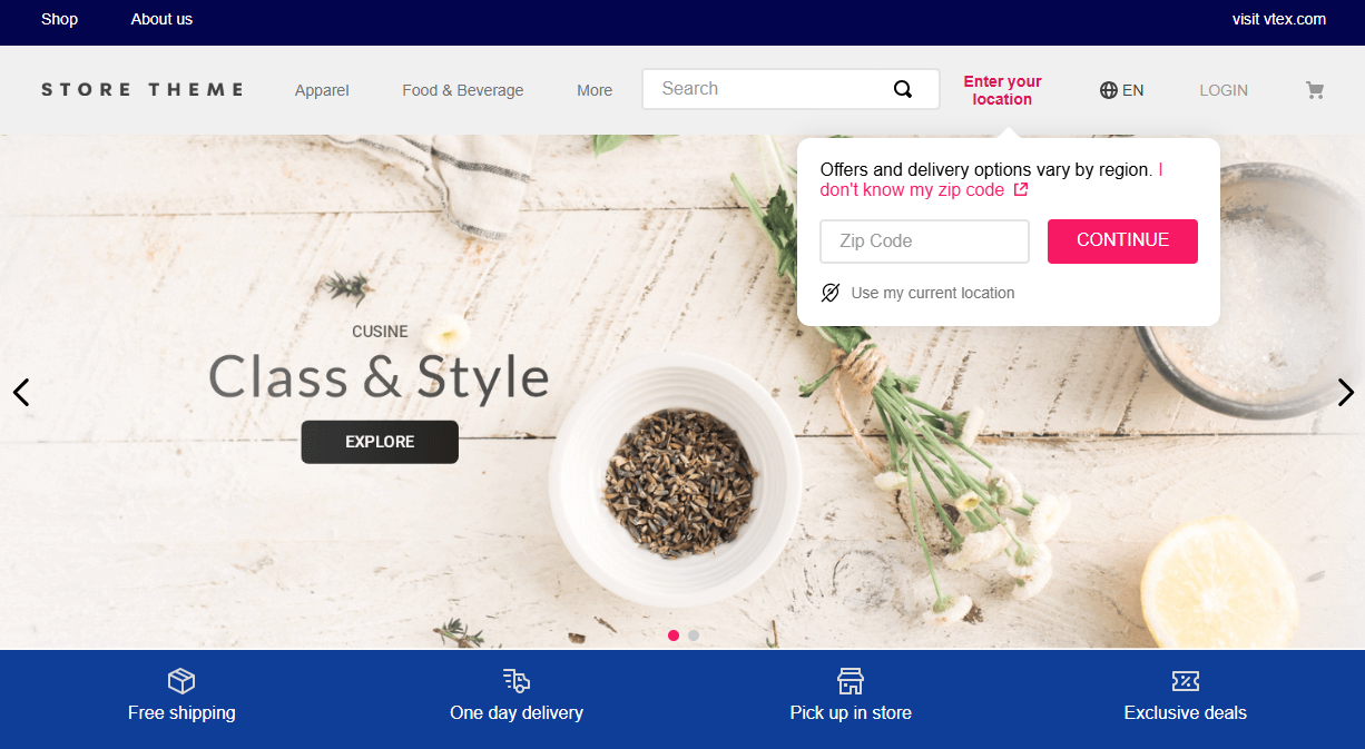
Step 2 - Displaying a location selector
To use Delivery Promise, customers must provide a delivery address early in their shopping journey. The delivery-promise-components app exposes Store Framework blocks that collect the location and, optionally, the fulfillment method (delivery vs. pickup or a specific pickup point).
-
Add the
delivery-promise-componentsapp to your theme dependencies inmanifest.jsonas shown below:_10"dependencies": {_10"vtex.delivery-promise-components": "1.x"_10} -
Declare the blocks in your theme header (or another layout that should show the controls). The app exposes three header blocks.
| Block | Description |
|---|---|
shopper-location-setter | Required. Collects the shopper’s location (postal code or equivalent). This value drives all Delivery Promise subsequent availability calculations and filters. |
shipping-method-selector | Optional. A control for choosing between delivery and pickup after a location is set. |
pickup-point-selector | Optional. A control for choosing which pickup point to use after a location is set. |
The
shopper-location-setterblock is required and must always be included in the header.shipping-method-selectorandpickup-point-selectorare optional. They complement the location setter but do not replace it, since both depend on the location already set in the session. Add them only if you want to expose additional controls in the UI. Otherwise, keep the header simple: eithershopper-location-setteralone, orshopper-location-setterpaired with one of the selectors. Using all three together is possible but uncommon.
Choose the configuration that matches your use case:
Location only
Use the shopper-location-setter block when you only need the shopper to provide their location, without separate header controls for shipping method or store.
Example
_11 "header-row#1-desktop": {_11 "children": ["shopper-location-setter"]_11 },_11_11 "shopper-location-setter": {_11 "props": {_11 "required": false,_11 "mode": "default",_11 "showLocationDetectorButton": false_11 }_11 }
Location + shipping method
Use shopper-location-setter and shipping-method-selector when you want the header to make the delivery or pickup choice explicit right after the shopper enters a location.
Example
_21 "header-row#1-desktop": {_21 "children": [_21 "shopper-location-setter",_21 "shipping-method-selector"_21 ]_21 },_21_21 "shopper-location-setter": {_21 "props": {_21 "required": false,_21 "mode": "default",_21 "showLocationDetectorButton": false_21 }_21 },_21_21 "shipping-method-selector": {_21 "props": {_21 "required": false,_21 "mode": "default"_21 }_21 }
Location + pickup point
Use shopper-location-setter and pickup-point-selector when pickup is a central part of your experience, and you want both "where am I?" and "which store?" visible in the header.
Example
_20 "header-row#1-desktop": {_20 "children": [_20 "shopper-location-setter",_20 "pickup-point-selector"_20 ]_20 },_20_20 "shopper-location-setter": {_20 "props": {_20 "required": false,_20 "mode": "default",_20 "showLocationDetectorButton": false_20 }_20 },_20_20 "pickup-point-selector": {_20 "props": {_20 "mode": "default"_20 }_20 }
- Configure the behavior with props to customize the blocks. Below are the available props.
shopper-location-setter
| Prop | Type | Default | Description |
|---|---|---|---|
required | boolean | false | When true, opens a non-dismissible postal code modal until a valid code is set. When false, uses the popover flow. |
mode | string | "default" | Display mode: default or icon. |
showLocationDetectorButton | boolean | false | Shows the control that uses the browser geolocation API to suggest the postal code. Available only on this block. |
shipping-method-selector
| Prop | Type | Default | Description |
|---|---|---|---|
required | boolean | false | When true, the shipping method modal cannot be dismissed until a method is selected (after a postal code is entered). |
mode | string | "default" | Display mode: default or icon. |
pickup-point-selector
| Prop | Type | Default | Description |
|---|---|---|---|
mode | string | "default" | Display mode: default or icon. |
Step 3 - Implementing sidebar filters
To display Delivery Promise filters in the search sidebar, configure the Search Result app as described below.
Delivery Promise filters are a beta feature and may be subject to breaking changes. If you customize this functionality, ensure your implementation can handle future updates.
-
In your theme's
manifest.json, add thesearch-resultapp as a dependency:_10"dependencies": {_10"vtex.search-result": "3.x"_10} -
Ensure your theme uses either the
search-result-layout.desktoporsearch-result-layout.mobileblocks, depending on the layout. Inside these layouts, include thefilter-navigator.v3block so the sidebar can render filters:
-
Enable the Delivery Promise filters by setting the
showShippingMethodFacettotruein each flexible search layout where the facet should appear. This property is disabled by default, so the shipping method filter remains hidden unless explicitly enabled. The example above enables it on both desktop and mobile layouts. -
Optionally, define which shipping options should be displayed using the
availableShippingValuesprop in the same layout blocks. When this prop is not defined, or when it is set to an empty array, the default options are used:delivery,pickup-in-point, andpickup-nearby. When you provide a non-empty array, it replaces the default entirely, and only the specified values are shown. Supported values correspond to the search API facet names and include:delivery,pickup-in-point,pickup-nearby,pickup-all.Example with an explicit list (same as the default) plus
pickup-allon desktop and mobile:_12"search-result-layout.desktop": {_12"children": ["filter-navigator.v3", "search-content"],_12"props": {_12"showShippingMethodFacet": true,_12"availableShippingValues": [_12"delivery",_12"pickup-in-point",_12"pickup-nearby",_12"pickup-all"_12]_12}_12}
The shipping method facet appears only when showShippingMethodFacet is enabled. The options listed match availableShippingValues when you set it, or fall back to the default set when the prop is not provided. Other Delivery Promise-related facets continue to behave as usual.