The Header app displays a navigation bar at the top of your store pages. It serves as the central hub for essential navigation elements, such as your store logo, the minicart, user login, and the search bar.
Installation
- Add the
store-headerapp to your theme's dependencies in themanifest.jsonfile:
_10 dependencies: {_10 "vtex.store-header": "2.x"_10 }
You can now use all the blocks exported by the store-header app. The following table lists the available blocks:
| Block name | Description |
|---|---|
header-layout.desktop |  header-row blocks. |
header-layout.mobile | Defines the Header layout for mobile devices through header-row blocks. |
header-row | |
header-border | Adds a 1px margin to a Header row. |
header-force-center | Centralizes its children blocks in a Header row. |
header-spacer | Adds spacing between blocks throughout a Header row. |
Configuration
- Declare the
header-layout.desktopandheader-layout.mobileblocks in yourheader.jsoncfile. This allows you to define different header structures for desktop and mobile devices.
_10{_10 "header": {_10 "blocks": [_10 "header-layout.desktop",_10 "header-layout.mobile"_10 ]_10 },
The Header is a default store interface element defined in the
interfaces.jsonfile, so you don't need to declare it in every template. Store Framework automatically applies your configuration across all store pages. To customize the header for specific pages, see the Advanced configuration section.
- In your
header.jsoncfile, defineheader-rowblocks insideheader-layout.desktopandheader-layout.mobile. The number of rows depends on your store design.
_15{_15 "header": {_15 "blocks": [_15 "header-layout.desktop",_15 "header-layout.mobile"_15 ]_15 },_15 "header-layout.desktop": {_15 "children": [_15 "header-row#1-desktop",_15 "header-row#2-desktop",_15 "header-row#3-desktop",_15 "header-row#4-desktop"_15 ]_15 },
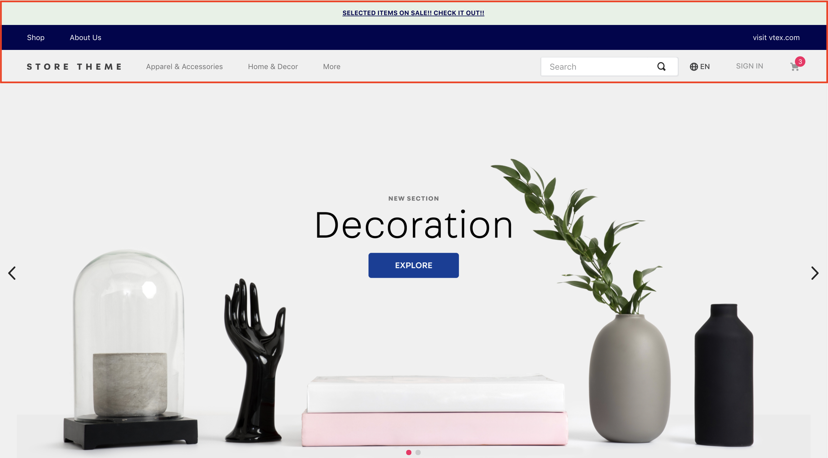
The example above uses four rows for the desktop header. This setup allows replicating the header to include telemarketing functionalities (when activated), notifications, page links, and other blocks, such as a logo and menu.
- Configure each
header-rowby adding props and declaring the desired blocks as children. The most commonly used blocks are Logo, Minicart, and Menu.
In the example below, we'll add a Telemarketing bar to the first row:
_10"header-row#1-desktop": {_10 "children": [_10 "telemarketing"_10 ],_10 "props": {_10 "fullWidth": true_10 }_10},
header-rowprops:
| Prop name | Type | Description | Default value |
|---|---|---|---|
zIndex | Number | Controls the vertical stacking order of elements for overlapping. | 0 |
sticky | Boolean | Determines if the header row remains fixed at the top of the screen during scroll (true) or not (false). | false |
fullWidth | Boolean | Determines if the header row should span the full width of the screen. | true |
inverted | Boolean | If true, the row uses the inverted base color defined in styles.json. | false |
⚠️ Repeat this process for all header-row blocks in both header-layout.desktop and header-layout.mobile, configuring each block with the necessary props.
Layout customization blocks
You can use the header-border, header-force-center, and header-spacer blocks as children of header-row to customize your header layout.
header-border
Adds a 1px margin to a header row.
_14"header-row#2-desktop": {_14 "children": [_14 "header-border",_14 "notification.bar#home"_14 ],_14 "props": {_14 "fullWidth": "true"_14 }_14},_14"notification.bar#home": {_14 "props": {_14 "content": "SELECTED ITEMS ON SALE! CHECK IT OUT!"_14 }_14},
header-force-center
Centralizes its child blocks within a header row.
_24"header-row#4-desktop": {_24 "props": {_24 "blockClass": "main-header",_24 "horizontalAlign": "center",_24 "verticalAlign": "center",_24 "preventHorizontalStretch": true,_24 "preventVerticalStretch": true,_24 "fullWidth": true_24 },_24 "children": ["header-force-center"]_24}, _24"header-force-center": {_24 "children":[_24 "logo#desktop"_24 ]_24},_24"logo#desktop": {_24 "props": {_24 "title": "Logo",_24 "href": "/",_24 "url": "https://storecomponents.vteximg.com.br/arquivos/store-theme-logo.png",_24 "width": "180"_24 }_24},
header-spacer:
Adds a flexible space between blocks in a header row. Blocks declared before header-spacer are pushed to the left, and blocks declared after are pushed to the right.
_11"header-row#3-desktop": {_11 "children": [_11 "vtex.menu@2.x:menu#websites",_11 "header-spacer",_11 "vtex.menu@2.x:menu#institutional"_11 ],_11 "props": {_11 "blockClass": "menu-link",_11 "inverted": "true"_11 }_11},
Advanced configuration
By default, the header configuration is applied to all store templates. To override this behavior and apply custom configurations to different templates, you can modify the interfaces.json file.
For detailed instructions, see the guide Customizing the Header and Footer blocks by page.
Customization
To apply CSS customizations to these and other blocks, follow the instructions in Using CSS Handles for store customization.
| CSS Handles |
|---|
container |
leanMode |
topMenuContainer |
topMenuLogo |
topMenuSearchBar |
topMenuIcons |
topMenuCollapsible |
forceCenter |
forceCenterInnerContainer |
headerBorder |
headerSpacer |
headerStickyRow |
headerRowContentContainer |