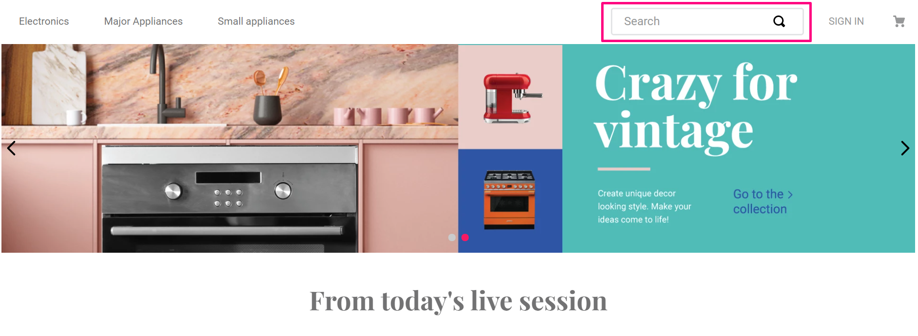
The search-bar component shows a search bar with autocomplete options and displays the matching products as well. This component can be imported and used by any VTEX App.
Configuration
- Import the
vtex.store-componentsapp to your theme's dependencies in themanifest.jsonfile as in the following example:
_10 "dependencies": {_10 "vtex.store-components": "3.x"_10 }
- Add the
search-barblock into theheadercomponent. For example:
_11 "header.full": {_11 "blocks": [_11 "login",_11 "minicart",_11 "logo",_11+ "search-bar",_11 "menu-link",_11 "telemarketing",_11 "category-menu"_11 ]_11 },
- Then, declare the
search-barblock using the props stated in the Props table. For example:
Props
| Prop name | Type | Description | Default value |
|---|---|---|---|
attemptPageTypeSearch | Boolean | If true when clicked on result link of brand, department or category will link to the corresponding brand, department or category page. When false will always go to a full text search page. | false |
autocompleteAlignment | HorizontalAlignment | Autocomplete Horizontal alignment. Possible values are: left, center, right. | left |
autocompleteFullWidth | Boolean | If true, the autocomplete will fill the whole window horizontally. | false |
autoFocus | Boolean | Define if the search input should autofocus or not | - |
blurOnSubmit | Boolean | Define if input should blur on submit. | false |
classes | CustomCSSClasses | Overrides default CSS handles. To better understand how this prop works, check this document. Note that this is only helpful if you're using this block as a React component. | undefined |
containerMode | enum | Defines how the autocomplete component should be displayed. Possible values are: overlay (suggestions overlapping other components) and container (displays the suggestion within a container). | overlay |
compactMode | Boolean | Define when to use the compact version of the component | - |
customSearchPageUrl | string | Template for a custom url. It can have a substring ${term} used as placeholder to interpolate the searched term. (e.g. /search?query=${term}) | - |
disableBlurAndTouchEndHandler | Boolean | The autocomplete can have touchable/clickable components. Interacting with those components may trigger blur and touch events that will close the autocomplete. When set to true, this prop will disable those handlers. | false |
displayMode | DisplayMode | Define the component display mode, such as which buttons should be visible. | clear-button |
emptyPlaceholder | String! | Shows a placeholder when the ResultList hasn't results to displayed | - |
hasIconLeft | Boolean | Define if the search icon is on left or right position | - |
iconClasses | String |  searchBarIcon. | - |
inputType | enum | Defines the value for the type HTML attribute (from the <input> field). Possible values are: search and text. We strongly recommend you to use search as it fixes some iOS issues. The text value is only kept as default for backwards compatibility. | text |
maxWidth | Number | String | Max width of the search bar | - |
minSearchTermLength | Number | If defined, it will block searches where the term length is lesser than minSearchTermLength. | - |
openAutocompleteOnFocus | Boolean | Defines if autocomplete should be open on input focus or not. | false |
placeholder | String! | Placeholder to be used on the input | - |
submitOnIconClick | Boolean | displayMode prop instead. | false |
DisplayMode
| Enum name | Enum value | Empty state | Filled state |
|---|---|---|---|
clear-button | 'clear-button' |  |  |
search-and-clear-buttons | 'search-and-clear-buttons' |  |  |
search-button | 'search-button' |  |  |
Using SearchBar with Intelligent Search
To improve the search experience usign the SearchBar component, such as the autocomplete option, you must use the component within Search app responsible for handling the Intelligent Search (IS) solution in IO stores.
The IS communicates with the autocomplete-result-list.v2 block exported by the Search app, and the block displays previous search results based on current and previous searches.
Follow the Search documentation to add the Search app to your store.
Customization
To apply CSS customizations in this and other blocks, follow the Using CSS handles for store customization guide.
| CSS Handles |
|---|
compactMode |
externalSearchButtonWrapper |
paddingInput |
searchBarContainer |
searchBarInnerContainer--opened |
searchBarInnerContainer--filled |
searchBarIcon |
searchBarIcon--clear |
searchBarIcon--external-search |
searchBarIcon--prefix |
searchBarIcon--search |
suffixWrapper |