Building a product details page
A product details page (PDP) is the page in an ecommerce website that displays information about a specific product, including dimensions, color, price, reviews, shipping, and other relevant details that consumers may want to check before purchasing.
The PDP is defined within the store.product block in the Store Theme app, and it's built with a series of child blocks. The store.product block accepts all blocks allowed by the store and flex-layout blocks as child dependencies, as well as block in the following list:
Blocks accepted by store.product
availability-subscriberbuy-buttonblog-related-postsbreadcrumbproduct-add-to-list-buttonproduct-assembly-optionsproduct-availabilityproduct-brandproduct-detailsproduct-descriptionproduct-highlightsproduct-identifierproduct-imagesproduct-kitproduct-nameproduct-priceproduct-rating-inlineproduct-rating-summaryproduct-reviewsproduct-teaser.productproduct-quantityproduct-questions-and-answersproduct-separatorproduct-specificationsshareshipping-simulatorsku-selector
Before you begin
To build a responsive PDP, you need to use flex-layout. For more information, read this guide.
Practical example
Consider the following example of a PDP built using the store.product and flex-layout blocks:
Click here to see the code sample
_81{_81 "store.product": {_81 "children": [_81 "flex-layout.row#product-breadcrumb",_81 "flex-layout.row#product-main",_81 "shelf.relatedProducts"_81 ]_81 },_81 "flex-layout.row#product-breadcrumb": {_81 "props": {_81 "marginTop": 4_81 },_81 "children": ["breadcrumb"]_81 },_81 "flex-layout.row#product-main": {_81 "props": {_81 "colGap": 7,_81 "rowGap": 7,_81 "marginTop": 4,_81 "marginBottom": 7,_81 "paddingTop": 7,_81 "paddingBottom": 7_81 },_81 "children": ["flex-layout.col#product-image", "flex-layout.col#right-col"]_81 },_81 "flex-layout.col#product-image": {_81 "props": {_81 "width": "60%",_81 "rowGap": 0_81 },_81 "children": ["product-images"]_81 },_81 "product-images": {_81 "props": {_81 "displayThumbnailsArrows": true_81 }_81 },_81 "flex-layout.col#right-col": {_81 "props": {_81 "preventVerticalStretch": true,_81 "rowGap": 0_81 },_81 "children": [_81 "product-name",_81 "product-rating-summary",_81 "product-price#product-details",_81 "product-separator",_81 "product-quantity",_81 "product-identifier.product",_81 "sku-selector",_81 "flex-layout.row#buy-button",_81 "availability-subscriber",_81 "shipping-simulator",_81 "share#default"_81 ]_81 },_81 "product-price#product-details": {_81 "props": {_81 "showInstallments": true,_81 "showSavings": true_81 }_81 },_81 "flex-layout.row#buy-button": {_81 "props": {_81 "marginTop": 4,_81 "marginBottom": 7_81 },_81 "children": ["buy-button"]_81 },_81_81 "share#default": {_81 "props": {_81 "social": {_81 "Facebook": true,_81 "WhatsApp": true,_81 "Twitter": false,_81 "Pinterest": true_81 }_81 }_81 }_81}
Note that in the code sample, the store.product child dependencies define five blocks, the first two being flex-layout.row.
Keep in mind that the
flex-layoutblock may be affected if you are using mobile mode. For more information, read the Flex Layout documentation.
First row of Flex Layout
In the first row of the flex-layout block, the breadcrumb block is rendered as follows:

_10"flex-layout.row#product-breadcrumb": {_10 "props": {_10 "marginTop": 4_10 },_10 "children": ["breadcrumb"]_10 },
To customize the breadcrumb, you can declare the breadcrumb block and configure its properties based on your preferences. For example:
_10"breadcrumb": {_10 "props": {_10 "showOnMobile": true_10 }_10}
Second row of Flex Layout
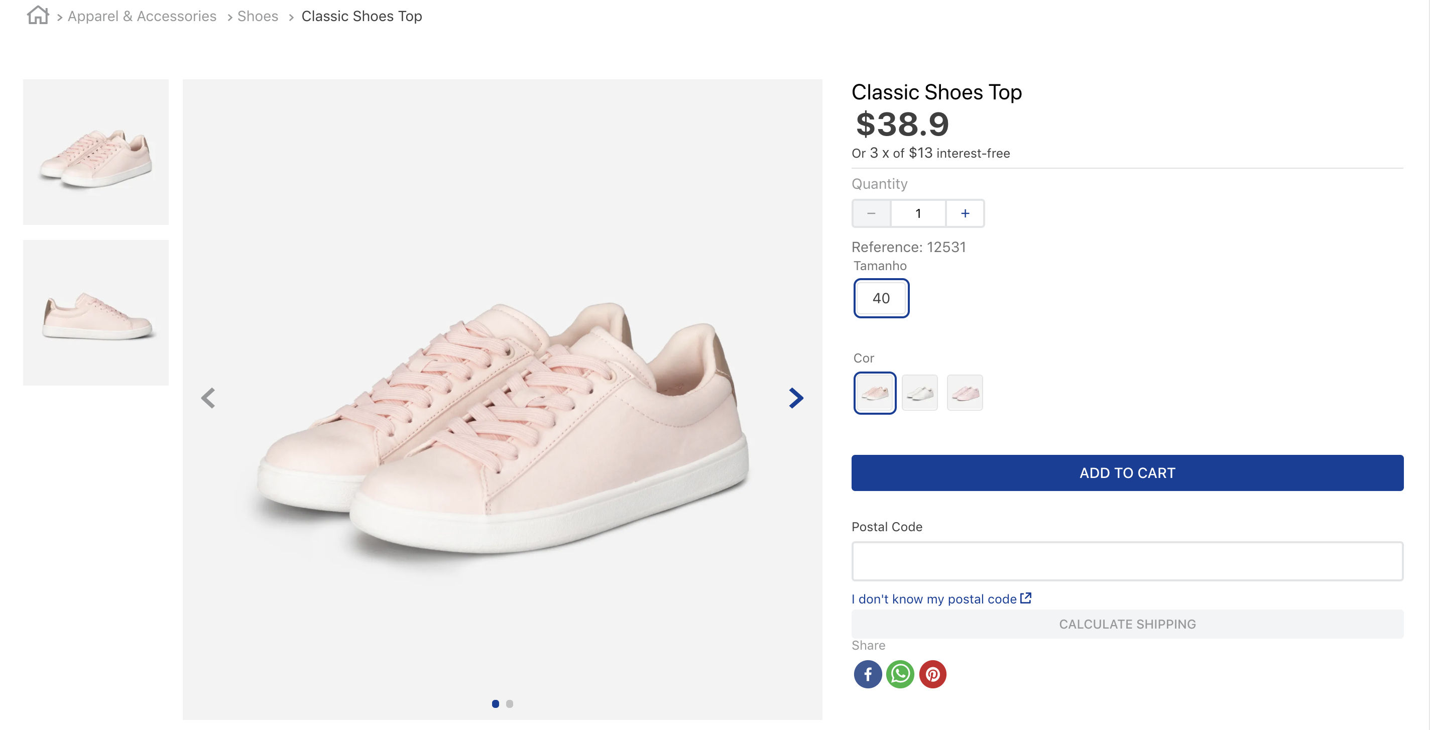
The second row of the flex-layout block renders the main information about the product.
It renders the product image (flex-layout.col#product-image) in the left column and the name, price, SKU selector, and buy button in the right column(flex-layout.col#right-col):
_11 "flex-layout.row#product-main": {_11 "props": {_11 "colGap": 7,_11 "rowGap": 7,_11 "marginTop": 4,_11 "marginBottom": 7,_11 "paddingTop": 7,_11 "paddingBottom": 7_11 },_11 "children": ["flex-layout.col#product-image", "flex-layout.col#right-col"]_11 },
To customize the flex-layout.col#product-image and flex-layout.col#right-col sections, you can declare these blocks and configure their properties based on your preferences as below:
_29"flex-layout.col#product-image": {_29 "props": {_29 "width": "60%",_29 "rowGap": 0_29 },_29 "children": ["product-images"]_29 },_29 "product-images": {_29 "props": {_29 "displayThumbnailsArrows": true_29 }_29 },_29 "flex-layout.col#right-col": {_29 "props": {_29 "preventVerticalStretch": true,_29 "rowGap": 0_29 },_29 "children": [_29 "product-name",_29 "product-price#product-details",_29 "product-separator",_29 "product-quantity",_29 "product-identifier.product",_29 "sku-selector",_29 "flex-layout.row#buy-button",_29 "shipping-simulator",_29 "share#default"_29 ]_29 },
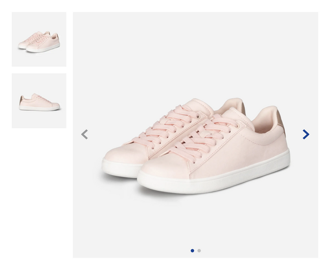
Left column
The left column of the second row contains the product-images block because this was the first flex-layout.col block to be declared.
Right column
The right column of the second row displays the price, buy button, and other relevant product details. In practice, it's composed of the following blocks:
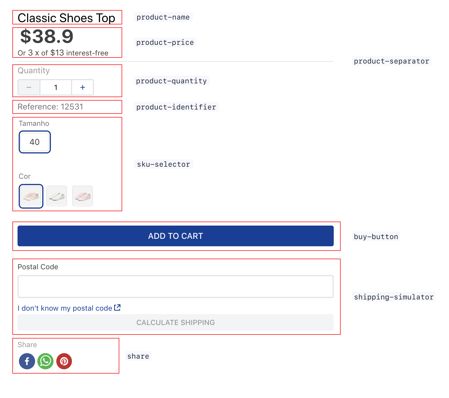
product-name: Displays the product name, along with its SKU name, if desired.product-price: Displays a properly formatted selling price. You can set it to display the list price (if different), installments, etc. Below is an example of a product price displaying both the sale and the list price.product-separator: Renders a line separator.product-quantity: Displays a quantity selector that allows customers to choose how many items they want to add to the cart.product-identifier: Displays the product identification number. It accepts different props, such as the label to display before/after the identifier.sku-selector: Allows the user to choose a SKU, automatically hiding impossible combinations or indicating combinations that are currently unavailable.add-to-cart-button: Adds an item to the cart. You can customize it to display a success message, redirect users to the cart page, etc.shipping-simulator: Allows users to enter their postal code to then display the available shipping options and their respective prices for the order.share: Allows product sharing on social media. You can customize its props to control which options will be displayed to the user.
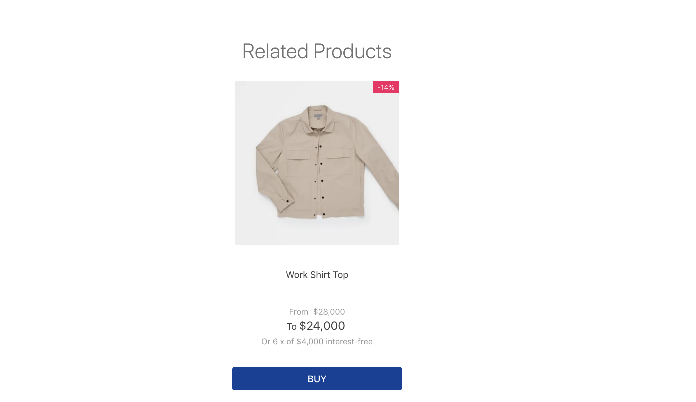
Related products
After the flex-layout rows, you need to declare the shelf.relatedProducts block in your store.product block. This block is a shelf that displays products related to the one the customer is browsing. These products are defined through Catalog in the Admin.
_10"shelf.relatedProducts": {_10 "props": {_10 "recommendation": "view",_10 "productList": {_10 "titleText": "Who saw also saw",_10 "itemsPerPage": 3_10 }_10 }_10}
When related products are identified, they are displayed as follows:
The shelf.relatedProducts block accepts different recommendation types, such as similars, view, buy, accessories, viewAndBought, and suggestions.