Using Flex Layout
Since Flex Layout is a structure that allows the construction of custom layouts according to the concept of rows and columns, it basically can be used to build any desired store page.
In this recipe, we will learn how to use it in a practical case, building an About Us page from scratch just as the one below:
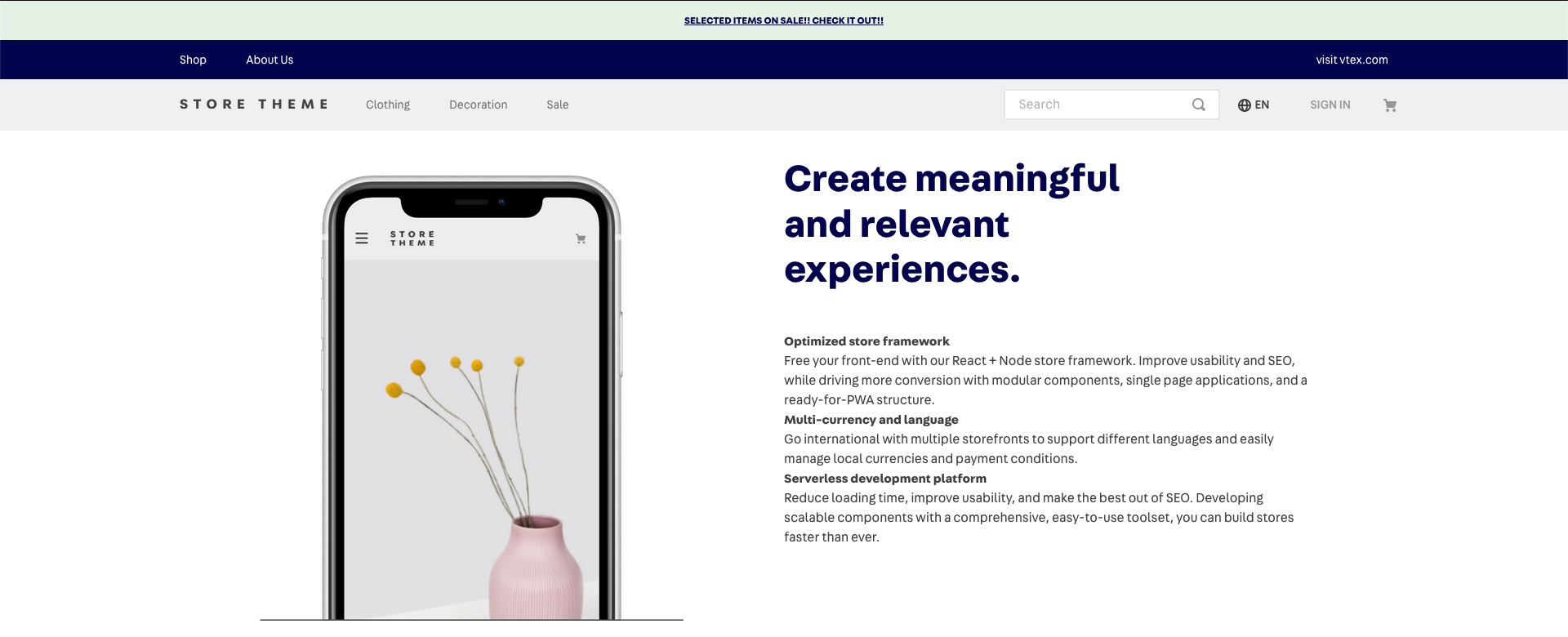
If we think on how we could divide this page layout, we realize that it could be easily thought of as a "one row with two columns" model:
To achieve the layout shown above, we must use the flex-layout.row and flex-layout.col blocks, which are going to define each row and column in the page layout and their children blocks.
Declaring the flex-layout.row
First, let's declare (in the blocks folder or blocks.jsonc file) the main block for the entire About Us page:
_10"store.custom#about-us": {_10 "blocks": [_10 "flex-layout.row#about-us"_10 ]_10},
As you can see, the store.custom#about-us block consists of a single flex-layout.row block, because it is always the highest order block in the flex-layout. You should never use the flex-layout block directly.
Defining the flex-layout.row and declaring the flex-layout.col
Now that we declared that we are going to use flex-layout.row#about-us, let's in fact define it:
_11"store.custom#about-us": {_11 "blocks": [_11 "flex-layout.row#about-us"_11 ]_11},_11"flex-layout.row#about-us": {_11 "children": [_11 "image#mobile-phone",_11 "flex-layout.col#text-about-us"_11 ]_11},
The
flex-layout.row#about-usblock is going to display its child dependencies in an interface, from left to right, one after the other.
As shown above, the flex-layout.row#about-us was declared with two child blocks, one of them being an image and the other a flex-layout.col block. Both flex-layout blocks only accept blocks allowed by their parent.
Defining the flex-layout.col
Let's define our flex-layout.col#text-about-us block:
_21"store.custom#about-us": {_21 "blocks": [_21 "flex-layout.row#about-us"_21 ]_21},_21"flex-layout.row#about-us": {_21 "children": [_21 "image#mobile-phone",_21 "flex-layout.col#text-about-us"_21 ]_21},_21"flex-layout.col#text-about-us": {_21 "children": [_21 "rich-text#title-about-us",_21 "rich-text#about-us"_21 ],_21 "props": {_21 "blockClass": "textColumn",_21 "preventVerticalStretch": true_21 }_21},
The
flex-layout.col#text-about-usblock is going to display its child dependencies in an interface, from top to bottom, one after the other.
The preventVerticalStretch prop prevents the column from occupying 100% of its parent's height when set as true. You can use other custom row props, which can be found in the Flex Layout documentation.
Final results
Here is the final about-us.json file using Flex Layout:
_35{_35 "store.custom#about-us": {_35 "blocks": ["flex-layout.row#about-us"]_35 },_35 "flex-layout.row#about-us": {_35 "children": ["image#mobile-phone", "flex-layout.col#text-about-us"]_35 },_35 "flex-layout.col#text-about-us": {_35 "children": ["rich-text#title-about-us", "rich-text#about-us"],_35 "props": {_35 "blockclass": "textColumn",_35 "preventVerticalStretch": true_35 }_35 },_35 "rich-text#title-about-us": {_35 "props": {_35 "text": "# Create meaningful and relevant experiences.",_35 "blockClass": "title"_35 }_35 },_35 "image#mobile-phone": {_35 "props": {_35 "src": "https://storecomponents.vteximg.com/files/mobile-phone.png",_35 "maxHeight": "",_35 "maxWidth": "",_35 "blockClass": "storePrint"_35 }_35 },_35 "rich-text#about-us": {_35 "props": {_35 "text": "**Optimized store framework** \n Free your frontend with our React + Node store framework. Improve usability and SEO, while increasing conversion with modular components, single-page applications, and a ready-for-PWA structure. \n **Multi-currency and language** \n Go international with multiple storefronts to support different languages and easily manage local currencies and payment conditions. \n **Serverless development platform** \n Reduce loading time, improve usability, and make the best out of SEO. Developing scalable components with a comprehensive, easy-to-use toolset, you can build stores faster than ever.",_35 "blockClass": "about"_35 }_35 }_35}
Rules and recommendations
- Each row and column can have as many levels as needed.
- When creating levels, it is necessary to alternate between rows and columns. Within a row, you can only place columns, and within columns, only rows.
- Be mindful about the structure that you set in your flex layout does not only affect your code organization, but also reflects in the way that blocks will be shown and managed through the Site Editor admin. Therefore, it is always important to take the organization of both code and Site Editor into account when planning to apply the Flex Layout onto a page.