The Disclosure Layout app creates a layout structure based on disclosure indicators.
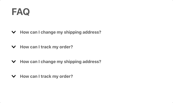
Check this example
Configuration
Step 1 - Adding the Disclosure Layout app to your theme dependencies
In the manifest.json file of your theme, add the Disclosure Layout app as a dependency:
_10+ "vtex.disclosure-layout": "1.x"
Now, you can use all the blocks exported by the disclosure-layout app. See the full list below:
| Block name | Description |
|---|
disclosure-layout | Parent block that enables you to build the disclosure layout using its three children blocks: disclosure-trigger, disclosure-content, and disclosure-state-indicator. |
disclosure-trigger | Declares the blocks that will be rendered as disclosure triggers, i.e., the blocks that, when clicked, will open or close the disclosure content (defined by the disclosure-content block). |
disclosure-content | Declares the blocks displaying the desired content when the disclosure trigger is clicked. |
disclosure-state-indicator | Optional block that renders the chevron or other UI elements that change when the disclosure is opened or closed. |
disclosure-layout-group | Wraps many disclosure-layouts blocks at once. You can use this block to control when each should be displayed, allowing only one disclosure-layout open at a time. |
disclosure-trigger-group | Wraps many disclosure-trigger blocks at once. You can use this block to control when and how the disclosure-layouts blocks declared inside the disclosure-layout-group should be displayed. |
Step 2 - Adding the Disclosure Layout blocks to your theme templates
Copy one of the examples below and paste it into your desired theme template, changing as necessary. If needed, add the disclosure-layout block to the block list of the template.
_21 "disclosure-layout#simple": {
_21 "children": ["disclosure-trigger#simple", "disclosure-content#simple"]
_21 "disclosure-trigger#simple": {
_21 "children": ["rich-text#question"]
_21 "disclosure-content#simple": {
_21 "children": ["rich-text#answer"]
_21 "rich-text#question": {
_21 "text": "How can I change my shipping address?"
_21 "rich-text#answer": {
_21 "text": "Call us at (212) 123-1234"
- Example using the
disclosure-layout-group block:
_45 "disclosure-layout-group#group": {
_45 "children": ["disclosure-layout#first", "disclosure-layout#second"]
_45 "disclosure-layout#first": {
_45 "children": ["disclosure-trigger#first", "disclosure-content#first"]
_45 "disclosure-trigger#first": {
_45 "children": ["rich-text#question1"]
_45 "disclosure-content#first": {
_45 "children": ["rich-text#answer1"]
_45 "rich-text#question1": {
_45 "text": "How can I change my shipping address?"
_45 "rich-text#answer1": {
_45 "text": "Call us at (212) 123-1234."
_45 "disclosure-layout#second": {
_45 "children": ["disclosure-trigger#first", "disclosure-content#first"]
_45 "disclosure-trigger#second": {
_45 "children": ["rich-text#question1"]
_45 "disclosure-content#second": {
_45 "children": ["rich-text#answer1"]
_45 "rich-text#question2": {
_45 "text": "How can I track my order?"
_45 "rich-text#answer2": {
_45 "text": "After logging in to your account, you can find this information in the Orders link."
- Example using the
disclosure-state-indicator block:
_10 "disclosure-state-indicator": {
_10 "Show": "icon-angle--down",
_10 "Hide": "icon-angle--up"
disclosure-layout props
| Prop name | Type | Description | Default value |
|---|
initialVisibility | enum | Defines the initial visibility of the layout content. Possible values are: visible (content initially open) or hidden (content is only displayed with user interaction). | hidden |
animated | boolean | Defines if the layout content should have animations. When set as true, this prop will enable additional data-\* attributes on the content, which you can use as selectors in CSS. It will also ensure that the element will be hidden once the transition has ended. | false |
disclosure-trigger props
| Prop name | Type | Description | Default value |
|---|
Show | block | Name of the block that will be rendered when prompted to show the content. | undefined |
Hide | block | Name of the block that will be rendered when prompted to hide the content. | undefined |
as | string | HTML tag to be applied to the component when rendered on the UI. | button |
children | block | Name of the block that will be rendered if no blocks are declared in the Show or Hide props. | undefined |
blockClass | string | Block ID defined by you that will be used in CSS customizations. | undefined |
disclosure-content props
| Prop name | Type | Description | Default value |
|---|
blockClass | string | Block ID defined by you that will be used in CSS customizations. | undefined |
children | [block] | List of blocks that will render the desired disclosure content. | undefined |
disclosure-state-indicator props
| Prop name | Type | Description | Default value |
|---|
Show | block | Name of the block that will be rendered when prompted to show the content. | undefined |
Hide | block | Name of the block that will be rendered when prompted to hide the content. | undefined |
disclosure-layout-group props
| Prop name | Type | Description | Default value |
|---|
maxVisible | enum | Defines how many disclosure-layout blocks should be displayed at a time. Possible values are: one (only one disclosure-layout block should have its content displayed at time) or many (different disclosure-layout block content can be displayed at time). | one |
disclosure-trigger-group props
| Prop name | Type | Description | Default value |
|---|
Show | block | Name of the block that will be rendered when prompted to show the content. | undefined |
Hide | block | Name of the block that will be rendered when prompted to hide the content. | undefined |
as | string | HTML tag to be applied to the component when rendered on the UI. | button |
children | block | Name of the block that will be rendered if no blocks are declared in the Show or Hide props. | undefined |
blockClass | string | Block ID defined by you that will be used in CSS customizations. | undefined |
Customization
To apply CSS customizations in this and other blocks, follow the instructions given in the recipe on Using CSS handles for store customization.
| CSS handles |
|---|
content |
content--visible |
content--hidden |
trigger |
trigger--visible |
trigger--hidden |
triggerGroup |
triggerGroup--visible |
triggerGroup--hidden |