The Store Form app provides blocks responsible for displaying a user form connected to Master Data through a JSON schema.
Configuration
Before configuring the Store Form block in your theme, make sure you have already configured a JSON schema in Master Data. Otherwise, the customer form will not be saved appropriately. To learn more, please refer to Creating forms for your store users.
-
Add the
store-formapp to your theme dependencies in themanifest.json. For example:_10"dependencies": {_10"vtex.store-form": "0.x"_10}
Now, you can use all blocks exported by the store-form app. See the full list below:
| Block name | Description |
|---|---|
form |  |
form-input.checkbox | Renders a checkbox field in the form. |
form-input.dropdown | Renders a dropdown field in the form. |
form-input.radiogroup | Renders a radio button field in the form. |
form-input.textarea | Renders a big text field in the form. |
form-input.text | Renders a small text field in the form with few available characters. |
form-field-group | Renders different form blocks (such as form-input.radiogroup and form-input.text) based on the schema's sub-property type. |
form-input.upload | Renders an Upload field in the form. |
form-submit | Renders a button to submit the user form content. |
form-success | Accepts an array of blocks rendered when the form is successfully submitted. Any children block is valid. |
-
In any desired store template, such as the
store.product, add theformblock. In the example below, the form block is contained in a Flex Layout row:_13{_13"store.product": {_13"children": [_13"flex-layout.row#product-breadcrumb",_13"flex-layout.row#product-main"_13"flex-layout.row#form",_13"shelf.relatedProducts",_13"product-reviews",_13"product-questions-and-answers"_13]_13},_13..._13} -
Then, declare the
formblock. Remember to specify whichentityandschemafrom Master Data should be fetched to build the block.
_18{_18 "flex-layout.row#form": {_18 "children": [_18 "flex-layout.col#form"_18 ]_18 },_18 "flex-layout.col#form": {_18 "children": [_18 "form"_18 ]_18 },_18 "form": {_18 "props": {_18 "entity": "clients",_18 "schema": "person"_18 }_18 }_18}
If the
formblock does not have any children configured, a default form will be rendered automatically based on the JSON schema in Master Data. This reading and interpretation of JSON schemas is facilitated by the Reacht Hook Form JSON Schema library, which supports the Store Form blocks logic behind the scenes.
| Prop name | Type | Description | Default value |
|---|---|---|---|
entity | string | | undefined |
schema | string | | undefined |
- If desired, complete the
formblock by adding and configuring an array of children blocks. You can use the blocks listed in the first table stated above. For example:
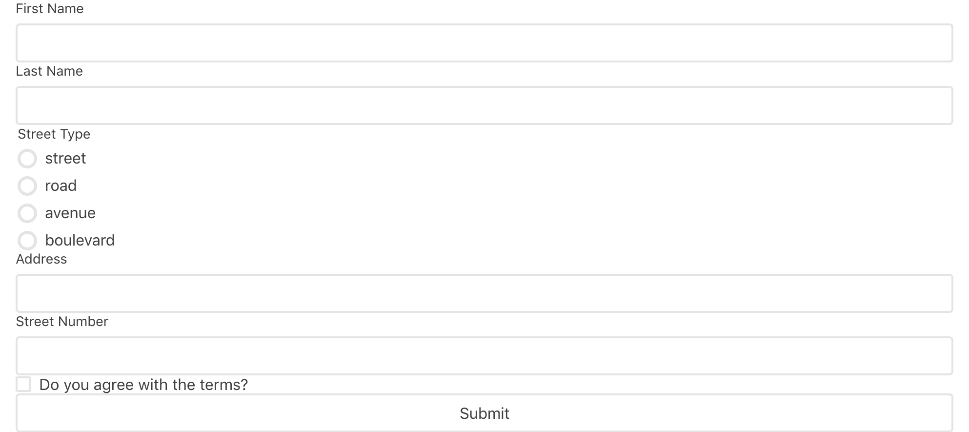
_53 "form": {_53 "props": {_53 "entity": "clients",_53 "schema": "person"_53 },_53 "children": [_53 "rich-text#formTitle",_53 "form-input.text#firstName",_53 "form-input.text#lastName",_53 "form-field-group#address",_53 "form-input.checkbox#agreement",_53 "form-submit"_53 ],_53 "blocks": ["form-success"]_53 },_53 "form-success": {_53 "children": [_53 "rich-text#successSubmit"_53 ]_53 },_53 "rich-text#successSubmit": {_53 "props": {_53 "text": "Succesfully submitted the data!",_53 "textAlignment": "CENTER",_53 "textPosition": "CENTER"_53 }_53 },_53 "form-input.text#firstName": {_53 "props": {_53 "pointer": "#/properties/firstName"_53 }_53 },_53 "form-input.text#lastName": {_53 "props": {_53 "pointer": "#/properties/lastName"_53 }_53 },_53 "form-input.checkbox#agreement": {_53 "props": {_53 "pointer": "#/properties/agreement",_53 "label": "Do you agree that this is the best form component in the whole wide world?"_53 }_53 },_53 "form-field-group#address": {_53 "props": {_53 "pointer": "#/properties/address"_53 }_53 },_53 "form-submit": {_53 "props": {_53 "label": "Submit"_53 }_53 }
form-input.radiogroup, form-input.dropdown, form-input.textarea and form-input.checkbox props
| Prop name | Type | Description | Default value |
|---|---|---|---|
pointer | string | | undefined |
label | string | | Property title |
form-input.textarea props
| Prop name | Type | Description | Default value |
|---|---|---|---|
placeholder | string | Placeholder for the text area input. | undefined |
form-input.text props
| Prop name | Type | Description | Default Value |
|---|---|---|---|
pointer | string | #/properties/firstName) for validating form block inputs. | undefined |
inputType | enum | Defines the type of the text field. Possible values are: input - renders a regular text field; hidden - renders a hidden text field used for pre-defining an editable value to be submitted to the form; password - renders a password text field. | input |
value (optional) | string | Displays a pre-defined text to be submitted when the inputType is set as hidden. | undefined |
label | string | | Property's title |
placeholder | string | Placeholder for the text input. | undefined |
form-field-group props
| Prop name | Type | Description | Default value |
|---|---|---|---|
pointer | string | form-field-group block, the path must not include a schema sub-property, only a schema property. | undefined |
uiSchema | object | Redefines how the form-field-groups block should render each sub-property declared in the JSON schema path defined in pointer. As previously mentioned, the form-field-groups already handle this functionality on their own. However, you have the option to override the sub-property types using a schema and redefine how each form block will be rendered. | undefined |
form-input.upload props
| Prop name | Type | Description | Default value |
|---|---|---|---|
pointer | string | form-field-group block, the path must not include a schema's sub-property, only a schema's property. | undefined |
accept | string |  *.TYPEFILE. Learn more about the accept field. |
uiSchemaobject:
_10const UISchema = {_10 type: UIType,_10 properties: {_10 // Note that the definition is recursive_10 childName: { UISchema },_10 childName: { UISchema },_10 // ..._10 childName: { UISchema },_10 },_10};
Where childName should be replaced for the desired sub-property name and the UIType should be replaced for one of the following values:
default: Will consider theform-field-groupown logic (e.g. using the React Hook Form JSON Schema library) for block rendering;radio: The sub-property will be rendered as aform-input.radiogroupblock.select: The sub-property will be rendered as aform-input.dropdownblock.input: The sub-property will be rendered as aform-input.textblock withinputTypeset toinput.hidden: The sub-property will be rendered as aform-input.textblock withinputTypeset tohidden.password: The sub-property will be rendered as aform-input.textblock withinputTypeset topassword.textArea: The sub-property will be rendered as aform-input.textareablock.checkbox: The sub-property will be rendered as aform-input.checkboxblock.upload: The sub-property will be rendered as aform-input.uploadblock.
App Behavior
The JSON schema created in Master Data is responsible for informing the form blocks about the data they should receive. It specifies the type of input expected for each form field from users.
When the user clicks the Submit button, the form blocks retrieve all input data and send it to the Schema validation. This process, which involves understanding the expected input and sending it to Master Data, is facilitated by the React Hook Form JSON schema library working behind the scenes.
If any unexpected answer is detected, and the form blocks does not match the Schema, Master Data will be unable to create a user form, and an error message will be returned to the user.
Customization
In order to apply CSS customizations to this and other blocks, follow the instructions in Using CSS handles for store customizations.
| CSS handles |
|---|
form |
formLoading |
formErrorLoading |
formSubmitContainer |
formSubmitButton |
formErrorServer |
formErrorUserInput |