Creating a Quickview using Modal Layout
Learn how to create a Quickview feature using the Modal Layout app.
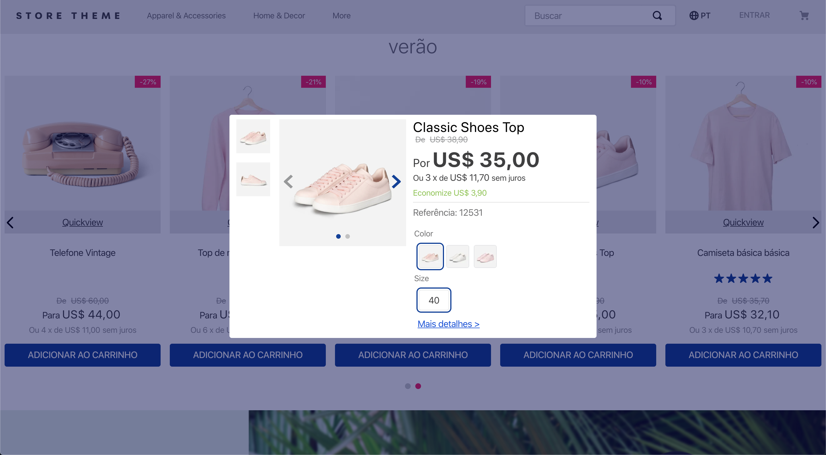
In this guide, you'll learn how to configure a Quickview feature in your store using the Modal Layout app. The Quickview allows users to view product details directly from the homepage or category pages without navigating to the product detail page.
This guide is based on the Store Theme template, a boilerplate with pre-set configurations for creating a store using Store Framework. Learn more in Available templates.
Instructions
Step 1 - Adding the Modal Layout app to the theme's dependencies
-
In a development workspace, open your Store Theme app using the code editor of your choice.
-
Open the
manifest.jsonfile and add the Modal Layout app to your theme dependencies.
Step 2 - Configuring the quickview trigger
To enable the Quickview feature, define the trigger for the modal. The modal-trigger#quickview block activates the modal when the user interacts with the associated element (for example, a button). This block links the modal trigger to the modal-layout#quickview, which contains the modal layout.
- Open the
quickview.jsoncfile located in thestore/blocks/product-summaryfolder. - Add the
modal-trigger#quickviewblock to trigger the Quickview modal. In this example, we're usingicon-expandto represent the trigger.
- Add the
modal-layout#quickviewas a child of themodal-trigger#quickviewblock. This defines the modal layout.
Note that the children property specifies the elements inside the trigger block. In this case, it includes icon-expand, which represents the visual element that users interact with to open the modal, and modal-layout#quickview, which defines the modal layout displayed when the trigger is activated. The props section includes blockClass, a custom CSS class (Quickview) that allows you to style both the modal trigger and the modal itself.
Step 3 - Customizing the Quickview modal
To customize the Quickview, you can combine Modal Layout's native blocks, such as modal-header, modal-content, and modal-actions, with other native components to structure and display the modal content. The inner content may include elements such as product images, name, price, SKU selector, and actions like adding the product to the cart or viewing more details.
For example, you can use Flex Layout to define the rows and columns within your modal and leverage Product Summary blocks to render product information. Learn more in the guides available under Using components.
Check the quickview.json for a complete example and consult the Modal Layout documentation for further information on configuring and customizing your modal.
Step 4 - Making your changes publicly available
After testing your component, deploy the new version of your Store Theme app to make it publicly available. Follow the instructions in the guide Deploying a new app version.