Documentation
Feedback
Guides
Storefront Development

Storefront Development
FastStoreUsing themes
Importing FastStore UI component styles
If you are using a FastStore UI component and want to apply its styles to your FastStore project, follow the steps below.
There are two different scenarios on how to import FastStore UI component styles:
  • Overriding a component: For this use case, we will override the ProductTitle component within the ProductDetails section.
  • Creating a new section: For this use case, we will create a new section in the CMS called OurStore.

Before you begin

Ensure you have a basic understanding of overrides

Refer to the Overriding components and props and Creating a new section guides for more information. In this guide, we will use the ProductTitle component and OurStores section.

Using CSS modules

We recommend using CSS Modules to style your new component.

Importing styles when overriding a component

For this scenario, we will use as an example the override of the ProductTitle component within the ProductDetails section.
  1. Open your FastStore project, navigate to the components folder, and create the customProductTitle.module.scss file. This file is responsible for importing the FastStore UI component style.
  2. Add the following code to the customProductTitle.module.scss file.
    "customProductTitle.module.scss"

    _10
    .customProductTitle {
    _10
    @import '@faststore/ui/src/components/molecules/Tag/styles.scss';
    _10
    }

This code imports the Tag styles to the custom component that you are creating.
  1. Import the styles in the CustomProductTitle.tsx file and add a className to the section
    CustomProductTitle.tsx

    _14
    import React from 'react'
    _14
    import { ProductTitle, Tag } from '@faststore/ui'
    _14
    _14
    _14
    import styles from './customProductTitle.module.scss'
    _14
    _14
    export default function CustomProductTitle() {
    _14
    return (
    _14
    <section className={styles.customProductTitle}>
    _14
    <ProductTitle title={<h1>New headphones</h1>} />
    _14
    <Tag variant="warning" label="On sale" onClose={() => {}} />
    _14
    </section>
    _14
    )
    _14
    }

  2. Run yarn dev in the terminal and open the local development server to see the changes. You should see a result similar to the image below:
    {"base64":"  ","img":{"width":1316,"height":764,"type":"png","mime":"image/png","wUnits":"px","hUnits":"px","length":239727,"url":"https://vtexhelp.vtexassets.com/assets/docs/src/importing-styles___6de1d121d0acc88b4545d04955c3eb89.png"}}

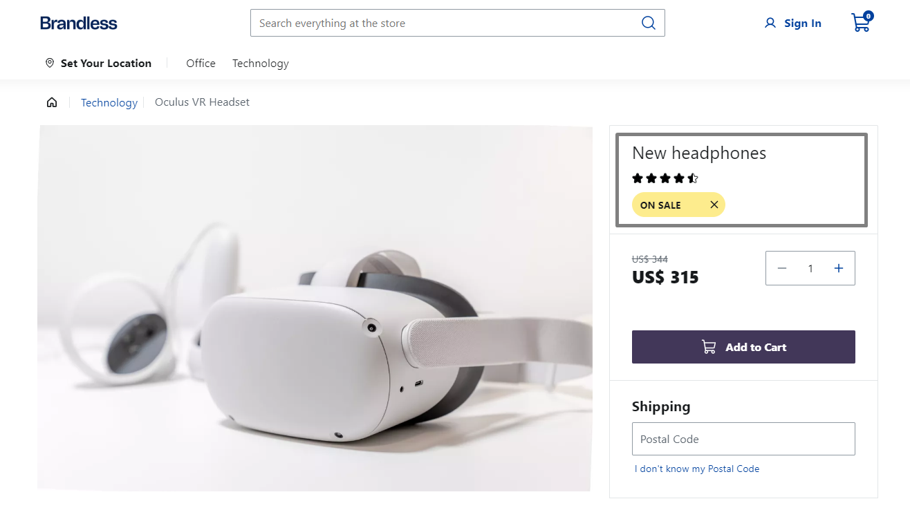
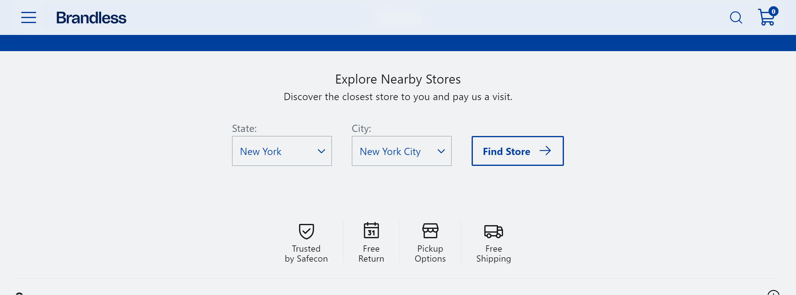
Importing styles when creating a new section

To follow this guide, we recommend creating the OurStores section, which we will use as an example.
With the section on the page, add some styles to it by opening the components folder and creating the ourStores.module.scss file. This file will import the FastStore UI components styles. Add the following code to the ourStores.module.scss file:
"src/components/ourStores.module.scss"

_10
.ourStores {
_10
@import '@faststore/ui/src/components/atoms/Button/styles.scss';
_10
@import '@faststore/ui/src/components/atoms/Select/styles.scss';
_10
@import '@faststore/ui/src/components/molecules/SelectField/styles.scss';
_10
}

This code imports the Button and SelectField styles to the custom component that you are creating. You also need to import the Select component styles since SelectField inherits them.
  1. Now, import this stylesheet to OurStores.tsx file and apply it.
    "src/components/OurStores.tsx"

    _47
    import React from 'react'
    _47
    import { Button, Icon, SelectField } from '@faststore/ui'
    _47
    _47
    import styles from './ourStores.module.scss'
    _47
    _47
    export interface OurStoresProps {
    _47
    title: string
    _47
    description: string
    _47
    }
    _47
    _47
    export default function OurStores(props: OurStoresProps) {
    _47
    return (
    _47
    <section className={styles.ourStores}>
    _47
    <h2>{props.title}</h2>
    _47
    <p>{props.description}</p>
    _47
    <div>
    _47
    <SelectField
    _47
    id="select-state-store"
    _47
    label="State:"
    _47
    options={{
    _47
    newYork: 'New York',
    _47
    arizona: 'Arizona',
    _47
    massachusetts: 'Massachusetts',
    _47
    hawaii: 'Hawaii',
    _47
    }}
    _47
    />
    _47
    <SelectField
    _47
    id="select-city-store"
    _47
    label="City:"
    _47
    options={{
    _47
    newYorkCity: 'New York City',
    _47
    phoenix: 'Phoenix',
    _47
    boston: 'Boston',
    _47
    honolulu: 'Honolulu',
    _47
    }}
    _47
    />
    _47
    <Button
    _47
    variant="secondary"
    _47
    icon={<Icon name="ArrowRight" />}
    _47
    iconPosition="right"
    _47
    >
    _47
    Find Store
    _47
    </Button>
    _47
    </div>
    _47
    </section>
    _47
    )
    _47
    }

You should be able to see something like the following:
{"base64":"  ","img":{"width":2552,"height":946,"type":"png","mime":"image/png","wUnits":"px","hUnits":"px","length":135138,"url":"https://vtexhelp.vtexassets.com/assets/docs/src/without-styles___4680d2a9a67e4175f3b73eff036ca8ac.png"}}
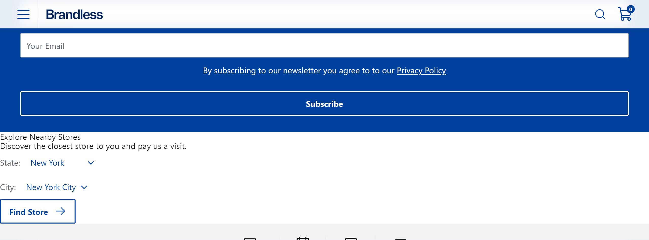
  1. Let's add more styles to it. You can customize it using the design tokens and component's data attributes.
    "src/components/ourStores.module.scss"

    _42
    .ourStores {
    _42
    @import '@faststore/ui/src/components/atoms/Button/styles.scss';
    _42
    @import '@faststore/ui/src/components/atoms/Select/styles.scss';
    _42
    @import '@faststore/ui/src/components/molecules/SelectField/styles.scss';
    _42
    _42
    width: 100%;
    _42
    display: flex;
    _42
    flex-direction: column;
    _42
    justify-content: center;
    _42
    align-items: center;
    _42
    padding: var(--fs-spacing-5);
    _42
    margin: auto;
    _42
    background-color: var(--fs-color-neutral-bkg);
    _42
    _42
    [data-fs-select-field] {
    _42
    flex-direction: column;
    _42
    align-items: flex-start;
    _42
    _42
    [data-fs-select] {
    _42
    border: var(--fs-border-width) solid var(--fs-border-color);
    _42
    margin-top: var(--fs-spacing-0);
    _42
    width: 10rem;
    _42
    height: var(--fs-control-min-height);
    _42
    _42
    select {
    _42
    width: 100%;
    _42
    }
    _42
    }
    _42
    }
    _42
    }
    _42
    _42
    .ourStores__title {
    _42
    font-size: var(--fs-text-size-title-section);
    _42
    margin-bottom: var(--fs-spacing-1);
    _42
    }
    _42
    _42
    .ourStores__content {
    _42
    display: flex;
    _42
    align-items: flex-end;
    _42
    column-gap: var(--fs-spacing-5);
    _42
    margin: var(--fs-spacing-5);
    _42
    }

    "src/components/OurStores.tsx"

    _47
    import React from 'react'
    _47
    import { Button, Icon, SelectField } from '@faststore/ui'
    _47
    _47
    import styles from './ourStores.module.scss'
    _47
    _47
    export interface OurStoresProps {
    _47
    title: string
    _47
    description: string
    _47
    }
    _47
    _47
    export default function OurStores(props: OurStoresProps) {
    _47
    return (
    _47
    <section className={styles.ourStores}>
    _47
    <h2 className={styles.ourStores__title}>{props.title}</h2>
    _47
    <p>{props.description}</p>
    _47
    <div className={styles.ourStores__content}>
    _47
    <SelectField
    _47
    id="select-state-store"
    _47
    label="State:"
    _47
    options={{
    _47
    newYork: 'New York',
    _47
    arizona: 'Arizona',
    _47
    massachusetts: 'Massachusetts',
    _47
    hawaii: 'Hawaii',
    _47
    }}
    _47
    />
    _47
    <SelectField
    _47
    id="select-city-store"
    _47
    label="City:"
    _47
    options={{
    _47
    newYorkCity: 'New York City',
    _47
    phoenix: 'Phoenix',
    _47
    boston: 'Boston',
    _47
    honolulu: 'Honolulu',
    _47
    }}
    _47
    />
    _47
    <Button
    _47
    variant="secondary"
    _47
    icon={<Icon name="ArrowRight" />}
    _47
    iconPosition="right"
    _47
    >
    _47
    Find Store
    _47
    </Button>
    _47
    </div>
    _47
    </section>
    _47
    )
    _47
    }

After applying these additional styles, you should be able to see this final look:
{"base64":"  ","img":{"width":2552,"height":946,"type":"png","mime":"image/png","wUnits":"px","hUnits":"px","length":129326,"url":"https://vtexhelp.vtexassets.com/assets/docs/src/with-styles___4b1cd40d4dcbbba544fd051b1f2dcb36.png"}}
Contributors
1
Photo of the contributor
+ 1 contributors
Was this helpful?
Yes
No
Suggest edits (Github)
Contributors
1
Photo of the contributor
+ 1 contributors
On this page