Adding more icon options to the Alert component
This guide illustrates a common use case for
getOverriddenSection in FastStore. It focuses on customizing the Headless CMS schema for a section to provide more icon options.For detailed instructions on overriding components, refer to Overriding native component’s props and Overriding a native component.
Context
- The native Alert section provides the following icon options by default:
| Alert default icon name | Icon |
|---|---|
Bell | Bell |
BellRinging | BellRinging |
Checked | Checked |
Info | Info |
Truck | Truck |
User | User |
- You want to allow Headless CMS editors to select in the Alert section from a wider range of icons supported by the
@faststore/uiiconography library.
Implementation
Overriding the Alert section
By leveraging
getOverriddenSection, you can customize the Alert section's Headless CMS schema to offer additional icon options. Follow the steps below:-
In the
src/components/sectionsfolder, create the folderCustomIconsAlertfolder. -
In the
CustomIconsAlertfolder, create theCustomIconsAlert.tsxfile. -
Import the following to the
CustomIconsAlert.tsxfile:_10import { getOverriddenSection } from '@faststore/core' -
Define the
CustomIconsAlertcomponent:_10import { AlertSection, getOverriddenSection } from '@faststore/core'_10_10const CustomIconsAlert = getOverriddenSection({_10Section: AlertSection,_10})_10_10export default CustomIconsAlert-
This is an Alert component override with custom icon options in the Headless CMS. The component is defined using
getOverriddenSection. -
This code changes only the schema to include more options for native Icons supported by
@faststore/ui. -
The override options specify the
Sectionto be overridden (Alert).
For further details on code implementation, see theCustomIconsAlertfolder available in the playground.store repository. -
Synchronizing the changes with the Headless CMS
Add the section to the Headless CMS by following the instructions available in syncing components to the Headless CMS.
The following schema was used as an example in
cms/faststore/sections.json:
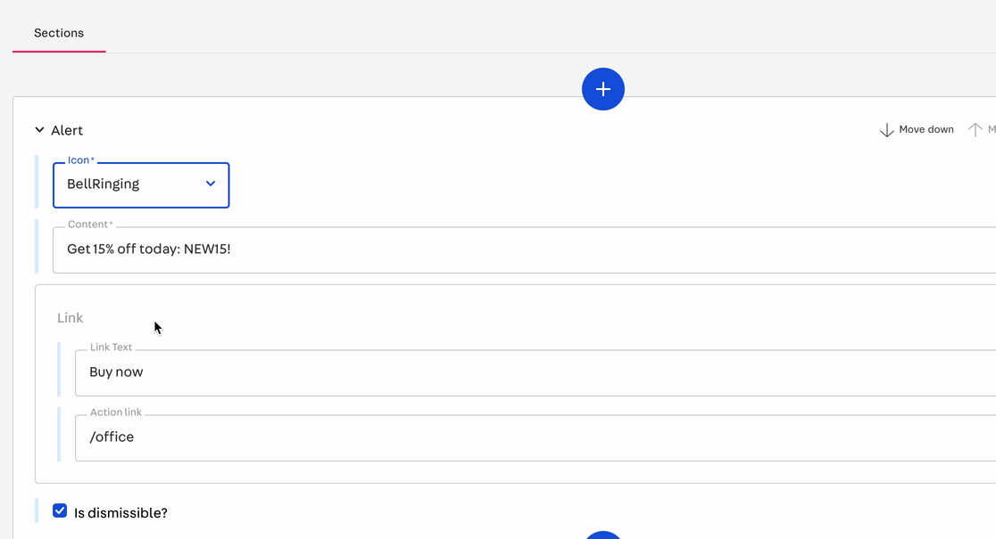
_45[_45 {_45 "name": "CustomIconsAlert",_45 "schema": {_45 "title": "Alert with more Icon options",_45 "description": "Add an alert that has more Icon options",_45 "type": "object",_45 "required": ["icon", "content", "dismissible"],_45 "properties": {_45 "icon": {_45 "type": "string",_45 "title": "Icon",_45 "enumNames": [_45 "Bell",_45 "BellRinging",_45 "Checked",_45 "Info",_45 "Truck",_45 "User",_45 "Plus",_45 "PlusCircle",_45 "Ruler",_45 "Star",_45 "Storefront",_45 "Twitter"_45 ],_45 "enum": [_45 "Bell",_45 "BellRinging",_45 "Checked",_45 "Info",_45 "Truck",_45 "User",_45 "Plus",_45 "PlusCircle",_45 "Ruler",_45 "Star",_45 "Storefront",_45 "Twitter"_45 ]_45 }_45 }_45 }_45 }_45]
For further details on code implementation, see thesections.jsonfile available in the playground.store repository.
Results
Once you have set your development mode to see the changes locally, you can see the new Alert icon. Below, you can check an example storefront before and after the instructions in this guide:
-
BeforeThe native Alert displays one of the default icons,
BellRinging, alongside the textGet 15% off today: NEW15! Buy now.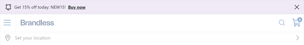
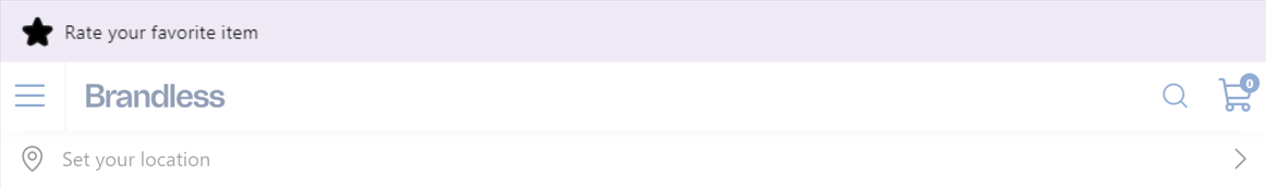
-
AfterThe native Alert was replaced with the custom one, which brings a new icon,
Star, from the@faststore/uiiconography library, alongside the textRate your favorite item.