Overriding native component's props
Overriding props allows you to customize a component's behavior while preserving its native integration. This approach is useful when you want to customize specific aspects of a native component, for example, an icon or a button label.
For this guide, we'll use the Buy Button component to make the customization.
Here's how the initial component looks with the
size prop set as regular in the Product Details Page (PDP):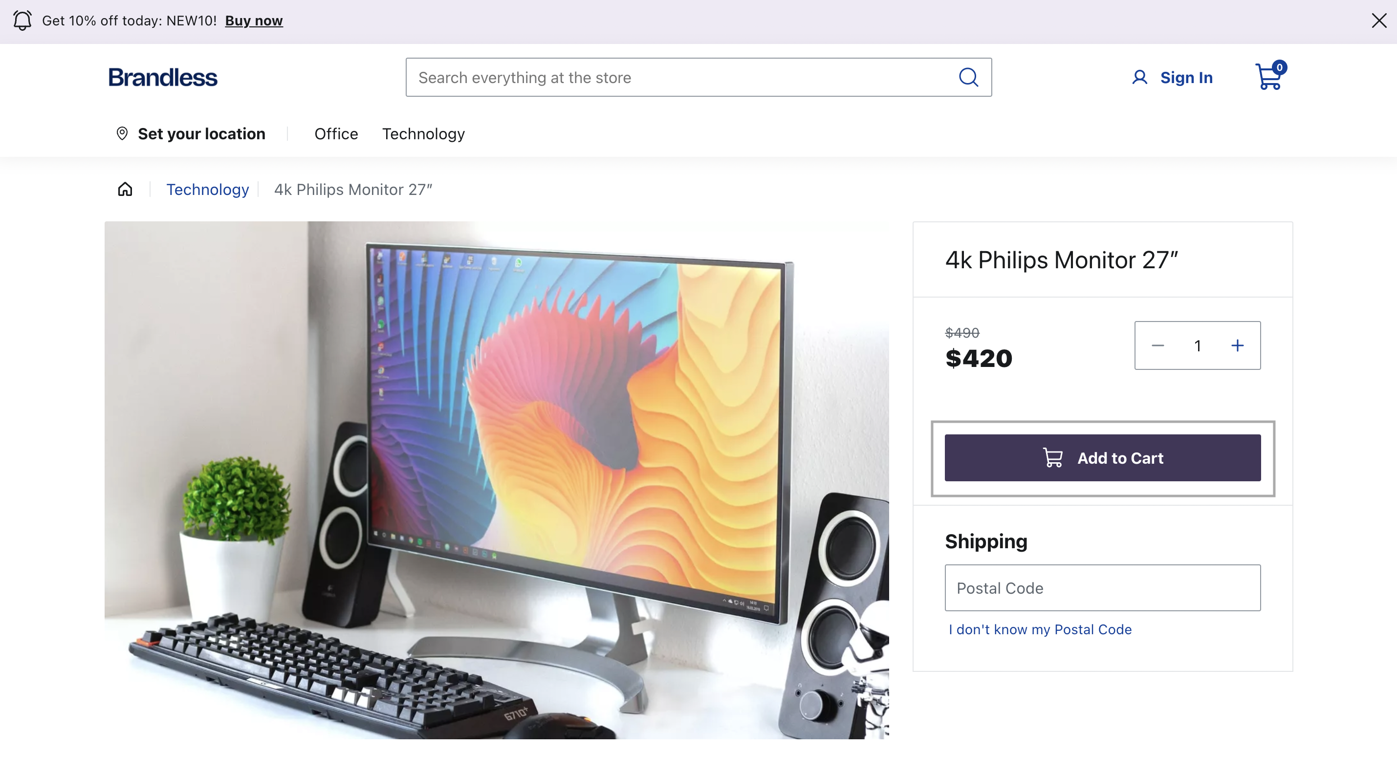
Before you begin
Make sure your
@faststore/core package has the 3.x version or above. If you need to update
it, refer to this release note.Instructions
Step 1 - Setting up the component file
-
After choosing a native section to be customized from the list of available native sections, open your FastStore project in any code editor of your preference.
-
Create a new branch to work with the custom component you will create.
-
Go to the
srcfolder, create thecomponentsfolder, and inside it, create thesectionsfolder. You can run the following command to create them:The naming of thesectionsfolder is arbitrary, as overrides can be created in any file since the import is made in thesrc/components/index.tsxfile.macOS and LinuxWindowsbash copy mkdir src/components src/components/sections -
In the
sectionsfolder, create a new file for your customized section. For example, create a new file namedProductDetailsWithCustomButton.tsxunder thesrc/components/sectionsdirectory.macOS and LinuxWindowsbash copy touch src/components/sections/ProductDetailsWithCustomButton.tsx -
Copy and paste the following code snippet into the file:Change the value of the
Sectionvariable to the section you wish to override. In the given example, we set theSectionvariable to the componentProductDetailsSectionto override this specific section. -
Save your changes.
Step 2 - Setting up the override
-
Open the
ProductDetailsWithCustomButton.tsxfile created in the Step 1 - Setting up the component file and add the following code: -
In the
componentsfolder, create theindex.tsxfile and add the following. This code overrides theBuyButtonpropssizeandiconPosition. -
Open the terminal, and run
yarn devto sync the new custom component to your store preview. -
Open the localhost available after running
yarn dev. You'll see a smaller button than the initial one, and the cart icon positioned on the right side.
Step 3 - Publishing your changes
If your changes are working locally and you want to publish them in production, follow the steps below:
- Publish your branch with the custom components files.
- Open a pull request in the store's GitHub repository.
- Review the pull request
- Merge the changes from this branch to the
mainone and the new component will be available in the live store.