Adding an image to the Alert component
This guide illustrates an advanced use case for
getOverriddenSection in FastStore. It focuses on customizing the Alert section's icon to display a custom image as an icon instead.For detailed instructions on overriding components, refer to Overriding native component’s props and Overriding a native component.
Context
- The native Alert section provides an
iconprop for customization. It only accepts predefined icons, but you want more control and flexibility over the displayed content. - You want to display a custom image as the icon alongside the text in your alert messages.
Implementation
By leveraging
getOverriddenSection, you can create a custom component called AlertWithImage that achieves the desired functionality. Follow the steps below:-
In the
src/components/sectionsfolder, create the folderAlertWithImagefolder. -
In the
AlertWithImagefolder, create theAlertWithImage.tsxfile. -
Import the following to the
AlertWithImage.tsxfile:_10import { getOverriddenSection } from "@faststore/core";_10import Image from "next/image";_10import { useMemo } from "react"; -
Define the
AlertWithImagePropsinterface:_10import { getOverriddenSection } from "@faststore/core";_10import Image from "next/image";_10import { useMemo } from "react";_10_10interface AlertWithImageProps_10extends Omit<React.ComponentProps<typeof AlertSection>, "icon"> {_10src: string;_10alt: string;_10}- This interface defines the props accepted by the
AlertWithImagecomponent. - It inherits all props from the native Alert component, excluding the icon prop, which we intend to replace with an image.
- It adds a new prop named
src, which specifies the image source URL.
- This interface defines the props accepted by the
-
Create the
AlertWithImagecomponent:_36import { useMemo } from "react";_36import { AlertSection, getOverriddenSection } from "@faststore/core";_36import { Image_unstable as Image } from "@faststore/core/experimental";_36_36interface AlertWithImageProps_36extends Omit<React.ComponentProps<typeof AlertSection>, "icon"> {_36src: string;_36alt: string;_36}_36_36export default function AlertWithImage(props: AlertWithImageProps) {_36const { src, alt, ...otherProps } = props;_36_36const OverriddenAlert = useMemo(_36() =>_36getOverriddenSection({_36Section: AlertSection,_36className: styles.alertWithImage,_36components: {_36Icon: {_36Component: () => (_36<Image_36src={props.src}_36alt={props.alt}_36width={24}_36height={24}_36/>_36),_36},_36},_36}),_36[]_36);_36_36return <OverriddenAlert {...otherProps} icon="" />;_36}-
This function receives the
AlertWithImageProps. -
It destructures the
srcprop containing the image source and remaining props using the spread operator (...otherProps). -
The core functionality lies within the
useMemohook.- It defines the
OverriddenAlertconstant usinggetOverriddenSection. - The override options specify:
Section: The section to be overridden (Alert).components: An object containing the override for the Icon component.
- It defines the
-
Inside the Icon override:
Component: A function returning anImagecomponent. This displays the image specified by thesrcprop.widthandheight: Optional props to set the size of the image.
-
The use of
useMemoensures this override is only created once, improving performance. -
The function returns the
OverriddenAlertcomponent, spreading theotherPropsand setting theiconprop tonoop(effectively disabling the default icon behavior).
For further details on code implementation, see theAlertWithImagefolder available in the playground.store repository. -
-
Add the section to the Headless CMS by following the instructions available in syncing components to the Headless CMS.The following schema was used as an example in
cms/faststore/sections.json:_45[_45{_45"name": "AlertWithImage",_45"schema": {_45"title": "Alert with image",_45"description": "Add an Alert that has an Image as an icon",_45"type": "object",_45"required": [_45"src",_45"content",_45"dismissible"_45],_45"properties": {_45"src": {_45"type": "string",_45"title": "Image source",_45"description": "Source of the Alert icon image"_45},_45"content": {_45"type": "string",_45"title": "Content"_45},_45"link": {_45"title": "Link",_45"type": "object",_45"properties": {_45"text": {_45"type": "string",_45"title": "Link Text"_45},_45"to": {_45"type": "string",_45"title": "Action link"_45}_45}_45},_45"dismissible": {_45"type": "boolean",_45"default": false,_45"title": "Is dismissible?"_45}_45}_45}_45}_45]
For further details on code implementation, see thesections.jsonfile available in the playground.store repository.
Results
Once you have set your development mode to see the changes locally, you can see the image as an icon in the alert:
-
BeforeThe native Alert displays one of the default icons, the
BellRinging, following the sentenceGet 15% off today: NEW15! Buy now.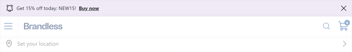
-
AfterThe native Alert was replaced with the custom one, which features a pink image in the form of an icon added through Headless CMS.
