Working with Delivery Promise components
Explore the core components of the Delivery Promise feature in FastStore, their functions, and how they integrate into your store.
This guide explains the components of the Delivery Promise feature for FastStore. You will understand the purpose of each component, how they function, and where they are located in the FastStore architecture. This knowledge will help you effectively implement and customize the Delivery Promise feature in your store.
To learn how to implement Delivery Promise in your store, see the guide Implementing Delivery Promise.
Components
Delivery Promise introduces modular components and hooks organized within the
@faststore/core and @faststore/ui packages.This guide focuses on the core components provided by the
@faststore/core package, which are included by default in FastStore projects. Learn more about the packages in Understanding the project structure.Below are the core components related to the Delivery Promise feature in FastStore.
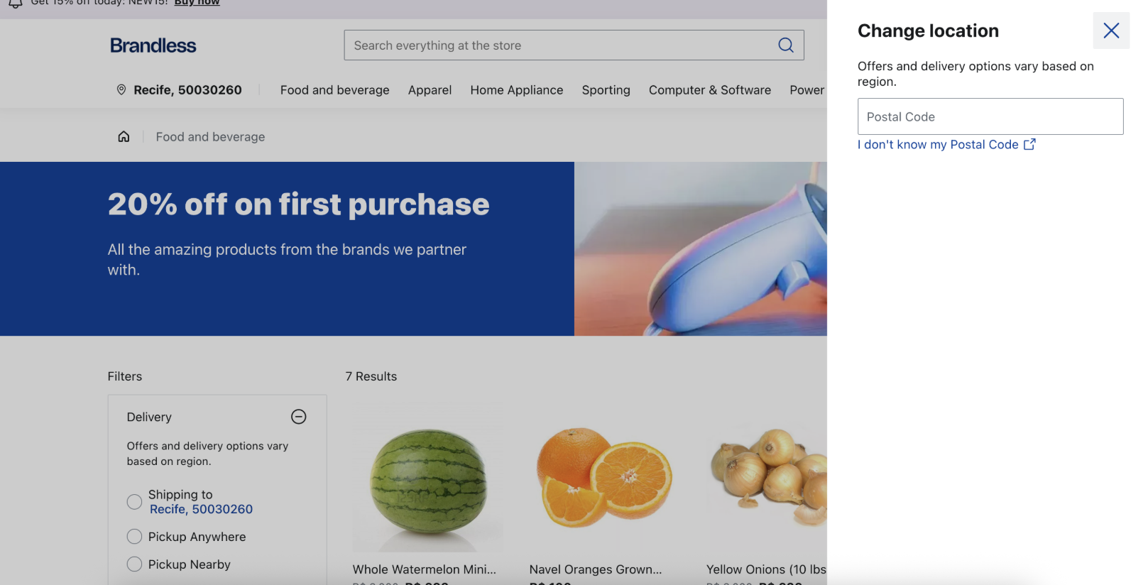
RegionButton
RegionButton is a desktop-only component integrated into the NavBar section, under the Global Sections content type in the Headless CMS.Its behavior is context-dependent. If a shopper doesn’t enter a postal code, a
Popover is displayed, and the button label changes depending on whether a default postal code is set. When a shopper enters a postal code, the button displays the location and suppresses the Popover. Additionally, if a shopper sets their location, the RegionModal component is triggered.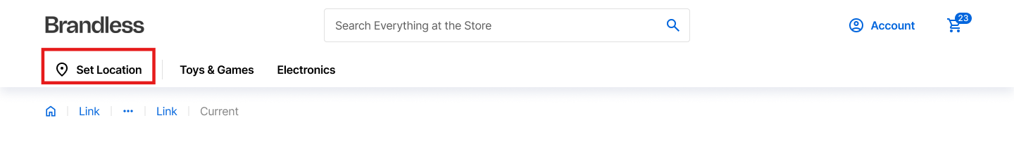
If you have customized the
NavBar, you must also customize the RegionButton component to use Delivery Promise. However, depending on your customization, you may need to implement your own version of RegionButton.This component leverages the following:
RegionModal
RegionModal is a component that serves as a section under the Global Sections content type in the Headless CMS. It contains logic to enforce required location input if specified in the discovery.config.js file, which means the modal can't be closed without providing a location. It checks for valid postal codes and verifies product availability for the given location.
If you have customized the
NavBar, you must also customize the RegionModal component to use Delivery Promise.This component leverages the following:
- UI Components:
RegionModal - Hooks:
useRegion
RegionBar
RegionBar is a mobile-only component that acts as a section under the Global Sections content type in the Headless CMS.Its behavior is context-dependent. If a shopper doesn’t enter a postal code, a
Popover is displayed, and the button label changes depending on whether a default postal code is set. When a shopper enters a postal code, the button displays the location and suppresses the Popover. Additionally, if a shopper sets their location, the RegionModal component is triggered.
Even if you have customized the
NavBar, you can still utilize the native RegionBar component to use Delivery Promise.This component leverages the following:
- UI Components:
RegionBar - Hooks:
useSession
RegionPopover
RegionPopover is a component that serves as a section under the Global Sections content type in the Headless CMS. When a default postal code is set in the discovery.config.js file, the location data (city and postal code) is displayed in a Popover.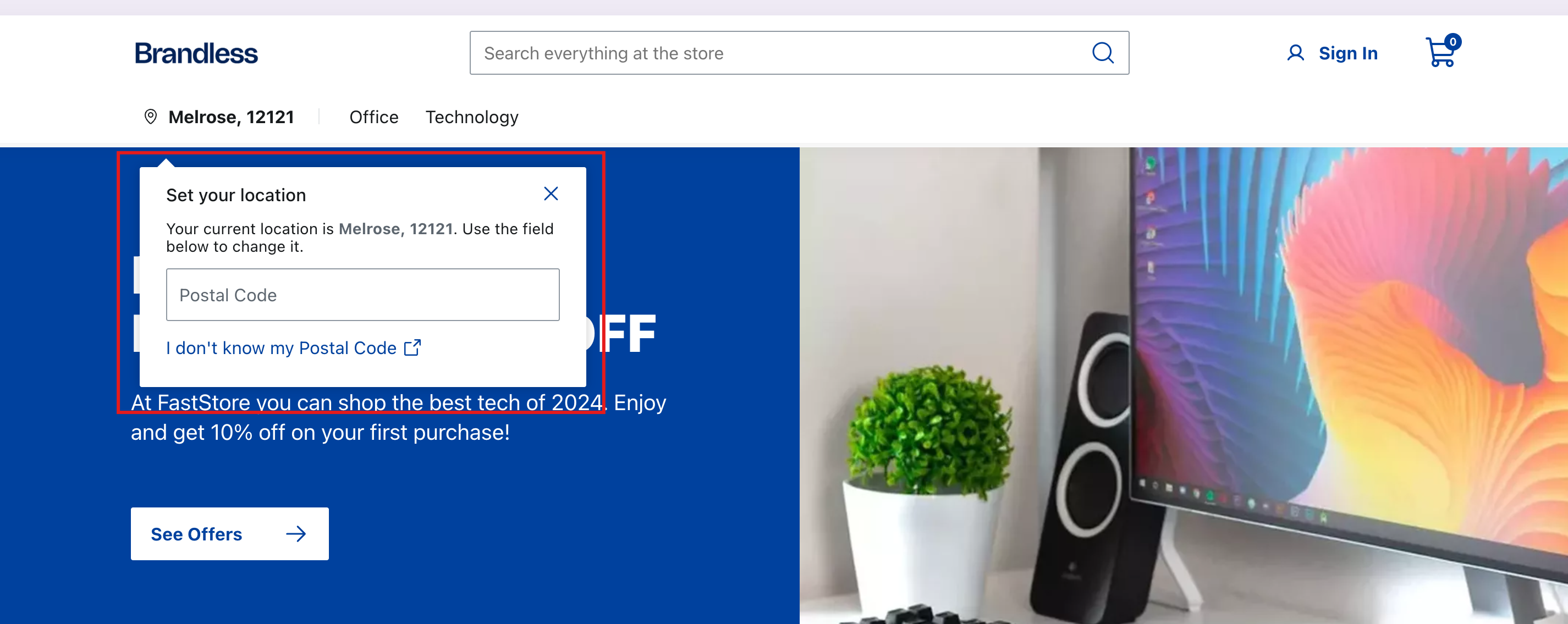
If you have customized
RegionBar or RegionButton, you can still use the native RegionPopover by integrating it into your custom components. However, depending on your customization, you may need to implement your own version of RegionPopover.This component leverages the following:
- UI Components:
Icon,InputField,Link, andPopover. - Hooks:
useSession,useRegion
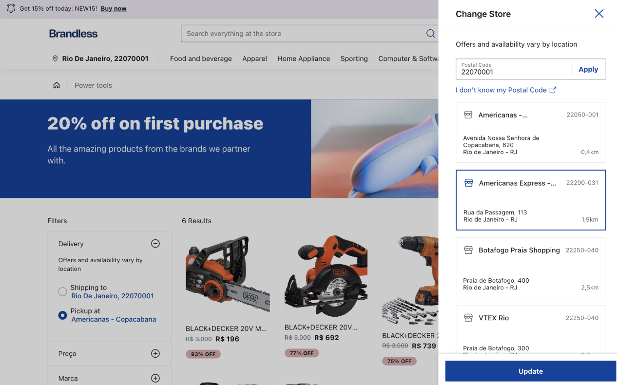
RegionSlider
The
RegionSlider component enables shoppers to manage their delivery-related location settings and pickup point filters in the Product Listing Pages (PLPs) or search pages. This component is implemented as a Global Section, making it available throughout the store on mobile and desktop browsers.It includes three interaction types: Setting a new location (no postal code set), changing an existing location (postal code set), and selecting a pickup point (pickup point filter) for more precise delivery options.
- No postal code set: The user clicks the "Set location" button, then the
RegionSlideropens, allowing them to set a postal code.
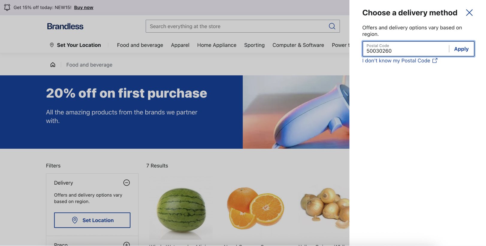
- Postal code set: The user clicks the postal code link, then the
RegionSlideropens, allowing them to change the location.
- Pickup point filter: The user applies or clears filters related to pickup points. When filters are cleared, the
RegionSliderresets its state and removes selected pickup points without closing the component.
This component leverages the following:
- UI Components: SlideOver
- Hooks:
useRegionanduseDeliveryPromise
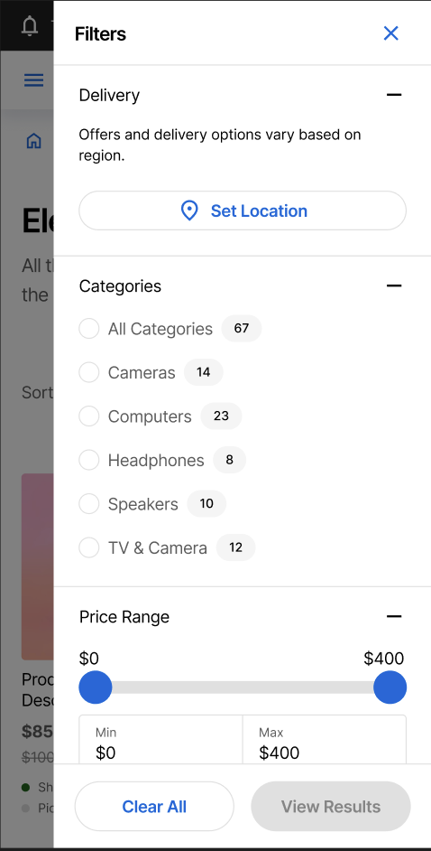
FilterDesktop
FilterDesktop is a desktop-only component integrated into the ProductGallery section, under the Global Sections content type in the Headless CMS. It adds a delivery-based filter option that combines all search and PLP filters.
FilterSlider
FilterSlider is a mobile-only component integrated into the ProductGallery section under the Global Sections content type in the Headless CMS. It adds a delivery-based filter option that combines all search and PLP filters.