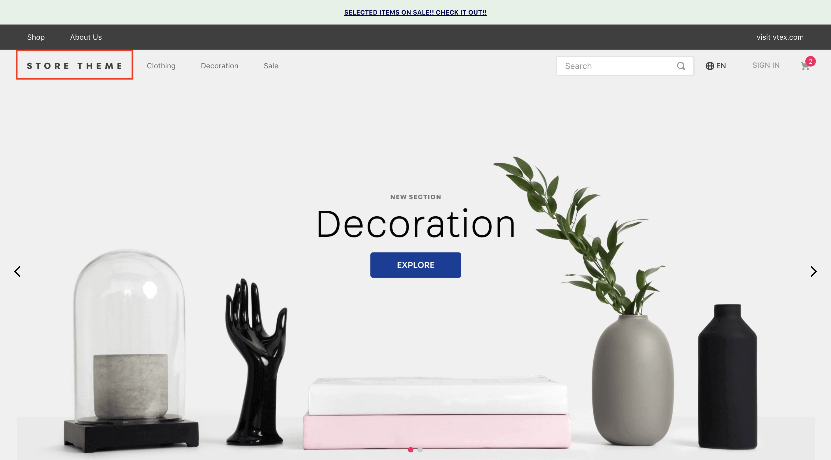
The logo block displays a logo in the store header.

Configuration
- Import the
vtex.store-componentsapp to your theme's dependencies in themanifest.jsonfile as in the following example:
_10 "dependencies": {_10 "vtex.store-components": "3.x"_10 }
- Add the
logoblock into theheadercomponent. For example:
_11 "header.full": {_11 "blocks": [_11 "login",_11 "minicart",_11+ "logo",_11 "search-bar",_11 "menu-link",_11 "telemarketing",_11 "category-menu"_11 ]_11 },
- Then, declare the
logoblock using the props stated in the Props table. For example:
_10 "logo": {_10 "props": {_10 "width": 132,_10 "height": 32,_10 "mobileWidth": 90,_10 "mobileHeight": 32_10 }_10 }_10}
Props
| Prop name | Type | Description | Default value |
|---|---|---|---|
classes | CustomCSSClasses | Overrides default CSS handles. To better understand how this prop works, check this document. Note that this is only helpful if you're using this block as a React component. | undefined |
color | String | The image fill color. | #F71963 |
height | Number | The logo image height. | 177 |
href | String | The image hyperlink. | undefined |
showLabel | Boolean | The label visibility. | true |
title | String! | The image alt description. | VTEX logo |
url | String | The image soure URL. | undefined |
width | Number | The logo image width. | 493 |
Customization
To apply CSS customizations in this and other blocks, follow the Using CSS handles for store customization guide.
| CSS Handles |
|---|
logoContainer |
logoImage |
logoLink |
sizeDesktop |
sizeMobile |