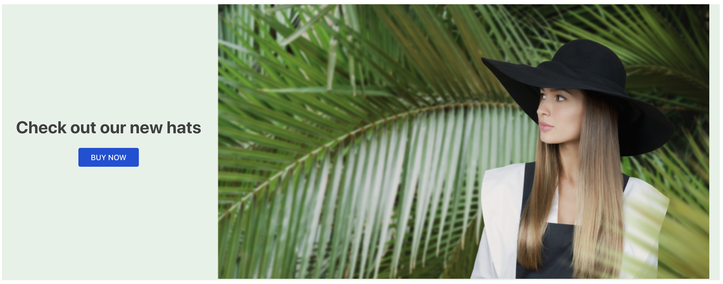
The info-card component groups information on a single topic. It often includes text, an image, and a call-to-action button.
Configuration
- Import the
vtex.store-componentsapp to your theme dependencies in themanifest.jsonfile, as in the following example:
_10 "dependencies": {_10 "vtex.store-components": "3.x"_10 }
- Add the
info-cardblock to the desired page template. - Add the
info-cardblock to the same template file using the props stated in the Props table. For example:
_15 "info-card": {_15 "props": {_15 "id": "info-card-example",_15 "isFullModeStyle": false,_15 "textPosition": "left",_15 "imageUrl": "https://storecomponents.vteximg.com.br/arquivos/banner-infocard2.png",_15 "headline": "Clearance Sale",_15 "callToActionText": "DISCOVER",_15 "callToActionUrl": "/sale/d",_15 "blockClass": "info-card-example",_15 "textAlignment": "center",_15 "fetchpriority": "auto",_15 "preload": true_15 }_15 },
Props
| Prop name | Type | Description | Default value |
|---|---|---|---|
blockClass | String | Extra class name for custom styling. | null |
callToActionLinkTarget | LinkTargetEnum | Where to display the call-to-action component's linked URL, as the name for a browsing context (a tab, window, or iframe). | "_self" |
callToActionMode | CallToActionEnum | Mode of the call-to-action component. | "button" |
callToActionText | string | Text displayed inside the call-to-action component. | "" |
callToActionUrl | string | URL of the call-to-action component. | "" |
headline | string | Headline of the Info Card. | null |
htmlId | string | ID of the container element. | null |
imageUrl | string | Path to the image used on desktop devices. | "" |
imageActionUrl | string | Redirect URL used when the image component is clicked. | "" |
isFullModeStyle | boolean | Style of the Info Card component. If true, the image component is used as the background, and text is displayed over it. | false |
linkTarget | LinkTargetEnum | Where to display the linked URL when the Info Card component is clicked. | "_self" |
mobileImageUrl | string | Path to the image used on mobile devices. If empty, the desktop image is used. | null |
subhead | string | Text to be displayed underneath the headline. If not provided, it will not be rendered. | null |
bodyText | string | Text to be displayed underneath the subhead. If not provided, it will not be rendered. | null |
textAlignment | TextAlignmentEnum | Text alignment inside the component: left, center or right. This prop is ignored if isFullModeStyle is true. | "left" |
textMode | TextModeEnum | Text mode used to process the text from headline and subhead props. | "html" |
textPosition | TextPositionEnum | Position of the text component: left, center or right. | "left" |
fetchpriority | string | The fetch priority hint ('high', 'low' or 'auto'). | |
auto | |||
preload | boolean | Preloads the first image in a list, prioritizing the image display over other assets. | |
false |
TextPositionEnum possible values
| Enum name | Enum value | Description |
|---|---|---|
| Left | 'left' | Text will be on the left. If isFullModeStyle is false, the image will be on the right. |
| Center | 'center' | Text will be in the center. Not applicable if isFullModeStyle is false. |
| Right | 'right' | Text will be on the right. If isFullModeStyle is false, the image will be on the left. |
CallToActionEnum possible values
| Enum name | Enum value | Description |
|---|---|---|
| None | none | Does not render any call-to-action components. |
| Button | button | Renders the call-to-action component as a button. |
| Link | link | Renders the call-to-action component as a text in a link format. |
LinkTargetEnum possible values
These values are the same ones supported by HTML5 anchor tags. For more information, please read the MDN documentation.
| Enum name | Enum value | Description |
|---|---|---|
| Self (default) | _self | Opens the link in the current browsing context. |
| Blank | _blank | Opens the link in a new tab, but users can configure browsers to open a new window instead. |
| Parent | _parent | Opens the link in the parent browsing context of the current one. If there is no parent, it behaves as _self. |
| Top | _top | Opens the link in the topmost browsing context (the "highest" context that is an ancestor of the current one). If there is no ancestor, it behaves as _self. |
TextModeEnum possible values
| Enum name | Enum value | Description |
|---|---|---|
| HTML | html | Uses HTML text for headline and subhead props. |
| Rich Text | rich-text | Uses markdown text and the rich-text block for headline and subhead props. |
Customization
To apply CSS customizations to this and other blocks, please see the Using CSS handles for store customization guide.
| CSS Handles |
|---|
infoCardCallActionContainer |
infoCardCallActionText |
infoCardContainer |
infoCardHeadline |
infoCardImage |
infoCardImageContainer |
infoCardImageLinkWrapper |
infoCardSubhead |
infoCardBodyText |
infoCardTextContainer |