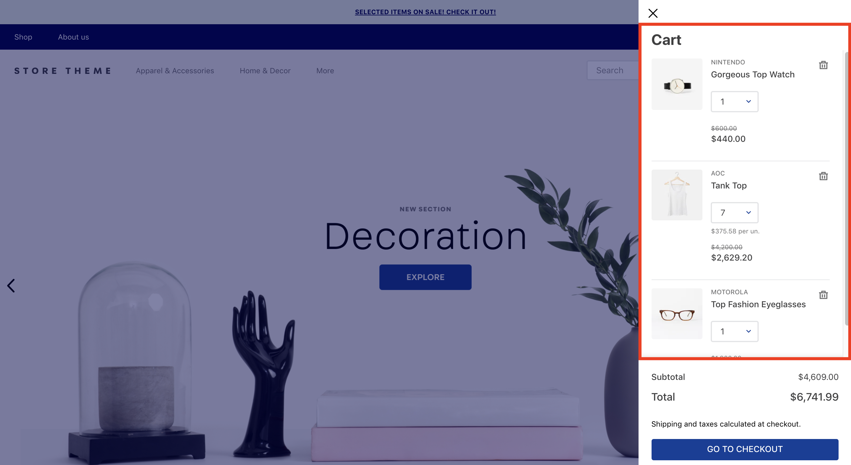
The Product List component displays all items in the user's cart and informs users when items are unavailable.
Currently, the Product List only works with Minicart v2.
Configuration
- Add the Product List app to your theme dependencies in
manifest.json. For example:
_10 "dependencies": {_10 "vtex.product-list": "0.x"_10 }
- Add the
product-listblock to theminicart-product-listblock (exported by the Minicart app). For example:
_10 "minicart-product-list#example": {_10 "blocks": ["product-list"]_10 }
Once you have added the product-list to the minicart-product-list, no further actions are required, as the block works with a default implementation behind the scenes. This means that the Product List component is ready to be rendered.
Advanced configuration
Currently, the product-list default implementation is the following:
_204{_204 "product-list": {_204 "blocks": [_204 "product-list-content-desktop", _204 "product-list-content-mobile"_204 ]_204 },_204 "product-list-content-desktop": {_204 "children": ["flex-layout.row#list-row.desktop"]_204 },_204 "flex-layout.row#list-row.desktop": {_204 "children": [_204 "flex-layout.col#image.desktop",_204 "flex-layout.col#main-container.desktop"_204 ],_204 "props": {_204 "fullWidth": true,_204 "paddingBottom": "7",_204 "paddingTop": "6",_204 "colSizing": "auto",_204 "preserveLayoutOnMobile": "true"_204 }_204 },_204 "flex-layout.col#image.desktop": {_204 "children": ["product-list-image"],_204 "props": {_204 "marginRight": "6"_204 }_204 },_204 "flex-layout.col#main-container.desktop": {_204 "children": [_204 "flex-layout.row#sub-container.desktop",_204 "flex-layout.row#message.desktop"_204 ],_204 "props": {_204 "width": "grow"_204 }_204 },_204 "flex-layout.row#sub-container.desktop": {_204 "children": [_204 "flex-layout.col#product-description",_204 "flex-layout.col#quantity.desktop",_204 "flex-layout.row#price-remove"_204 ],_204 "props": {_204 "preserveLayoutOnMobile": "true",_204 "colSizing": "auto"_204 }_204 },_204 "flex-layout.col#quantity.desktop": {_204 "children": [_204 "flex-layout.row#quantity-selector.desktop",_204 "flex-layout.row#unit-price.desktop"_204 ],_204 "props": {_204 "marginLeft": "8"_204 }_204 },_204 "flex-layout.row#price-remove": {_204 "children": [_204 "flex-layout.col#price.desktop",_204 "flex-layout.col#remove-button.desktop"_204 ],_204 "props": {_204 "colSizing": "auto"_204 }_204 },_204 "flex-layout.row#quantity-selector.desktop": {_204 "children": ["quantity-selector"],_204 "props": {_204 "preventHorizontalStretch": "true"_204 }_204 },_204 "flex-layout.row#unit-price.desktop": {_204 "children": ["unit-price#desktop"],_204 "props": {_204 "marginTop": "3",_204 "preventHorizontalStretch": "true"_204 }_204 },_204 "unit-price#desktop": {_204 "props": {_204 "textAlign": "center"_204 }_204 },_204 "flex-layout.col#price.desktop": {_204 "children": ["price#desktop"],_204 "props": {_204 "blockClass": "priceWrapper",_204 "marginLeft": "6",_204 "preventHorizontalStretch": "true",_204 "verticalAlign": "middle"_204 }_204 },_204 "price#desktop": {_204 "props": {_204 "textAlign": "right"_204 }_204 },_204 "flex-layout.col#remove-button.desktop": {_204 "children": ["remove-button"],_204 "props": {_204 "marginLeft": "6",_204 "verticalAlign": "middle"_204 }_204 },_204 "flex-layout.row#message.desktop": {_204 "children": ["message#desktop"],_204 "props": {_204 "marginTop": "4"_204 }_204 },_204 "message#desktop": {_204 "props": {_204 "layout": "cols"_204 }_204 },_204 "product-list-content-mobile": {_204 "children": ["flex-layout.row#list-row.mobile"]_204 },_204 "flex-layout.row#list-row.mobile": {_204 "children": [_204 "flex-layout.col#image.mobile",_204 "flex-layout.col#main-container.mobile"_204 ],_204 "props": {_204 "fullWidth": true,_204 "paddingBottom": "6",_204 "paddingTop": "5",_204 "colSizing": "auto",_204 "preserveLayoutOnMobile": "true"_204 }_204 },_204 "flex-layout.col#image.mobile": {_204 "children": ["product-list-image"],_204 "props": {_204 "marginRight": "5"_204 }_204 },_204 "flex-layout.col#main-container.mobile": {_204 "children": [_204 "flex-layout.row#top.mobile",_204 "flex-layout.row#quantity-selector.mobile",_204 "flex-layout.row#unit-price.mobile",_204 "flex-layout.row#price.mobile",_204 "flex-layout.row#message.mobile"_204 ],_204 "props": {_204 "width": "grow"_204 }_204 },_204 "flex-layout.row#top.mobile": {_204 "children": [_204 "flex-layout.col#product-description",_204 "flex-layout.col#remove-button.mobile"_204 ],_204 "props": {_204 "colSizing": "auto",_204 "preserveLayoutOnMobile": "true"_204 }_204 },_204 "flex-layout.row#quantity-selector.mobile": {_204 "children": ["quantity-selector"],_204 "props": {_204 "marginTop": "5",_204 "preventHorizontalStretch": "true"_204 }_204 },_204 "flex-layout.row#unit-price.mobile": {_204 "children": ["unit-price"],_204 "props": {_204 "marginTop": "3"_204 }_204 },_204 "flex-layout.row#price.mobile": {_204 "children": ["price#mobile"],_204 "props": {_204 "marginTop": "5",_204 "preventHorizontalStretch": "true"_204 }_204 },_204 "price#mobile": {_204 "props": {_204 "textAlign": "left"_204 }_204 },_204 "flex-layout.col#remove-button.mobile": {_204 "children": ["remove-button"],_204 "props": {_204 "marginLeft": "3"_204 }_204 },_204 "flex-layout.row#message.mobile": {_204 "children": ["message#mobile"],_204 "props": {_204 "marginTop": "3"_204 }_204 },_204 "message#mobile": {_204 "props": {_204 "layout": "rows"_204 }_204 }_204}
The default implementation means that whenever you declare the product-list block in your store, you are actually telling your theme to render the above json behind the scenes.
In order to customize the product-list configuration, copy the code above, paste it, and change it as you wish.
| Block name | Description |
|---|---|
product-list |  minicart-product-list block to render a default detailed list with all products added to the shopping cart. |
product-list-content-desktop | Creates the product list layout for desktop devices. |
product-list-content-mobile | Creates the product list layout for mobile devices. |
message | Renders a message about the product availability. |
product-name | Renders the product names. |
product-reference | Renders the product reference information. |
price | Renders the product prices. |
unit-price | Renders the price for each unit of the product added to the cart. |
product-list-image | Renders the product images. |
product-brand | Renders the product brands. |
product-variations | Renders the product variations. |
product-quantity-label | Renders a product label that displays the number of items added to the cart. |
quantity-selector | Renders a selector that allows users to choose how many units of a product they want to add to the cart. |
remove-button | Renders a button that allows users to remove a product from the list. |
minicart-product-list props
| Prop name | Type | Description | Default value |
|---|---|---|---|
splitItem | boolean | Determines whether products with attachments should be split and treated as individual items (true) or as a single item (false) when their quantity is increased in the minicart. | false |
product-list props
| Prop name | Type | Description | Default value |
|---|---|---|---|
itemCountMode | enum | Quantity badge behavior when displaying the total number of items added in Minicart. Possible values are: total (the quantity badge displays the number of items added to the cart), distinct (the quantity badge only displays the number of different products added to the cart), totalAvailable (the quantity badge displays the number of available items added to the cart), and distinctAvailable (the quantity badge only displays the number of different and available products added to the cart). | distinct |
lazyRenderHeight | number | The height (px) of each item loading element. | 100 |
lazyRenderOffset | number | The distance (px) that each item should be from the viewport at the time of its rendering. | 300 |
message props
| Prop name | Type | Description | Default value |
|---|---|---|---|
layout | enum | Position of the availability message in the list. Possible values are: rows (displaying the message in the product row) or cols (displaying the message in the product column). | cols |
price props
| Prop name | Type | Description | Default value |
|---|---|---|---|
textAlign | string | Position of the product's price in the list. | left |
showListPrice | boolean | Whether the product prices should be displayed in the list: (true) or (false). | true |
unit-price props
| Prop name | Type | Description | Default value |
|---|---|---|---|
textAlign | string | Position of the product's unit price in the list. | left |
unitPriceType | enum | Defines whether the price type should be displayed. Possible values are: sellingPrice or price | price |
unitPriceDisplay | enum | Defines when the unit price should be displayed. Possible values are: always (unit price is always displayed) or default (unit price is only displayed when the number of products is greater than one). | default |
displayUnitListPrice | enum | Defines whether the product list price should be displayed. Possible values are: showWhenDifferent (the list price is displayed when it is different from the regular price), and notShow (the list price is never displayed). | notShow |
product-list-image props
| Prop name | Type | Description | Default value |
|---|---|---|---|
width | number | Product image width (in pixels). | 96 |
product-reference props
| Prop name | Type | Description | Default value |
|---|---|---|---|
identifierLabel | string | Text label to be displayed to the left of the product reference value. | undefined |
identifyOption | enum | Desired product reference data, i.e., product identifier, to be displayed. Possible options are: ProductId, ProductSkuItemId, ProductReferenceId, and ProductSkuReferenceId. | ProductReferenceId |
remove-button props
| Prop name | Type | Description | Default value |
|---|---|---|---|
variation | enum | Variation for the button's visual prominence based on the VTEX Styleguide. Possible values are: primary, secondary, tertiary, inverted-tertiary, danger, and danger-tertiary. | danger |
displayMode | enum | Defines how the remove button should be displayed. Possible values are: icon-button (renders an icon button), and text-button (renders a text message button). If you want to create a modal in the remove button, use the icon-button value. | icon-button |
quantity-selector props
| Prop name | Type | Description | Default value |
|---|---|---|---|
mode | enum | Type of quantity selector input. Possible values are default, and stepper. In the default mode, the quantity stepper will initially render a dropdown component, and after the quantity exceeds 10, it will switch to an input. The stepper mode will always render a numeric stepper component. | default |
quantitySelectorStep | enum | Defines how the number of products that have unitMultiplier will work. Possible values are: singleUnit (the quantity will be not affected with the unitMultiplier), and unitMultiplier (the quantity will be affected with the unitMultiplier). | unitMultiplier |
Customization
To apply CSS customizations to this and other blocks, follow the instructions in Using CSS Handles for store customization.
| CSS Handles |
|---|
availabilityMessageContainer |
availabilityMessageTextContainer |
availabilityMessageText |
productBrandName |
productImageAnchor |
productImageContainer |
productImage |
productListAvailableItemsMessage |
productListItem |
productListUnavailableItemsMessage |
productName |
productPriceContainer |
productPriceCurrency |
productPrice |
productQuantityLabel |
productIdentifier |
productIdentifierValue |
productIdentifierLabelValue |
productVariationsContainer |
productVariationsItem |
quantityDropdownContainer |
quantityDropdownMobileContainer |
quantityInputContainer |
quantityInputMobileContainer |
quantitySelectorContainer |
quantitySelectorWrapper |
quantitySelectorButton |
quantitySelectorDecrease |
quantitySelectorIncrease |
removeButtonContainer |
item |
removeButton |
unitPriceContainer |
unitListPrice |
unitPriceMeasurementUnit |
unitPricePerUnitCurrency |