Rendering a badge on top of a product
To render a badge on top of a Product Summary component, for example, product collection on a Shelf block, you combine the Product Highlights app and Stack Layout.
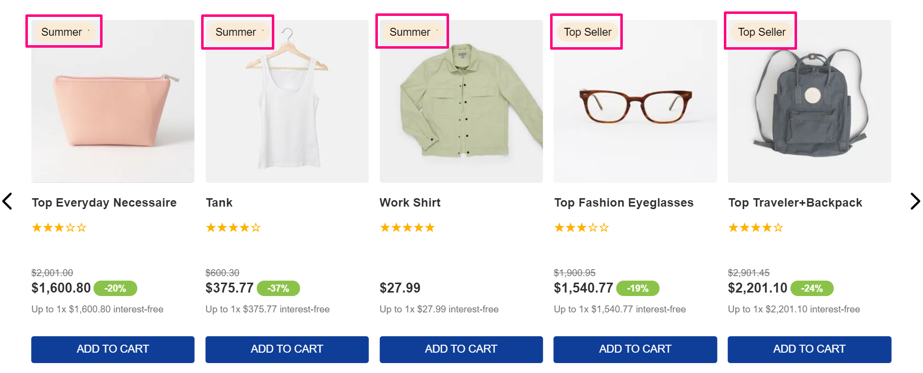
Before you begin
-
Knowledge of how the Product Summary, Product Highlights, Stack Layout, and Product collections work is required for this recipe. If you have any doubts regarding them, we strongly recommend you access their technical documentation: Product Summary, Product Highlights, Stack Layout and Collections.
-
Ensure you have already installed VTEX IO CLI on your machine.
-
Also, make sure you have as a dependency
"vtex.product-summary": "2.x"in your theme’smanifest.json.
Instructions
-
In your theme’s
manifest.jsonfile, add the Product Highlights app and Stack Layout as a dependency:_10“dependencies” : {_10"vtex.product-highlights": "2.x",_10"vtex.stack-layout": "0.x”,_10_10} -
Open a product template you desire.
-
Then, add the
stack-layoutcomponent to theblockslist of the desired template, for example:_10{_10"product-summary.shelf": {_10"children": [_10"stack-layout#prodsum",_10]_10},_10... -
In the theme’s template, declare the
stack-layoutcomponent, and add the"product-summary-image#shelf"and"vtex.product-highlights@2.x:product-highlights#collection"as itschildrento render the image and the badge, respectivetly._10"stack-layout#prodsum": {_10"children": [_10"product-summary-image#shelf",_10"vtex.product-highlights@2.x:product-highlights#collection"_10]_10}, -
Then declare the props of the children. The first is
"product-summary-image#shelf"props, responsible for rendering the product's image._10_10"product-summary-image#shelf": {_10"props": {_10"showBadge": true,_10"aspectRatio": "1:1",_10"maxHeight": 300_10}_10}, -
After declare the props and the children of
vtex.product-highlights@2.x:product-highlights#collection:product-highlight-wrapperandproduct-highlight-text.The
product-highlight-textonly renders the text already defined in the Collection page in a store’s Admin. For more information about it, refer to Collections articles and the Product Highlights app_19_19"vtex.product-highlights@2.x:product-highlights#collection": {_19"props": {_19"type": "collection"_19},_19"children": ["product-highlight-wrapper"]_19},_19"product-highlight-wrapper": {_19"props": {_19"blockClass": "collection"_19},_19"children": ["product-highlight-text"]_19},_19"product-highlight-text": {_19"props": {_19"message": "{highlightName}"_19}_19},_19...
Once you have declared the blocks’ props, link the app and see the changes live at the Development workspace you are working.