classes | CustomCSSClasses | Overrides default CSS handles. To better understand how this prop works, please refer to this documentation. Please note that this is only helpful if you're using this block as a React component. | undefined |
disableUnavailableSelectOptions | boolean | Whether a product variation that leads to an impossible product combination should be displayed with the disabled attribute when displayMode is set to select. By default, all select options are configured without the disabled attribute set based on the type of variation | false |
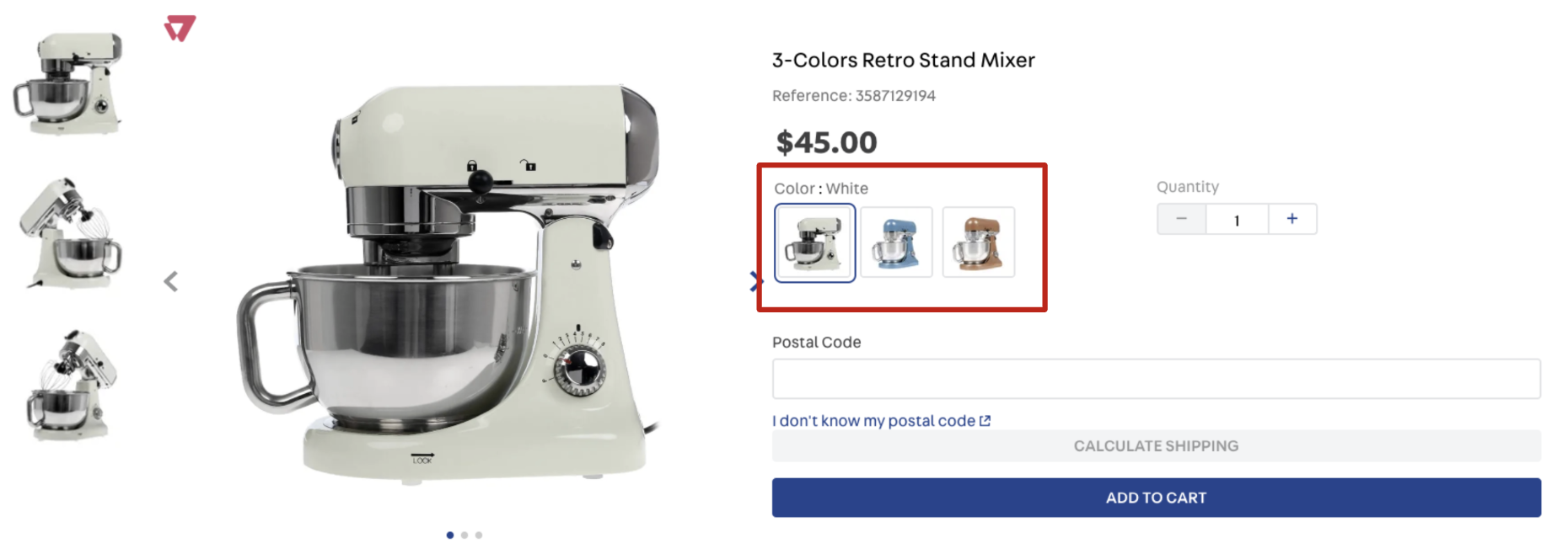
displayMode | enum | Defines how the product variation names will be displayed (it does not apply to product variation images). Possible values are: default (displays all variation names), select (only displays the selected variation name), or slider (displays all variation names in a slider when the number of available options is greater than the value defined in the sliderDisplayThreshold prop). Please note that this prop is responsive, so you can declare an object as its value, specifying a value for each breakpoint (desktop and mobile). | default |
hideImpossibleCombinations | boolean | Defines whether a product variation should be clickable (true) or (false). The variation will not be displayed if true. If false, the variation will be displayed with less opacity. For example, there are two colors for a pair of sneakers: pink and white. If the pink sneaker is only available in one size, the other sizes will not be displayed (true). | true |
sortVariationsByLabel | boolean | Defines if the variations are to be sorted in alphabetical order. | false |
imageHeight | number | object | Height (in px) of the product thumbnail image. You can declare an object as its value in case you want to define a height for each device (desktop and mobile). |
imageWidth | number | object | Width (in px) of the product thumbnail image. You can declare an object as its value in case you want to define a width for each device (desktop and mobile). |
initialSelection | enum | Controls the user's initial selection for available variations when the product page is fully loaded. Possible values are: complete (selects the first available SKU variation values), image (selects the first available image variation), or empty (no variations will be selected when the page is loaded). | complete |
maxItems | number | The maximum number of variation items to be displayed in the SKU selector before the See more button. The button will always be displayed 2 items before the number set in maxItems. | 10 |
showValueForVariation | enum | Displays a value for the selected variation. This prop replaces the former showValueNameForImageVariation (deprecated). Possible values are: none (no values are displayed when the variation is selected), image (displays only the image value for the selected variation, if any), or all (all variation values are displayed). | none |
sliderArrowSize | number | Controls the size (height and width) in pixels of the navigation arrows rendered when displayMode is set as slider. | 12 |
sliderDisplayThreshold | number | The minimum number of product variation names that should be displayed using slider display mode. This prop only works properly when displayMode is set as slider. | 3 |
sliderItemsPerPage | object | Controls how many slides should be displayed on each type of device when displayMode is set as slider. There is more information regarding this prop structure below this table. | {desktop: 3, tablet: 2, phone: 1} |
showVariationsErrorMessage | boolean | Whether an error message should be displayed when the BuyButton is clicked but no available variation was selected (true) or (false). | true |
showVariationsLabels | enum | Where variation names should be displayed. Possible values are: none (does not display the variation names). Replaces the previous false behavior), variation (displays the variation name as a header of the items. Replaces the previous true behavior), itemValue (displays the variation name before each item's value), and variationAndItemValue (behaves as variation and itemValue at the same time). | variation |
thumbnailImage | string | The first image to be displayed. This prop value must be the same text string defined in the desired product image imageLabel field (from the Catalog module). If you use this prop and no image declaring the same text string in its imageLabel field is found, any product image will be randomly rendered. To apply the thumbnailImage configuration, please read the Configuring custom images for the SKU Selector documentation | undefined |
variationsSpacing | number | Defines the margin-bottom size to be applied in the rendered product variations. Possible values range from 0 to 11 (the prop value is not in px; every value represents a tachyon class). | 7 |
visibility | enum | Defines the scenarios in which the SKU selector should be displayed. Possible values are: always (it will always be displayed, even if the product has only one SKU option) or more-than-one (the SKU selector is only displayed when the product has more than one SKU option). | always |
visibleVariations | array | Specifies which product variations should be displayed on the product details page. Please note that no variations will be displayed if you declare a name that does not represent a real product variation or an empty array. There is more information regarding this prop structure below this table. | undefined |