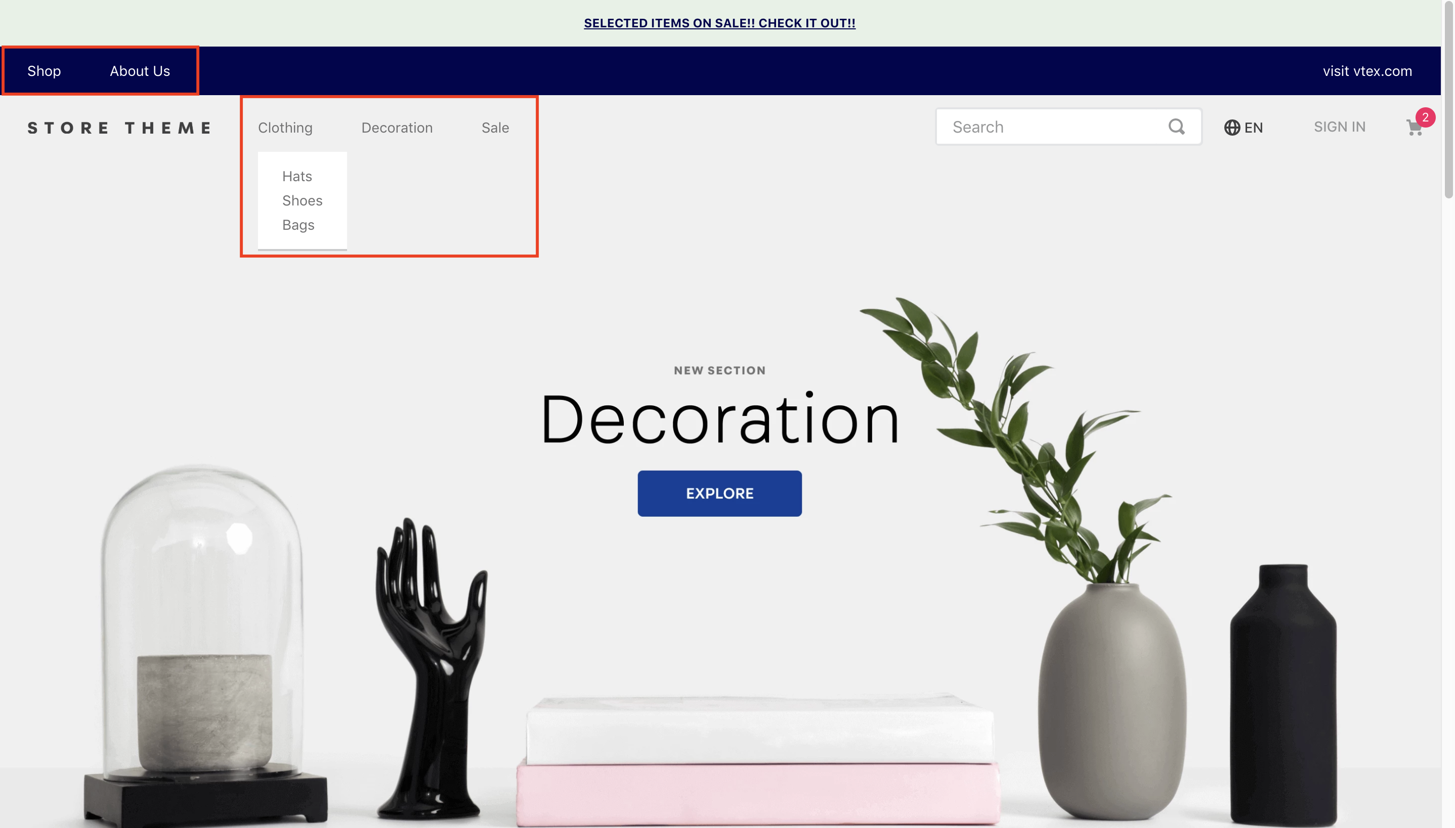
The Menu component displays a navigation bar with links and dropdown submenus. It can be configured to display internal or external links and supports both category-based and custom menu items.
Configuration
- Add the app to the store theme dependencies in the
manifest.jsonfile.
_10 "dependencies": {_10 "vtex.menu": "2.x"_10 }
-
Add the
vtex.menu@2.x:menublock to the store header template. -
Configure the
menu-itemblocks to build the store menu options. These can be declared in two ways invtex.menu@2.x:menu: as children or as props. The advantage of the second type ofmenu-itemconfiguration is that Site Editor can be used to edit the blocks.
menu-item as children
Example:
_28"vtex.menu@2.x:menu#websites": {_28 "children": [_28 "menu-item#shop",_28 "menu-item#about-us"_28 ]_28},_28"menu-item#shop": {_28 "props": {_28 "id": "menu-item-shop",_28 "type": "custom",_28 "highlight": false,_28 "itemProps": {_28 "type": "internal",_28 "href": "#",_28 "noFollow": false,_28 "tagTitle": "Shop",_28 "text": "Shop"_28 },_28 "iconProps": {_28 "id": "bnd-logo",_28 "size": 16,_28 "viewBox": "0 0 16 16",_28 "activeClassName": "rebel-pink",_28 "mutedClassName": "c-action-primary"_28 },_28 "iconToTheRight": true_28 }_28}
menu-item as props
Example:
_30"vtex.menu@2.x:menu#websites": {_30 "props": {_30 "items": [_30 {_30 "id": "menu-item-shop",_30 "type": "custom",_30 "highlight": false,_30 "itemProps": {_30 "type": "internal",_30 "href": "#",_30 "noFollow": false,_30 "tagTitle": "Shop",_30 "text": "Shop"_30 }_30 },_30 {_30 "id": "menu-item-about-us",_30 "type": "custom",_30 "highlight": false,_30 "itemProps": {_30 "type": "internal",_30 "href": "/about-us",_30 "noFollow": false,_30 "tagTitle": "about-us",_30 "text": "About Us"_30 }_30 }_30 ]_30 }_30}
Adding a submenu
You can define a submenu by adding the submenu block to a menu-item:
_24"menu-item#shop": {_24 "props": {_24 "type": "custom",_24 "highlight": false,_24 "itemProps": {_24 "type": "internal",_24 "href": "#",_24 "noFollow": false,_24 "tagTitle": "Shop",_24 "text": "Shop"_24 },_24 },_24 "blocks": ["vtex.menu@2.x:submenu#shop"] // Defining a submenu_24},_24"vtex.menu@2.x:submenu#shop": {_24 "children": [_24 "vtex.menu@2.x:menu#submenushop"_24 ]_24},_24"vtex.menu@2.x:menu#submenushop": {_24 "children": [_24 "menu-item#shop"_24 ]_24}
The Menu block doesn't require any specific child blocks to work
menu-item props
The available menu-item block props are:
| Prop name | Type | Description | Default value |
|---|---|---|---|
type | string | Menu item type, either category or custom | category |
id | string | Menu item ID | undefined |
highlight | boolean | Indicates whether the item has a highlight | undefined |
iconPosition | string | Icon position relative to the menu item text, either to the left or right | left |
iconProps | IconProps | Icon props | undefined |
onMountBehavior | enum | Indicates whether the submenu should always be automatically displayed when its parent is hovered/clicked on (open) or (close) | closed |
itemProps | CategoryItem or CustomItem | Item props | undefined |
blockClass | CustomCSSClasses | Used to override default CSS handles. To learn how this prop works, check this description of useCustomClasses. Please note that this is only useful when importing this block as a React component. | undefined |
Icon props
| Prop name | Type | Description | Default value |
|---|---|---|---|
id | string | Icon ID | N/A |
isActive | boolean | Indicates if the item is active | true |
size | number | Icon size | 16 |
viewBox | string | Icon view box | 0 0 16 16 |
activeClassName | string | Icon classname when isActive is true | N/A |
mutedClassName | string | Icon classname when isActive is false | N/A |
Category-specific props
| Prop name | Type | Description | Default value |
|---|---|---|---|
categoryId | number | Item category ID | N/A |
text | string | Menu item text | N/A |
Custom item props
| Prop name | Type | Description | Default value |
|---|---|---|---|
type | string | Menu item type, either internal or external | internal |
href | string | Link to the menu item destination | N/A |
noFollow | boolean | No follow attribute | N/A |
tagTitle | string | Menu item tag | N/A |
text | string | Menu item text | N/A |
Customization
To apply CSS customizations to this and other blocks, please follow the instructions in Using CSS Handles for store customization.
| CSS Handle |
|---|
accordionIcon--isClosed |
accordionIcon--isOpen |
accordionIcon |
container |
linkLeft |
linkMiddle |
linkRight |
menuContainerNav |
menuContainer |
menuItemInnerDiv |
menuItem |
menuItem--isOpen |
menuItem--isClosed |
menuLinkDivLeft |
menuLinkDivMiddle |
menuLinkDivRight |
menuLinkNav |
renderLink |
styledLinkContainer |
styledLinkContent |
styledLinkIcon |
styledLink |
submenuAccordion |
submenuColumn |
submenuContainer |
submenuWrapper--isClosed |
submenuWrapper--isOpen |
submenuWrapper |
submenu |