Using events to trigger side effects on store components
Events or pixel events are notifications broadcast by your storefront whenever a user performs a tracked action, such as:
- Adding an item to the cart (
addToCartevent). - Removing an item from the cart (
removeItemevent). - Accessing a loaded page (
pageViewevent). - Viewing a product (
productImpressionevent).
Analytics tools commonly use these events to track users' shopping behavior and interactions across your store pages.
You can also use events to create dynamic interactions between your store components by using the customPixelEventId prop. These events can generate side effects in the UI, triggering automatic behaviors in your store components as needed.
The customPixelEventId prop can be used as either an event sender or receiver, depending on its implementation. When used in a sender component, it emits an event in response to user interaction. In a receiver component, it listens for that specific event and triggers a corresponding UI update.
The prop's value must be a unique ID, enabling blocks to identify which event is being sent or received during user interaction in the UI.
The following table lists the components that support the customPixelEventId prop:
| Block name | Behavior |
|---|---|
add-to-cart-button | Sends an event when clicked. |
minicart.v2 | Receives an event and performs a UI action. |
drawer-trigger | Sends an event when clicked. |
drawer | Receives an event and performs a UI action. |
modal-trigger | Sends an event when clicked. |
modal-layout | Receives an event and performs a UI action. |
Use case example
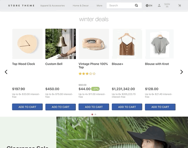
In this section, we describe how events and the customPixelEventId prop can trigger side effects in the interface. Follow the steps below to configure the Minicart to automatically open when a new product is added using the Add to Cart Button.
Instructions
Step 1 - Add dependencies
In your theme's manifest.json file, make sure the minicart and add-to-cart-button apps are listed as dependencies:
_10"dependencies": {_10 "vtex.minicart": "2.x",_10 "vtex.add-to-cart-button": "0.x"_10}
Step 2 - Configure the event sender
In your store theme code, declare the customPixelEventId prop in the block responsible for sending the desired event, passing a unique ID as its value. Example:
_10{_10 "add-to-cart-button#example": {_10 "props": {_10 "customPixelEventId": "example-add-to-cart"_10 }_10 },_10}
Step 3 - Configure the event receiver
In the minicart.v2 block, declare the customPixelEventName prop in the block responsible for listening for the desired event. Use the same unique ID that you declared in the sender block. Example:
_10{_10 "minicart.v2": {_10 "props": {_10 "customPixelEventName": "example-add-to-cart"_10 },_10 "children": ["minicart-base-content"]_10 }_10}
The
customPixelEventNameprop triggers theminicart.v2to open automatically in the interface whenever it detects a pixel event with the specified name. If you also set acustomPixelEventIdprop on the sender, theminicart.v2opens only if both the event's name and custom ID match. Learn more in Minicart.
After saving your changes and deploying your new Store Theme version, the Add to Cart Button component will send the example-add-to-cart event when clicked. The Minicart will then automatically open in response to any event with this ID.