The specified version of the app (0.70.0) does not exist. This page is about the latest stable version, which is 1.27.5.
This is an app for Yourviews Reviews. Check out our website for more information.
Configuration
- Install the
Yourviewsapp in the desired account; - In the admin's account, access Apps and then select the Yourviews Reviews box;
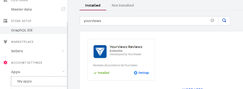
- Once in the app's page, define the app’s configurations in the setup section:
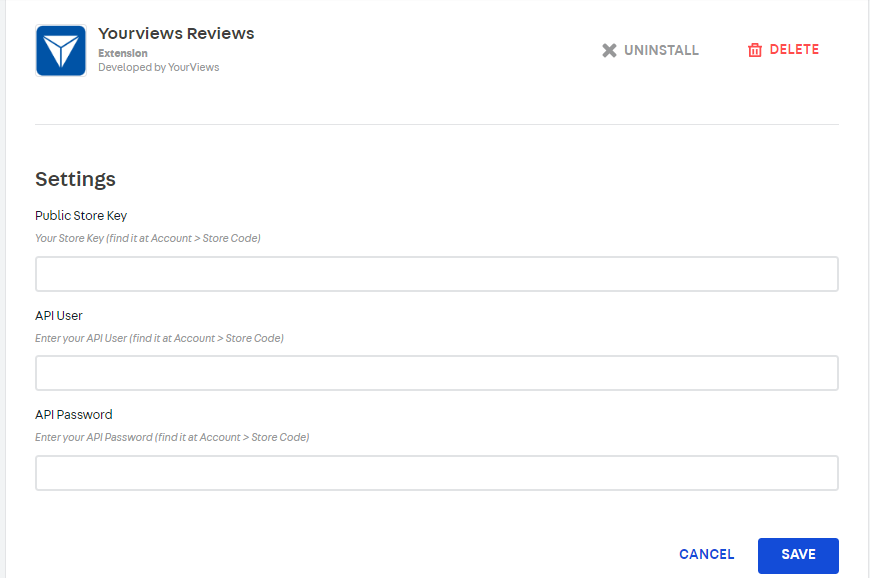
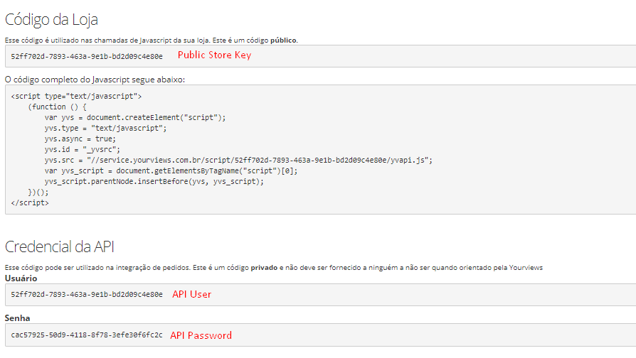
All of the required keys can be found in the Yourviews Admin Panel, in the Account > Store Code menu item;
- Public Store key: The Store Key is the main public code of your store.
- API User: In the Store Code menu in Yourviews, scroll down the page to "API Credential". This is the "User" code
- API Password: In the Store Code menu in Yourviews, scroll down the page to "API Credential". This is the "Password" code
- Use Rich Snippets: Check it if you want the app to emit Rich Snippets markup in the product pages. Only AggregateRating is supported for now.
:warning: This app fills the standard VTEX review blocks with content using abstract interfaces from vtex.product-review-interfaces . The VTEX review blocks are:
-
"product-reviews": This block can be added to the product page (store.product). It renders the main Yourviews content which lists any reviews for the product being viewed as well as a form to add a new review. -
"product-rating-summary": This block can be added to the product page (store.product) and renders the average rating for the product being viewed as well as the number of reviews that have been submitted. -
"product-rating-inline": Similar to the previous block, but intended to be used in product shelves. -
"product-questions-and-answers": This block and be added to the product page. It renders the Questions And Answers feature, that enable your customers to ask questions for a given product
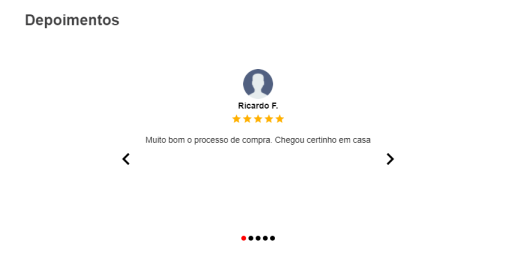
Testimonials
You can show your Store Reviews from Yourviews in a Testimonial format, presented in the form of a carousel (as a slide show). As this is not a default block from VTEX, you need additional steps to use this functionality.
If you need more information regarding this functionality, please check our Help Page
Configuration
-
Install the Yourviews application on the desired VTEX account by running
vtex install yourviews.yourviewsreviewson your terminal.It may have already been installed, so check the need for installation in this step.
-
Open your Store Theme directory in your code editor.
-
Add the Yourviews app to the manifest (
manifest.json) of your Store Theme, inside peerDependencies, as shown below:_10"peerDependencies": {_10"yourviews.yourviewsreviews": "0.x"_10}Yourviews application needs a custom block called
testimonialsfor the Testimonials component to be displayed on your theme's home screen. -
Add
testimonialsblock on Store Theme home blocks list. For example:_15{_15"store.home": {_15"blocks": [_15"list-context.image-list#demo",_15"__fold__.experimentalLazyAssets",_15"flex-layout.row#deals",_15"rich-text#shelf-title",_15"flex-layout.row#shelf",_15"info-card#home",_15"rich-text#question",_15"rich-text#link",_15+ "testimonials",_15"newsletter"_15]_15}, -
Configure which Testimonials will be shown, in the Yourviews Admin Panel, at Configuration > Testimonial. Check our Help Page for more information regarding this configuration
Customization
-
With CSS Handles you can customize our application with more freedom, some of the advantages: Icons and SVGs can be customized with the colors of your store's theme, be able to use VTEX's Flex Layout, in addition to manipulating the elements, lists , divs, etc.
-
Some precautions to be taken: avoid unnecessary customizations in the components or something that could break the behavior and functioning of the same.
-
Next we will have some steps that show how to adjust colors of some elements so that you can have the visual identity of your store, and then the list with all the CSS Handles and their brief description.
- If you do not know how to use the CSS Handles, see the VTEX Documentation at this link 👉 Using CSS Handles for store customization
-
Some elements use classes from Tachyons to define border styles, spacing, margins, etc.
- Access the related VTEX documentation to learn more about the Tachyons.
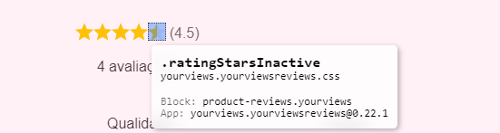
Rating Stars
-
All components that use stars, implement the same classes for active and inactive stars, as stars are rendered using SVG, you can change the color using the
fillproperty, and the size using thewidthandheight(⚠ use the same value ofwidthandheightfor the active and inactive stars to avoid strange behavior), see the following example:- CSS Handle:
.ratingStarsActive,.ratingStarsInactive
_11.ratingStarsActive {_11fill: #fc0;_11width: 20px;_11height: 20px;_11}_11_11.ratingStarsInactive {_11fill: #eee;_11width: 20px;_11height: 20px;_11}-
These Handles change the stars in the following places: List of Products and Recommended Products, Product Screen (below the product name), Testimonials (below the photo and name of the user who left the testimonial), Product Summary.
-

-
- CSS Handle:
Histogram
-
In the Histogram chart, we can change the color of the bars using the CSS
background-colorproperty:- CSS Handle:
.histogramBarColor
_10.histogramBarColor {_10background-color: #fc0;_10} - CSS Handle:
Recommendation Percentage
-
The color of the donut chart for displaying the percentage of recommendation can be changed using the CSS
border-colorproperty:- CSS Handle:
.recommendPercentBorder
_10.recommendPercentBorder {_10border-color: #fc0;_10} - CSS Handle:
Average Rating
-
On the product screen, in the information to the right of the photo (below the name), we have the rating stars, there we can add an average next to the stars (same as the summary below on this same screen), this information comes by default with the visualization disabled, with the CSS
displayproperty with the valuenone, to activate just change this same property toblock:- CSS Handle:
.ratingAverage
_10.ratingAverage {_10display: none;_10margin: 0px 4px;_10}- Standard view, without the average

- View with Rating Average

- CSS Handle:
Testimonial
-
In the Testimonials component, we can modify some elements such as the icons for the indication of the current testimony, the previous and next buttons, etc.
- CSS Handles:
.carouselStatusDotInactive,.carouselStatusDotActive,.carouselSliderName,.carouselSliderAvatar,.carouselSliderText,.carouselArrowButton,.carouselArrowIcon
_31.carouselStatusDotInactive {_31font-size: 8px;_31color: rgb(170, 170, 170);_31}_31.carouselStatusDotActive {_31font-size: 8px;_31color: rgb(66, 66, 66);_31}_31.carouselSliderName {_31font-weight: bold;_31margin-bottom: 5px;_31}_31.carouselSliderAvatar {_31width: 50px;_31height: 50px;_31border-radius: 50%;_31}_31.carouselSliderText {_31max-width: 500px;_31min-height: 150px;_31margin: 15px auto;_31_31text-align: center;_31}_31.carouselArrowButton {_31cursor: 'pointer';_31}_31.carouselArrowIcon {_31font-size: 40;_31color: #3f3f40;_31} - CSS Handles:
List of CSS Handles
- Below we have all the CSS Handles available for you to use and customize according to your need, but be careful with structural changes that may break the components:
| CSS Handle | Description |
|---|---|
reviewsLoader | Reviews loading Spinner |
reviewsEmptyState | Display when the review list is empty |
reviewsContainer | Reviews component container |
recommendPercent | Recommendation Percentage Chart Container |
recommendPercentBorder | Percentage of Recommendation Chart Border |
reviewsSummary | Summary of Reviews |
reviewsList | Reviews list |
reviewsBox | Reviews box (same style of VTEX Styleguide's Box component) |
reviewItemContainer | Review items container |
reviewItem | Review item |
reviewsPagination | Pagination component container |
reviewsWriteReviewButton | Write new review Button |
reviewHistogramBar | Histogram chart bars |
reviewsCustomerPhotos | List of review photos sent by customers |
carouselStatusDotActive | Icon for displaying the current testimonial carousel image |
carouselStatusDotInactive | Inactive image indication icon (next or previous items) of the testimonials carousel |
carouselSliderName | Name of the user who sent the testimonial |
carouselSliderAvatar | Photo of the user who sent the testimonial (if not, a silhouette illustration is inserted instead) |
carouselSliderText | Testimonial text/message written by the user |
carouselArrowButton | Testimonials carousel previous/next button |
carouselArrowIcon | Arrow icon inside Previous/Next button |
- For more Handles, use the querystring
?__inspectin your development workspace and inspect the elements, if you have any doubts access the documentation referring to the following link 👉 Using CSS Handles for store customization