This page is about version 3.150.0 of the app, which is not the most recent version. The latest stable version is 3.178.5.
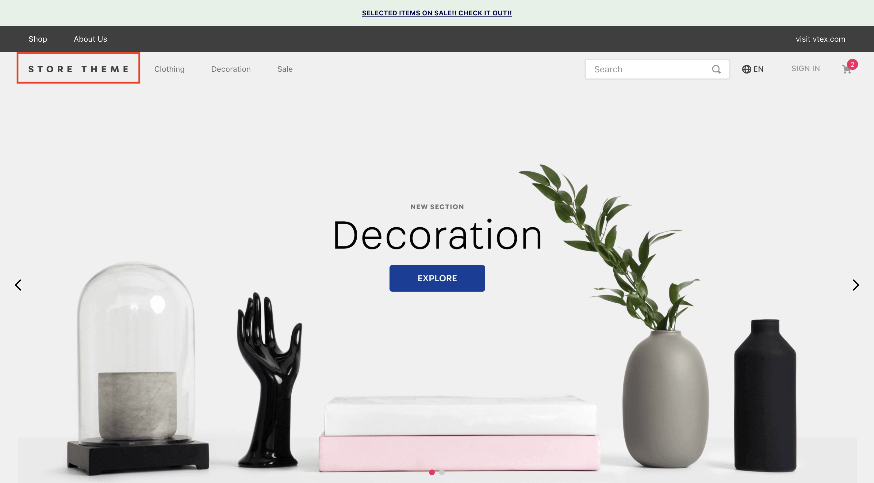
Logo is a VTEX block responsible for displaying an image logo for the store header.
Configuration
- Import the
vtex.store-componentapp to your theme's dependencies in the manifest.json;
_10 "dependencies: {_10 "vtex.store-components": "3.x"_10 }
- Add the
logoblock into your Header. For example:
_21"header.full": {_21 "blocks": [_21 "login",_21 "minicart",_21 "logo",_21 "search-bar",_21 "menu-link",_21 "telemarketing",_21 "category-menu"_21 ]_21},_21_21 "logo": {_21 "props": {_21 "width": 132,_21 "height": 32,_21 "mobileWidth": 90,_21 "mobileHeight": 32_21 }_21 }_21}
| Prop name | Type | Description | Default value |
|---|---|---|---|
title | String! | The image alt description | VTEX logo |
color | String | The image fill color | #F71963 |
showLabel | Boolean | Set the label visibility | true |
width | Number | The logo image width | 493 |
height | Number | The logo image height | 177 |
url | String | The image url | undefined |
href | String | Image link | undefined |
classes | CustomCSSClasses | Used to override default CSS handles. To better understand how this prop works, we recommend reading about it here. Note that this is only useful if you're using this block as a React component. | undefined |
Customization
In order to apply CSS customizations in this and other blocks, follow the instructions given in the recipe on Using CSS Handles for store customization.
| CSS Handles |
|---|
sizeDesktop |
sizeMobile |
logoLink |
logoContainer |
logoImage |