This page is about version 3.115.0 of the app, which is not the most recent version. The latest stable version is 3.178.4.
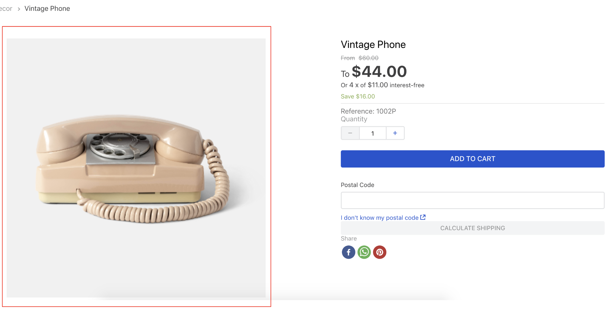
ProductImages is a VTEX block responsible for rendering a product image or video.

Configuration
- Import the
vtex.store-componentapp to your theme's dependencies in themanifest.json;
_10 "dependencies": {_10 "vtex.store-components": "3.x"_10 }
- Add the
product-imagesblock to any block belowstore.product(Product template). For example:
_15 "store.product": {_15 "children": [_15 "flex-layout.row#product",_15 ]_15 },_15 "flex-layout.row#product": {_15 "children": [_15 "product-images"_15 ]_15 },_15 "product-images": {_15 "props": {_15 "displayThumbnailsArrows": true_15 }_15 },
| Prop name | Type | Description | Default Value |
|---|---|---|---|
aspectRatio | string | Sets the aspect ratio of the image, that is, whether the image should be square, portrait, landscape, etc. The value should follow the common aspect ratio notation i.e. two numbers separated by a colon such as 1:1 for square, 3:4 for upright portrait, or 1920:1080 for even large values) | "auto" |
contentOrder | 'videos-first' | 'images-first' | Controls the order in which the images and videos are displayed. | 'images-first' |
displayThumbnailsArrows | boolean | Displays navigation arrows on the thumbnails media (if there are enough thumbnails for them to scroll) | false |
hiddenImages | string | Hides images whose labels match the values listed in this prop. Intended to be used along with the product-summary-sku-selector block. You can have more information at the SKU Selector documentation | skuvariation |
position | Enum | Set the position of the thumbnails (left or right). Only used when thumbnailsOrientation is vertical | left |
showNavigationArrows | boolean | Controls if the navigation arrows should appear | true |
showPaginationDots | boolean | Controls if the pagination dots should appear | true |
thumbnailAspectRatio | string | Sets the aspect ratio of the thumbnail image; For more information about aspect ratio, check the aspectRatio prop | "auto" |
thumbnailMaxHeight | number | The max height for the thumbnail image | true |
thumbnailsOrientation | Enum | Choose the orientation of the thumbnails. Can be set to vertical or horizontal | vertical |
zoomFactor | number | Sets how much the zoom increases the image size (e.g. 2 will make the zoomed-in image twice as large) | 2 |
zoomMode | disabled|in-place-click|in-place-hover | Sets the zoom behavior. | in-place-click |
Customization
In order to apply CSS customizations on this and other blocks, follow the instructions given in the recipe on Using CSS Handles for store customization.
| CSS Handles |
|---|
carouselContainer |
carouselCursorDefault |
carouselGaleryCursor |
carouselGaleryThumbs |
carouselIconCaretLeft |
carouselImagePlaceholder |
carouselInconCaretRight |
carouselThumbBorder |
figure |
image |
productImagesContainer (content is deprecated) |
productImagesGallerySlide |
productImagesGallerySwiperContainer |
productImagesThumb |
productImagesThumbActive |
productImagesThumbCaret |
productImagesThumbsSwiperContainer |
productImageTag |
productVideo |
swiperBullet |
swiperCaret |
thumbImg |
video |
video |
videoContainer |