The Overlay Layout app provides blocks that help you create a Dropdown, Select or a Tooltip component.
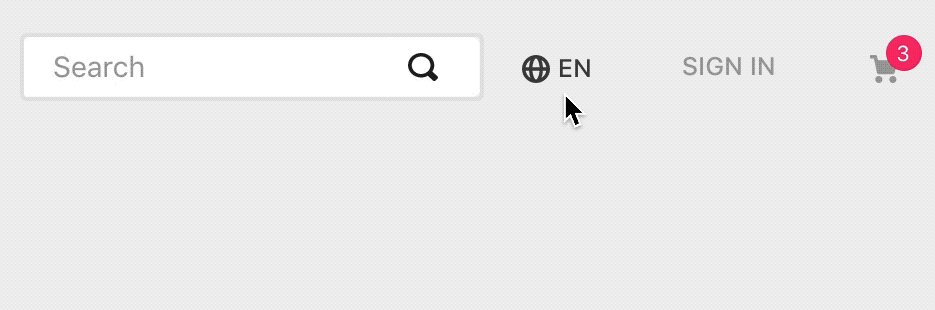
Example of a Locale Switcher using the Overlay Layout.
Configuration
- Add the Overlay Layout app to your theme's dependencies in the
manifest.json, for example:
_10{_10 "dependencies": {_10 "vtex.overlay-layout": "0.x"_10 }_10}
Now you can use the two blocks exported by the app:
| Block name | Description |
|---|---|
overlay-trigger |  overlay-layout content. |
overlay-layout | |
- In any desired theme template, add the
overlay-triggerand then declare it using a block of your choosing and theoverlay-layout:
_10{_10 "overlay-trigger": {_10 "children": [_10 "rich-text#question",_10 "overlay-layout" _10 ]_10 },
Notice that the overlay-trigger is not rendered. Following the example stated above, the rich-text block will be the one rendered and responsible for effectively triggering the Overlay Layout content (defined by the children block of overlay-layout).
overlay-trigger props
| Prop name | Type | Description | Default value |
|---|---|---|---|
trigger | Enum | Defines whether the popover-layout will be opened by click (click) or hover (hover). | click |
- Configure the chosen trigger block and declare the
overlay-layoutusing its props. For example:
_21 "rich-text#question": {_21 "props": {_21 "text": "**Click to open the Overlay Layout**",_21 "blockClass": "question"_21 }_21 },_21 "overlay-layout": {_21 "props": {_21 "placement": "left"_21 },_21 "children": [_21 "rich-text#link"_21 ]_21 },_21 "rich-text#link": {_21 "props": {_21 "text": "\n**Reach us at**\nwww.vtex.com.br",_21 "blockClass": "link"_21 }_21 }_21}
The overlay-layout defines which block will be rendered in order to build the Overlay Layout content. This means that you will have to pass to it a children block to be rendered.
overlay-layout props
| Prop name | Type | Description | Default value |
|---|---|---|---|
placement | Enum | Defines the Overlay Layout content placement when it is triggered according to the Trigger component positioning. Possible values are: bottom, left, right or top. If there is no page space in the placement that you choose, it will fit in a fallback position. | bottom |
scrollBehavior | Enum | Defines the Overlay Layout content behavior when users try to scroll the page. Possible values are: lock-page-scroll (in which users can't scroll), close-on-scroll (the block is closed when users start scrolling) or default (Scroll does not affect the Overlay Layout content). | default |
backdrop | Enum | Once the Overlay Layout content is rendered, it defines whether a backdrop overlay will be displayed (visible) or not (none). When set as visible, the backdrop will close Overlay Layout content when clicked on. Otherwise, the content will be closed only if any component from the page is clicked on. | none |
showArrow | Boolean | Whether an arrow pointing to the overlay-trigger component should be displayed on UI(true) or not (false). | false |
offsets | Object | Defines the overlay-layout component positioning when compared to the overlay-trigger (unit used is px). For more details, check out the offsets object table stated below. | { skidding: 0, distance: 0 } |
offsetsobject:
| Prop | Type | Description |
|---|---|---|
skidding | Number | Defines the overlay-layout component positioning side by side with the overlay-trigger. |
distance | Number | Defines the distance between the overlay-layout and the overlay-trigger components in the UI. A positive number places the overlay-layout component farther, while a negative number lets it overlap the overlay-trigger. |
Customization
In order to apply CSS customizations in this and other blocks, follow the instructions given in the recipe on Using CSS Handles for store customization.
| CSS Handles |
|---|
arrow |
container |
outsideClickHandler |
paper |
popper |
popperArrow |
trigger |