Brandless
This themeable structure is made of two complementary layers: a useful and assorted library of templates for the components and sections, alongside a comprehensive set of design tokens to further customize them.
Customizing your store
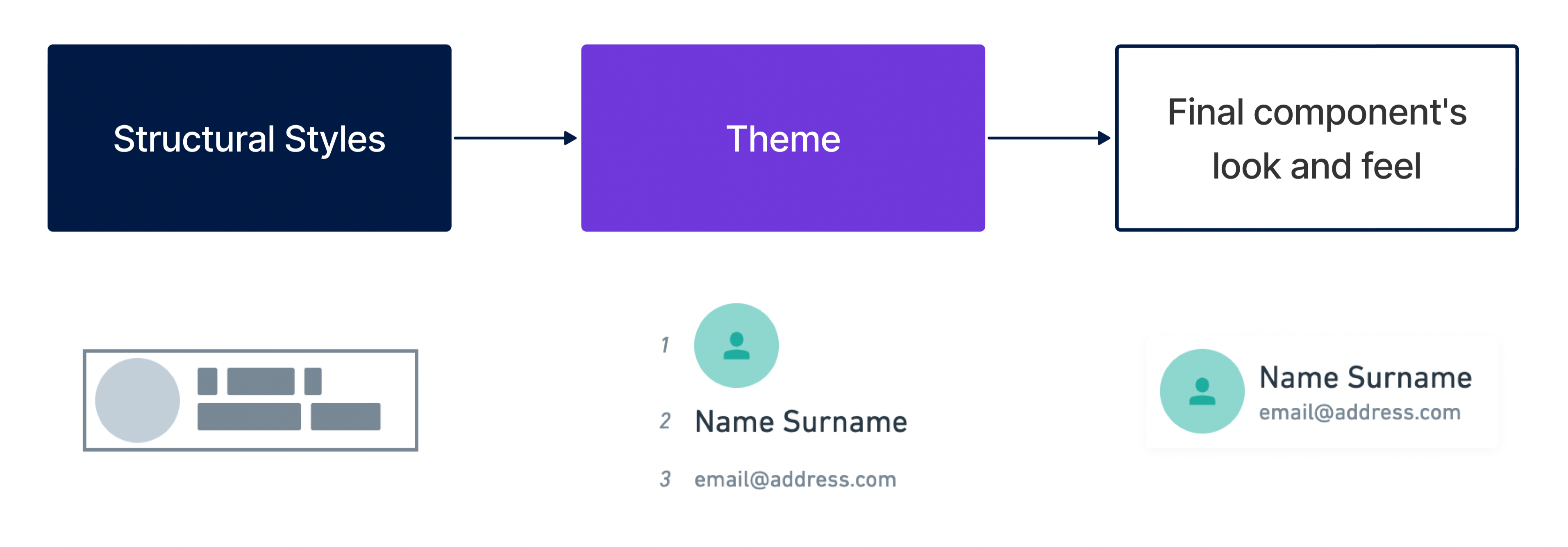
Structural Styles, the first layer, has foundational styles that lay things out in common design patterns for different use cases. It also covers a component's fundamental interactions, like showing/hiding a dropdown or moving a toggle’s knob to make it active.
The second, Theme, is where the branding lives and what truly differentiates one UI from another. Graphic elements—like typography (and type scale), colors, imagery, borders, spacing, & more—are controlled by design tokens that a developer can easily tweak to create a unique look and feel.
Additional styles can be added to overwrite what was set in the Structure and/or Theme, reaching a state of total flexibility and freedom. Lastly, the developer can throw away all existing FastStore CSS altogether and build it from scratch.
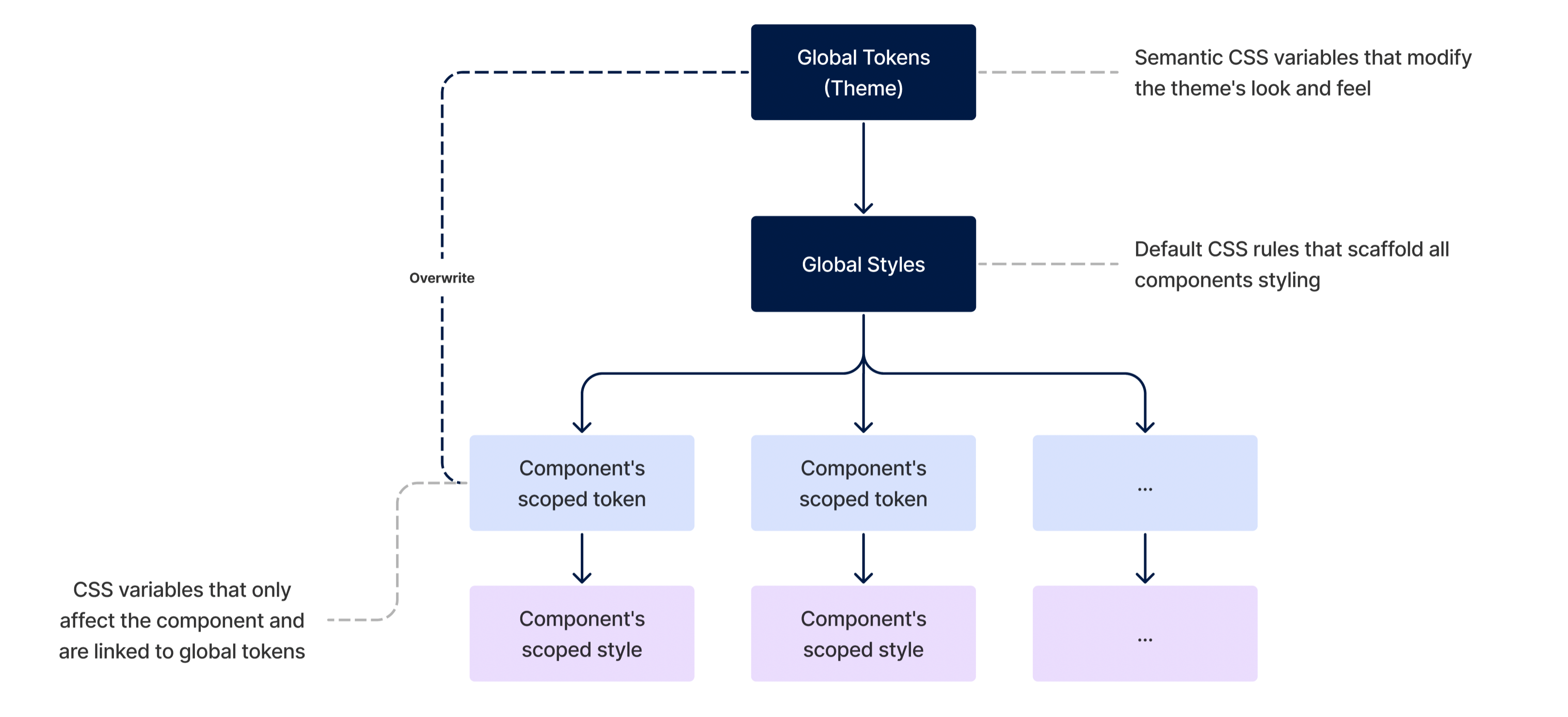
Theming architecture
Starting from the bottom up, we have the components: fully-featured UI blocks that belong to a larger whole system. The components have their own CSS that defines their overall appearance and how things are arranged; these scoped stylesheets are the Templates. The Templates' visual properties are tied to local variables—design tokens—that draw the final picture of the component; these local, scoped variables, on the other hand, are tied to global tokens, which form the Theme.
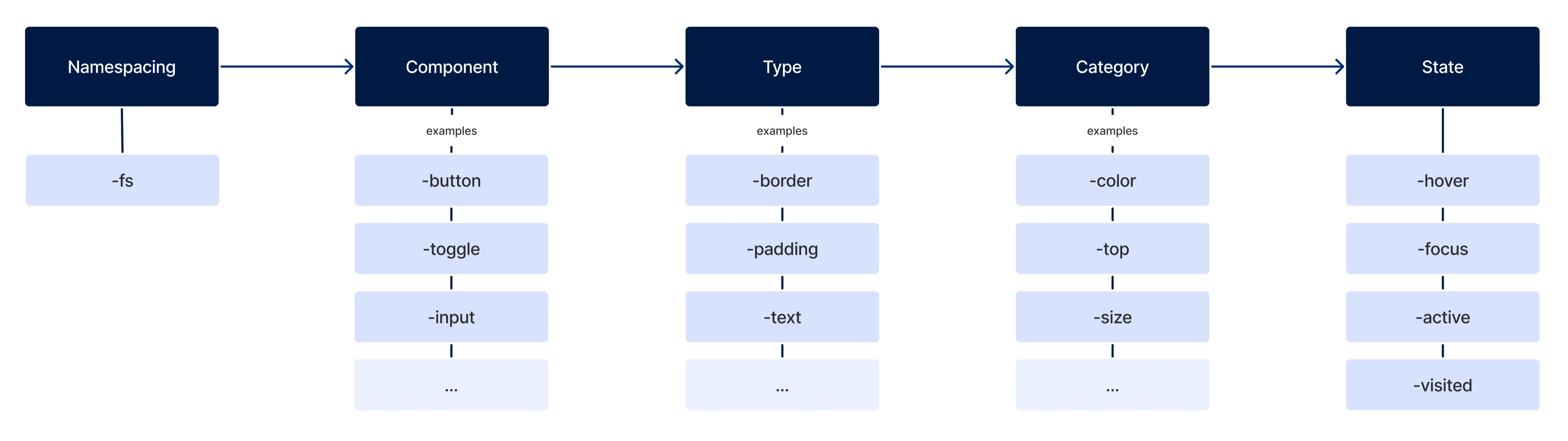
Design tokens naming scheme
Scoped Tokens (components)
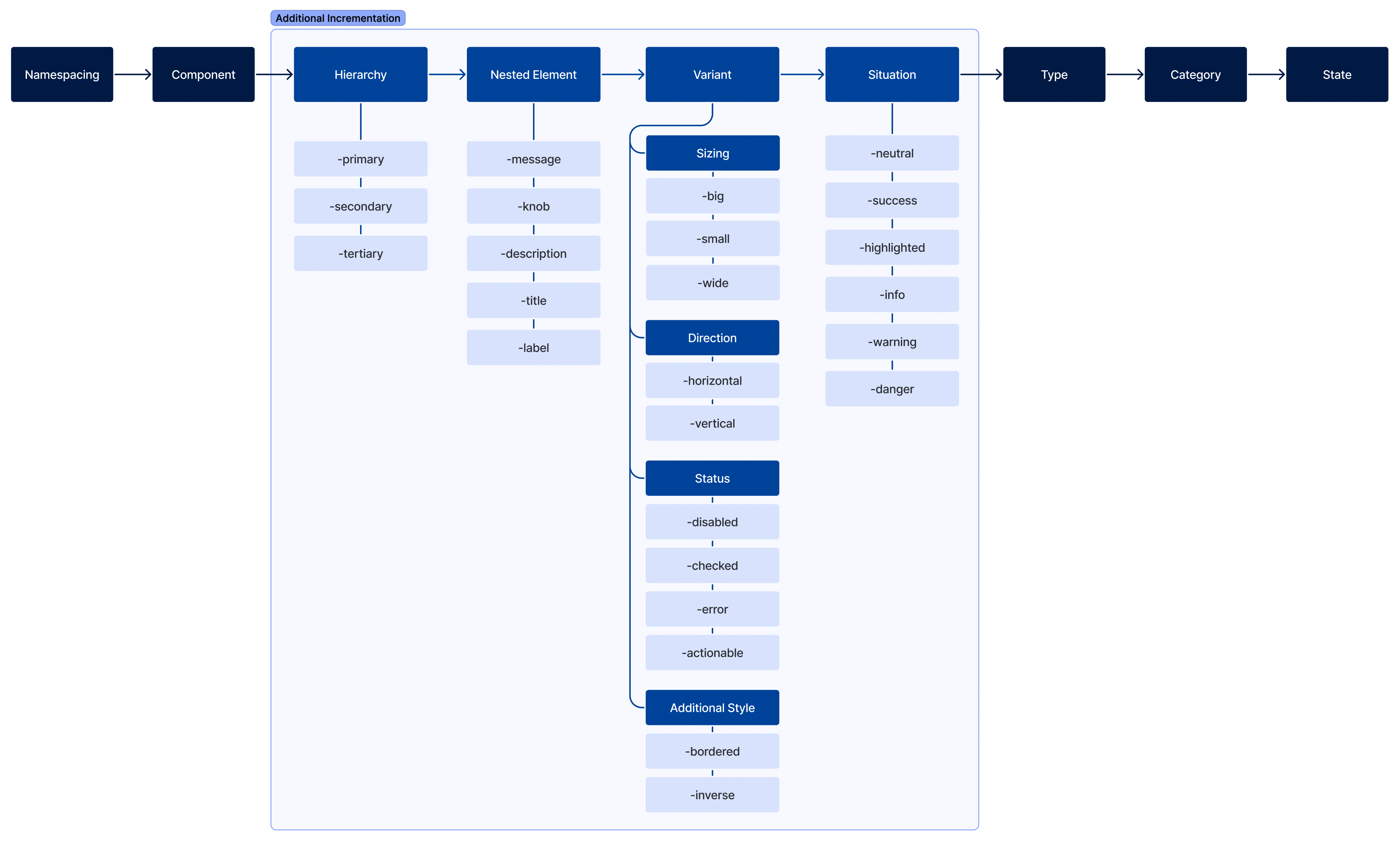
All components' design tokens must follow a strict scheme to achieve predictability and cohesiveness. The tokens parts must tell:
- Namespacing: Where this token is coming from (is it a global or a component's local part);
- Component: Their semantic meaning;
- Type: What property type it affects;
- Category Which category of this type is going to be affected;
- State: Their interactive state.
If needed, we can use other additional incrementation to the token's name, such as:
- Hierarchy: Define its tier;
- Nested Element: To sytle elements contained inside the component;
- Variant: What differentiate it from the default;
- Situation: When they should be used;
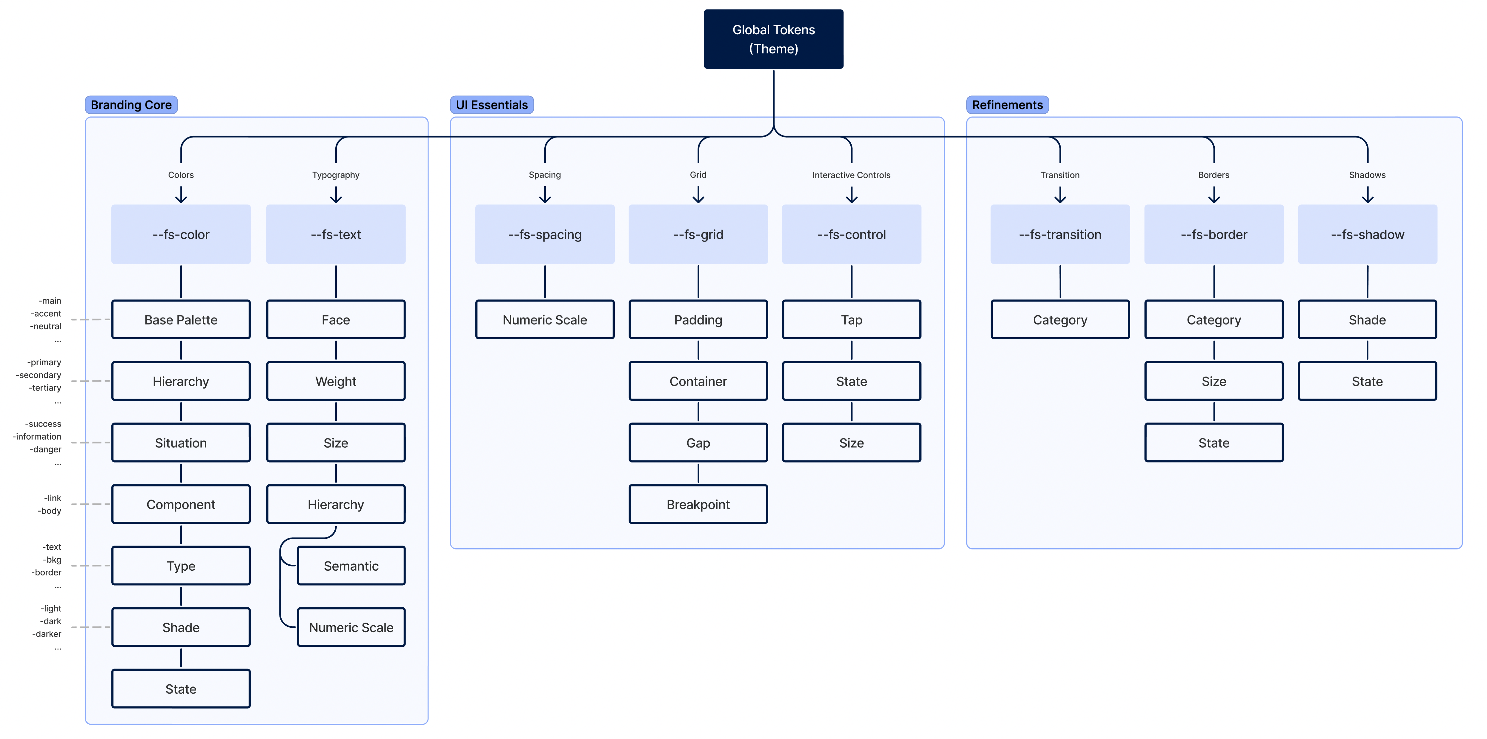
Theme (or global design tokens)
Global design tokens are parameters that affect all UI look 'n' feel. They are the main configuration file of a Theme. It's constituted of three main groups:
- Branding Core
- UI Essentials
- Refinements