This app is no longer maintained by VTEX. This means support and maintenance are no longer provided.
The pickup point selector app adds a block to your store that lets shoppers add a product to their cart and select a pickup point in a single action.
The app creates a list of available pickup points by running a simulation with the selected SKU and the shopper's ZIP code.
This app should only be used inside the product page, since one of its dependencies is the
product-context.
Configuration
Follow the steps below to configure the app on your store theme.
1. Install the app in your workspace and account.
To do this, you can go to the Pickup point selector page in the VTEX app store or run this command in your terminal:
_10vtex install vtexbr.pickup-selector
2. Add the app as a theme dependency in the manifest.json file.
See an example of how to do this:
_10 "peerDependencies": {_10 "vtexbr.pickup-selector": "2.x"_10 }
Now, you are able to use all the blocks exported by the pickup-selector app and its respective props.
3. Adding the main block
Declare the app's main block in a given theme template or inside another block from the theme. See the code example below.
_10 "pickup-selector": {_10 "children": [_10 "pickup-selector-zipcode-input",_10 "pickup-selector-search-sla-button",_10 "pickup-selector-sla-list"_10 ]_10 }
Note that the blocks
pickup-selector-zipcode-input,pickup-selector-search-sla-buttonandpickup-selector-sla-listare required inside the main block. But you can use them in any order you want. You can also use flex-layout if needed.
4. Configuring the pickup-selector-sla-list
The only block that should be used inside this one is the pickup-selector-option-card. We do this so you can style the option card however you want, and we will use it as a template for all the options. Below you can see an example.
_10 "pickup-selector-sla-list": {_10 "children": [_10 "pickup-selector-option-card"_10 ]_10 }
5. Configuring the pickup-selector-option-card
You are free to style this block as you wish.
The app provides blocks to help with information about the pickup point. They are the following:
pickup-selector-option-card-pickup-point-namepickup-selector-option-card-pickup-point-addresspickup-selector-option-card-pickup-point-distancepickup-selector-option-card-pickup-point-sla
The only mandatory block inside this one is the pickup-selector-option-card-add-product-button.
Below you can see an example:
_46 "pickup-selector-option-card": {_46 "children": [_46 "flex-layout.col#card-container"_46 ]_46 },_46_46 "flex-layout.col#card-container": {_46 "children": [_46 "flex-layout.row#card-header",_46 "product-separator",_46 "flex-layout.row#card-body"_46 ]_46 },_46_46 "flex-layout.row#card-header": {_46 "props": {_46 "colSizing": "auto"_46 },_46 "children": [_46 "pickup-selector-option-card-pickup-point-distance",_46 "pickup-selector-option-card-pickup-point-name"_46 ]_46 },_46_46 "flex-layout.row#card-body": {_46 "props": {_46 "colSizing": "auto"_46 },_46 "children": [_46 "flex-layout.col#card-body-address",_46 "flex-layout.col#card-body-call-to-action"_46 ]_46 },_46_46 "flex-layout.col#card-body-address": {_46 "children": [_46 "pickup-selector-option-card-pickup-point-address"_46 ]_46 },_46_46 "flex-layout.col#card-body-call-to-action": {_46 "children":[_46 "pickup-selector-option-card-pickup-point-sla",_46 "pickup-selector-option-card-add-product-button"_46 ]_46 }
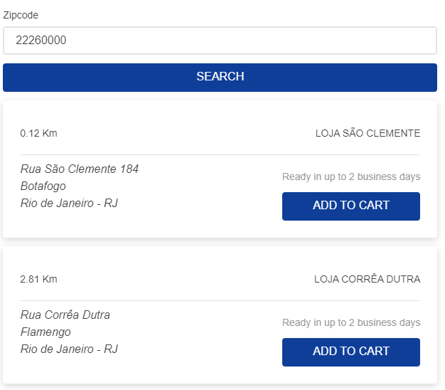
Using the configuration above, the end result would look like this:
Blocks
Check out the full list of exported blocks below:
| Block name | Description |
|---|---|
pickup-selector | Main block. |
pickup-selector-zipcode-input | Shows the zipcode input. |
pickup-selector-search-sla-button | Button used to search the pickup SLA options based on the provided postal code and the selected SKU. |
pickup-selector-sla-list | List that shows the card with the available pickup options. |
pickup-selector-option-card | Card with pickup option information. |
pickup-selector-option-card-pickup-point-name | Pickup point name. |
pickup-selector-option-card-pickup-point-address | Pickup point address. |
pickup-selector-option-card-pickup-point-distance | Distance to pickup point (in Km). |
pickup-selector-option-card-pickup-point-sla | Pickup point SLA. |
pickup-selector-option-card-add-product-button | Button that adds the product to the cart and selects the pickup point. |
Props
Some of these blocks accept props as described below:
pickup-selector-option-card-pickup-point-distance props
| Prop name | Type | Description | Default value |
|---|---|---|---|
distanceSystem | string | This prop is used to calculate the distance displayed by the block; it accepts metric (shows distance in Km) and imperial (shows distance in Mi). | metric |
pickup-selector-option-card-add-product-button props
| Prop name | Type | Description | Default value |
|---|---|---|---|
customPixelEventId | string | This prop should only be used with minicart.v2. It defines the ID of the event sent by the button upon user interaction. Should be the same ID configured on minicart.v2 so that the drawer opens successfully after adding the product to the cart. | undefined |
showToastFeedback | boolean | This prop is a fallback in order to support minicart.v1. This will show a toast with feedback on successfully adding the product to the cart. | false |
Customization
In order to apply CSS customizations in this and other blocks, follow the instructions given in the recipe on Using CSS Handles for store customization.
| CSS Handles |
|---|
pickupPointOptionCard |
pickupPointAddress |
pickupPointDistance |
pickupPointName |
pickupPointSla |
pickupSelectorContainer |
pickupSelectorSlaList |
searchSlaButtonContainer |
selectPickupPointButtonContainer |
zipcodeInputContainer |