The Tab Layout app provides you the needed structure to create different layouts within the store's main one from the use of tabs.
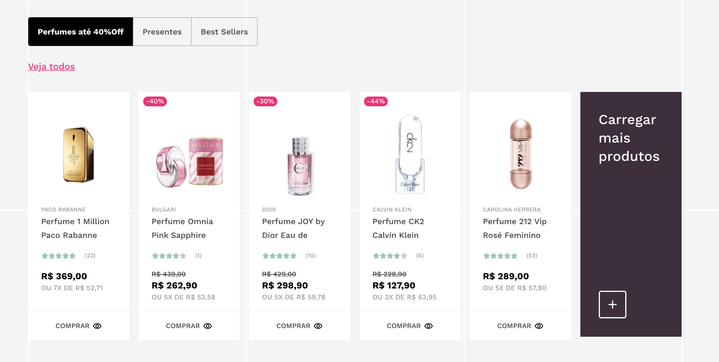
Example of an brazilian VTEX store with tabs (Perfumes até 40%off, Presentes, and Best Sellers) displaying different content for users.
Configuration
- Add the Tab Layout app to your theme's dependencies in the
manifest.json file:
_10+ "vtex.tab-layout": "0.x"
Now, you are able to use all the blocks exported by the tab-layout app. Check out the full list below:
| Block name | Description |
|---|
tab-layout | for the layout structure, declaring the desired list of tabs and its content. |
tab-list | Defines the list of tabs to be rendered. It only accepts the tab-list.item block as child. |
tab-list.item | Defines the rendering for a given tab. Notice that it does not define the tab content, which is handled by the tab-content.item block. |
tab-list.item.children | Flexible alternative to tab-list.item. Defines the rendering for a given tab and also accepts any array of blocks as its children. |
tab-content | Defines the list of content to be rendered in each tab. It only accepts the tab-content.item block as child. |
tab-content.item | Defines the content for a given tab. |
- In the desired page tempate, such as
store.home, add the tab-layout block:
- Declare the
tab-list and the tab-content blocks as tab-layout's children. Do not forget to use the tab-layout's props, for example:
_15+ "blockClass": "home",
_15+ "defaultActiveTabId": "home1"
- Add and then declare the desired
tab-list.item blocks as tab-list's children:
_34 "blockClass": "home",
_34 "defaultActiveTabId": "home1"
_34+ "tab-list.item#home1",
_34+ "tab-list.item#home2"
_34+ "tab-list.item#home1": {
_34+ "defaultActiveTab": true
_34+ "tab-list.item#home2": {
- Add and then declare the desired
tab-content.item blocks as tab-content's children:
_60 "blockClass": "home",
_60 "defaultActiveTabId": "home1"
_60 "tab-list.item#home1",
_60 "tab-list.item#home2"
_60 "tab-list.item#home1": {
_60 "defaultActiveTab": true
_60 "tab-list.item#home2": {
_60+ "tab-content#home": {
_60+ "tab-content.item#home1",
_60+ "tab-content.item#home2"
_60+ "tab-content.item#home1": {
_60+ "tab-content.item#home2": {
_60+ "rich-text#question",
Do not forget to also declare the tab-content.item's children blocks in order to properly render the tab content.
tab-layout props
| Prop name | Type | Description | Default value |
|---|
defaultActiveTabId | string | ID of the desired tab to be rendered as the default one. If no value is provided, the first tab declared in the theme will be used as default. | undefined |
blockClass | string | Block ID of your choosing to be used in CSS customization. | undefined |
tab-list props
| Prop name | Type | Description | Default value |
|---|
blockClass | string | Block ID of your choosing to be used in CSS customization. | undefined |
tab-list.item props
| Prop name | Type | Description | Default value |
|---|
blockClass | string | Block ID of your choosing to be used in CSS customization. | undefined |
tabId | string | Tab ID of your choosing. It will be used to match the tab to its content (defined by the tab-content.item block). | undefined |
label | string | Defines the tab's text label. | undefined |
defaultActiveTab | boolean | Defines the item as the default active tab. | false |
tab-list.item.children props
| Prop name | Type | Description | Default value |
|---|
blockClass | string | Block ID of your choosing to be used in CSS customization. | undefined |
tabId | string | Tab ID of your choosing. It will be used to match the tab to a given content (defined by the tab-content.item block). | undefined |
tab-content props
| Prop name | Type | Description | Default value |
|---|
blockClass | string | Block ID of your choosing to be used in CSS customization. | undefined |
tab-content.item props
| Prop name | Type | Description | Default value |
|---|
blockClass | string | Block ID of your choosing to be used in CSS customization. | undefined |
tabId | string | Tab ID of your choosing. It will be used to match the content to a given tab (defined by the tab-list.item / tab-list.item.children blocks). | undefined |
*Pay attention to the chosen tab ID declared in both tab-list.item and tab-content.item blocks, once it is the key to link a given tab to its content.
Customization
In order to apply CSS customizations in this and other blocks, follow the instructions given in the recipe on Using CSS Handles for store customization.
| CSS Handle |
|---|
container |
contentContainer |
contentItem |
listContainer |
listItem |
listItemActive |
listItemChildren |
listItemChildrenActive |