Product Specifications

The Product Specifications block has been deprecated in favor of the Product Specifications app. Although support for this block is still granted, we strongly recommend you to update your store theme with the Product Specification's blocks in order to keep up with the component's evolution.
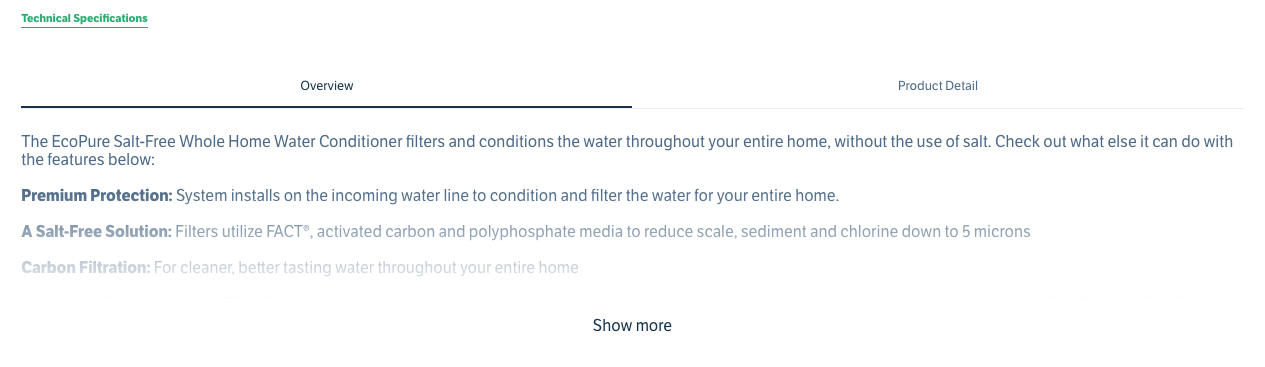
The product-specifications block shows the technical specifications of a product.
Configuration
- Import the
vtex.store-componentsapp to your theme's dependencies in themanifest.jsonfile as in the following example:
_10 "dependencies": {_10 "vtex.store-components": "3.x"_10 }
- Add the
product-specificationsblock to any child of thestore.producttemplate (Product Details Page template). For example:
_10 "store.product": {_10 "children": [_10 "flex-layout.row#product",_10 ]_10 },_10 "flex-layout.row#product": {_10 "children": [_10+ "product-specifications#product"_10 ]_10 },
- Then, declare the
product-specificationsblock using the props stated in the Props table. For example:
_10 "product-specifications#product": {_10 "props": {_10 "shoudCollapseOnTabChange": true,_10 "collapsible": "desktopOnly"_10 }_10 },
Props
| Prop name | Type | Description | Default value |
|---|---|---|---|
collapsible | mobileOnly|desktopOnly|always|never | Defines when the content of the specifications should be collapsed. | always |
hiddenSpecifications | String[] | Name of the specifications to be hidden. | [] |
shouldCollapseOnTabChange | Boolean | If it should collapse if you change the tab. | false |
showSpecificationsTab | Boolean | Shows the component in the tabs mode if true. | false |
visibleSpecifications | String[] | Name of the specifications to be presented. Only provide one of hiddenSpecifications or visibleSpecifications. | [] |
Customization
To apply CSS customizations in this and other blocks, follow the Using CSS handles for store customization guide.
| CSS Handles |
|---|
specificationItemProperty[data-specification="{specificationName}"] |
specificationItemSpecifications |
specificationsTab |
specificationsTable |
specificationsTableBody |
specificationsTableContainer |
specificationsTableHead |
specificationsTablePropertyHeading |
specificationsTableSpecificationHeading |
specificationsTableRow |
specificationsTabsContainer |
specificationsTitle |