
Previously, there were no CSS handles to enable users to select and customize non-active dots in the product-images block (from Store Components app).
The non-active dot represents the image that is not currently being hovered on by users.
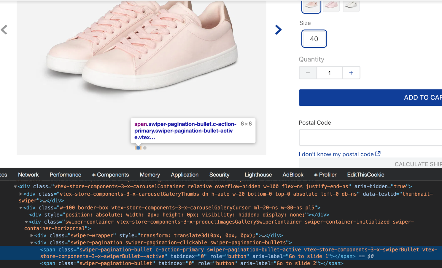
In the image above only the first image dot, which was currently selected (or active), had both vtex-store-components-3-x-swiperBullet and vtex-store-components-3-x-swiperBullet--active CSS classes. The second image dot, which was not active, did not have any CSS class which basically means that users were not able to select it for customization.
Thanks to the new swiperBullet and swiperBullet--active CSS Handles, the image's non-active dots can now be selected and customized. For more on this, do not forget to access the Product Images block documentation and our documentation or Using CSS Handles for store customization.