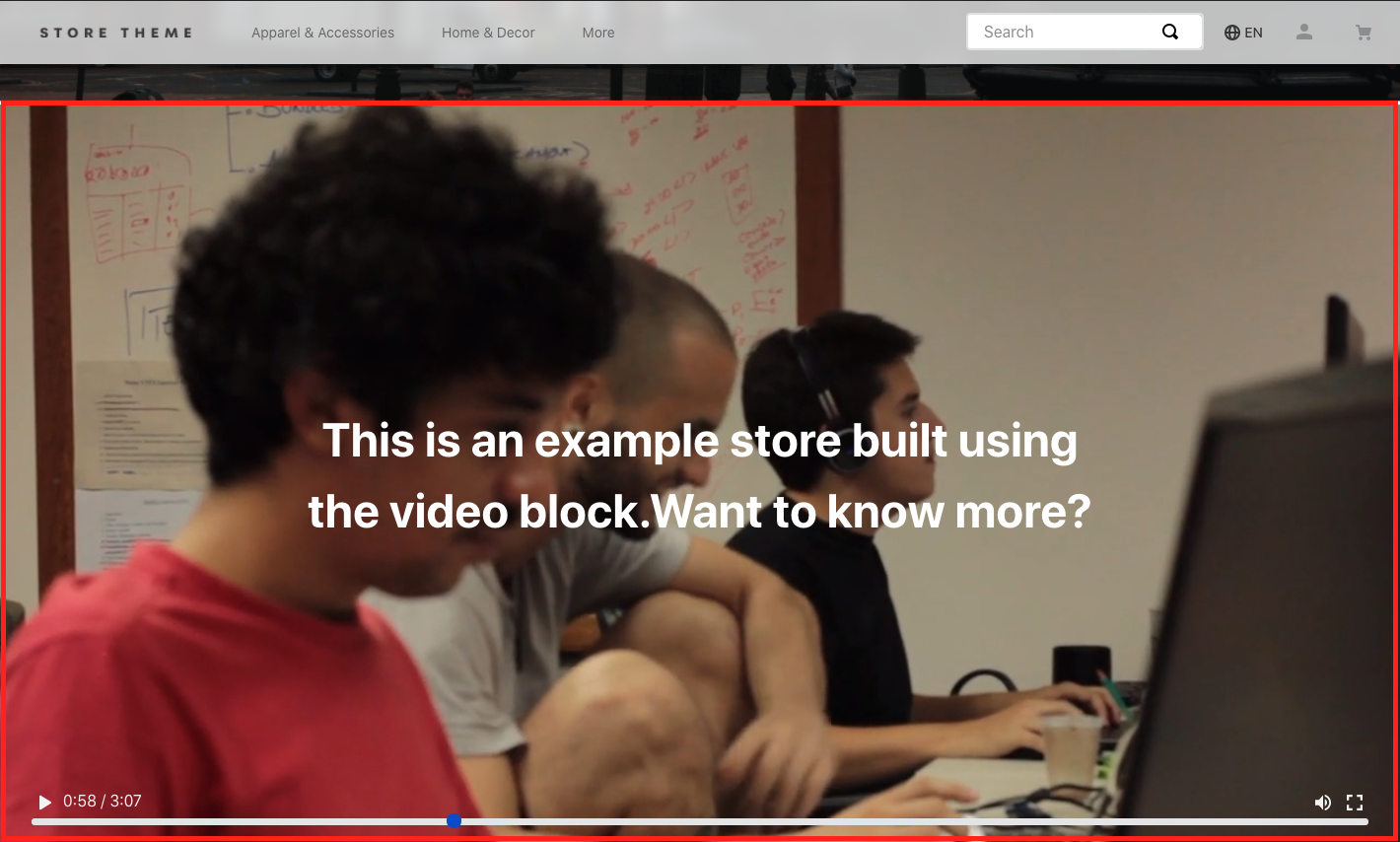
Video
The Video app allows you to display video assets on your store pages.

Configuration
- Add the
store-videoapp to your theme's dependencies in themanifest.jsonfile:
_10 "dependencies ": {_10+ "vtex.store-video": "1.x"_10 }
- In any desired theme template, add the
videoblock with the desirable props. For example:
_11 "video#background": {_11 "props": {_11 "width": "100%",_11 "height": "600px",_11 "loop": false,_11 "autoPlay": true,_11 "muted": false,_11 "src": "https://www.youtube.com/watch?v=wygFqZXMIco",_11 "blockClass": "videoEl"_11 }_11 }
video props
| Prop name | Type | Description | Default value |
|---|---|---|---|
name | string | Video name for SEO and accessibility. | undefined |
description | string | Video description for SEO and accessibility. | undefined |
src | string | Video URL. It can be a youtube URL, vimeo URL or a self-hosted video URL. | undefined |
type | string | Video type. | undefined |
poster | string | Cover image URL to be displayed before the video playback. This is only available on the HTML5 player. | undefined |
controlsType | enum | Video control options. It can be custom-vtex (only works if the video URL represents an HTML5 player), native or none. | undefined |
autoPlay | boolean | Whether the video will start automatically after loading (true) or not (false). Note that if the value is true, the muted property will also be set as true and cannot be changed. | false |
muted | boolean | Whether the video will start with the audio on (false) or not (true). This prop can only be false if the autoPlay prop is set to false. | false |
loop | boolean | Whether the video will run in a loop (true) or not (false). | false |
playsInline | boolean | Whether the video will play inline (true) or not (false). | false |
width | number or string | Width of the video exhibition area. It could be as % (string) or pixels (number). | undefined |
height | number or string | Height of the video exhibition area. It could be as % (string) or pixels (number). | undefined |
PlayIcon | string | Video play icon for custom-vtex controls. | icon-play |
PauseIcon | string | Video pause icon for custom-vtex controls. | icon-pause |
VolumeOnIcon | string | Video volume on icon for custom-vtex controls. | icon-volume-on |
VolumeOffIcon | string | Video volume off icon for custom-vtex controls. | icon-volume-off |
FullscreenIcon | string | Video fullscreen icon for custom-vtex controls. | icon-extend |
classes | CustomCSSClasses | Used to override default CSS handles. To better understand how this prop works, we recommend reading about it here. Note that this is only useful if you're importing this block as a React component. | undefined |
Use the admin's Site Editor to manage some props declared in the video block.
Customization
In order to apply CSS customizations in this and other blocks, follow the instructions given in the recipe on Using CSS Handles for store customization.
| CSS Handles |
|---|
controlsContainer |
fallbackContainer |
fallbackImage |
fullscreenButton |
playButton |
trackBar |
trackContainer |
trackTimer |
videoContainer |
videoElement |
volumeContainer |
volumeButton |
volumeSlider |
It's required that
controlsTypeprop is set ascustom-vtexin order to have the following CSS Handles properly working:controlsContainer,fullscreenButton,playButton,trackContainer,trackTimer,trackBar,volumeContainer,volumeSlider, andvolumeButton.