Share
1 min read
The Share component allows shoppers to share a product URL via social media. This component can be imported and used by any VTEX app.
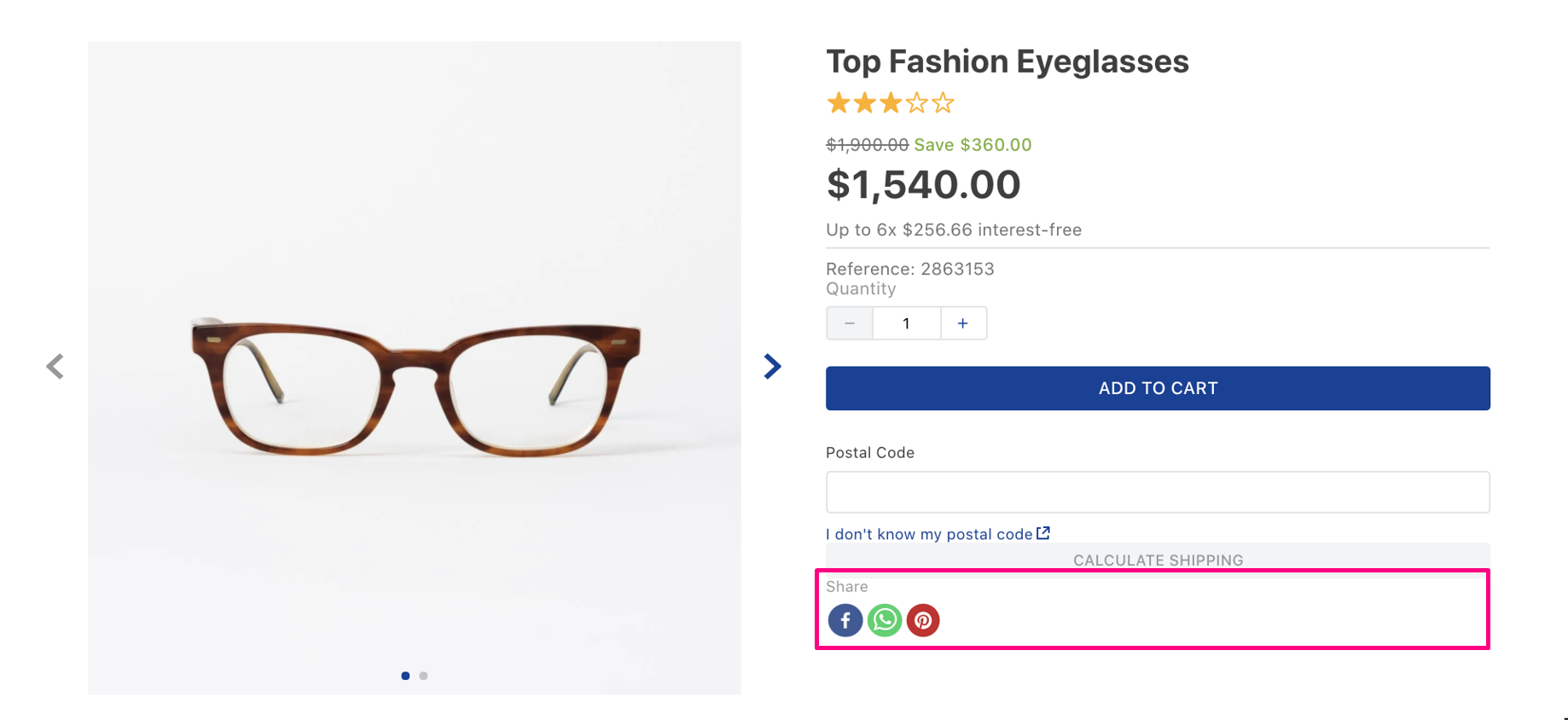
Configuration
- Import the
vtex.store-componentsapp to your theme's dependencies in themanifest.jsonfile as in the following example:
_10 "dependencies": {_10 "vtex.store-components": "3.x"_10 }
- Add the
shareblock as a child of thestore.producttemplate (Product Details Page template). For example:
_10 "store.product": {_10 "children": [_10 "share"_10 ]_10 }
- Then, declare the
shareblock using the props stated in the Props table. For example:
_10 "share": {_10 "component": "Share"_10 }
Props
| Prop name | Type | Description | Default value |
|---|---|---|---|
buttonsContainerClass | String | Button container classes. | true |
className | String | Main container classes. | null |
imageUrl | String | Image url to share in social medias. | |
options | Options | Share button options, such as size. | {} |
shareLabelClass | String | Share label classes. | true |
social | Social | Possible social media icons to be displayed. | {Facebook: true, Twitter: true, WhatsApp: true, Pinterest: true} |
options props:
| Prop name | Type | Description |
|---|---|---|
size | Number | The size of the share button in pixels. |
social props:
| Prop name | Type | Description |
|---|---|---|
Facebook | Boolean | If Facebook social media will be shown. |
Twitter | Boolean | If Twitter social media will be shown. |
WhatsApp | Boolean | If WhatsApp social media will be shown. |
Customization
To apply CSS customizations in this and other blocks, follow the Using CSS handles for store customization guide.
| CSS Handles |
|---|
shareButtons |
shareContainer |
shareLabel |
shareLoader |
shareSocialButton |
shareSocialIcon |