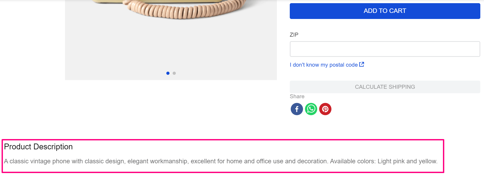
Product Description
The product-description block displays the description of a product. This Component can be imported and used by any VTEX App.

Configuration
- Import the
vtex.store-componentsapp to your theme's dependencies in themanifest.jsonfile as in the following example:
_10 "dependencies": {_10 "vtex.store-components": "2.x"_10 }
- Add the
product-descriptionblock to any child of thestore.producttemplate (Product Details Page template). For example:
_10 "store.product": {_10 "children": [_10 "flex-layout.row#product",_10 ]_10 },_10 "flex-layout.row#product": {_10 "children": [_10+ "product-description"_10 ]_10 }
- Then, declare the
product-descriptionblock using the props stated in the Props table.
Props
| Prop name | Type | Description | Default |
|---|---|---|---|
classes | CustomCSSClasses | Overrides default CSS handles. To better understand how this prop works, check this document. Note that this is only helpful if you're using this block as a React component. | undefined |
collapseContent | Boolean | If true, whenever the product description is too big, it will collapse and show a "Show More" button. When false, it will never collapse and will always show the whole description. | true |
showTitle | boolean | Define whether or not to show the title. | true |
title | string | Defines a custom title for the description section. | undefined |
Customization
To apply CSS customizations in this and other blocks, follow the Using CSS handles for store customization guide.
| CSS Handles |
|---|
productDescriptionContainer |
productDescriptionText |
productDescriptionTitle |