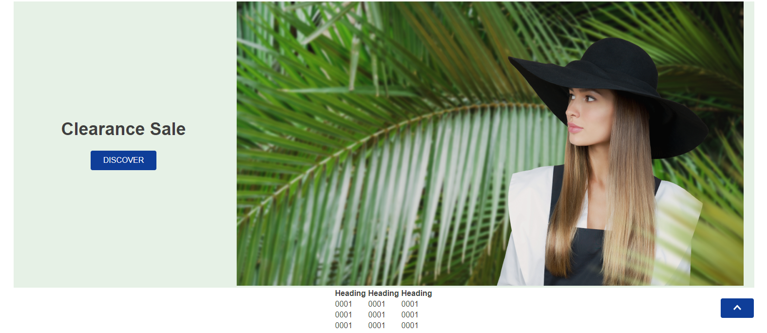
Back To Top Button
The back-to-top-button component is a button that redirects users to the top of the page when clicked.
Back To Top Button rendered as a text button
Back To Top Button rendered as a caret icon
Configuration
- Import the
vtex.store-componentsapp to your theme's dependencies in themanifest.jsonfile as in the following example:
_10 "dependencies": {_10 "vtex.store-components": "3.x"_10 }
- Add the
back-to-top-buttonblock into a store template of your choice. In the example, it will be added to the home page:
_10 "store.home": {_10 "blocks": [_10+ "back-to-top-button",_10 ]_10 },
- Then, declare the
back-to-top-buttonblock using the props stated in the Props table. For example:
_10 "store.home": {_10 "blocks": [_10 "back-to-top-button",_10 ]_10 },_10+ "back-to-top-button":{_10+ "props":{_10+ "displayThreshold": 800,_10+ }_10+ }
Props
| Prop name | Type | Description | Default Value |
|---|---|---|---|
display | enum | Defines the component rendering. Possible values are: button to display a button with a Back To Top label text or caret-icon to display just an icon. | button |
displayThreshold | number | Defines the window Y pixel in which the button will be displayed. | 600 |
Customization
To apply CSS customizations in this and other blocks, follow the Using CSS handles for store customization guide.
| CSS Handles |
|---|
backToTopButtonActive |
backToTopButtonContainer |
backToTopButtonHidden |