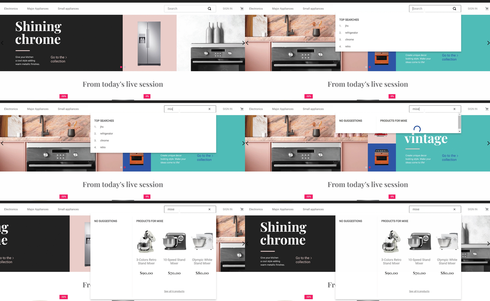
Autocomplete Result List
The autocomplete-result-list component displays the autocomplete functionality in the search bar. This component serves mainly to ease the creation of custom autocomplete components for search engines.

Configuration
- Import the
vtex.store-componentsapp to your theme's dependencies in themanifest.jsonfile as in the following example:
_10 "dependencies": {_10 "vtex.store-components": "3.x"_10 }
- Add the
autocomplete-result-listblock into thesearch-barcomponent. For example:
_10 "search-bar": {_10 "blocks": [_10+ "autocomplete-result-list"_10 ]_10 }
- Then, declare the
autocomplete-result-listblock using the props stated in the Props table.
Props
The
autocomplete-result-listblock is commonly used with Downshift. Hence, some of its props are directly related to it.
| Prop name | Type | Description | Default value |
|---|---|---|---|
attemptPageTypeSearch | Boolean | Uses the input term to try to navigate to the proper page type (e.g. a department, a brand, a category) if true. | - |
classes | CustomCSSClasses | Overrides default CSS handles. To better understand how this prop works, check this document. Note that this is only helpful if you're using this block as a React component. | undefined |
closeMenu (Downshift) | Function | Closes the menu. | - |
customSearchPageUrl | String | Template for a custom URL. It accepts a substring ${term} as placeholder to interpolate the searched term (e.g., /search?query=${term}). | - |
data | Object | Graphql data response. | {} |
highlightedIndex (Downshift) | Number | The index that should be highlighted. | - |
getItemProps (Downshift) | Function | Returns the props for every menu item element being rendered. | - |
getMenuProps (Downshift) | Function | Returns the props for the ul or root element of your menu. | - |
inputValue | String | Search query. | - |
onClearInput | Function | Clears the input. | - |
isOpen | Boolean | Identifies if the autocomplete should be opened. | - |
Customization
To apply CSS customizations in this and other blocks, follow the Using CSS handles for store customization guide.
| CSS Handles |
|---|
resultsItem |
resultsItemImage |
resultsItemName |
resultsList |
searchTerm |
spinnerContainer |
spinnerInnerContainer |