Product Quantity
The Product Quantity allows users to a add a chosen amount of the displayed product in their cart.
Configuration
- Add the Product Quantity app to your dependencies in the theme's
manifest.jsonfile:
_10 "dependencies": {_10 "vtex.product-quantity": "1.x"_10 }
You are now able to use all blocks that are exported by the Product Quantity app. Check out the full list below:
| Block name | Description |
|---|---|
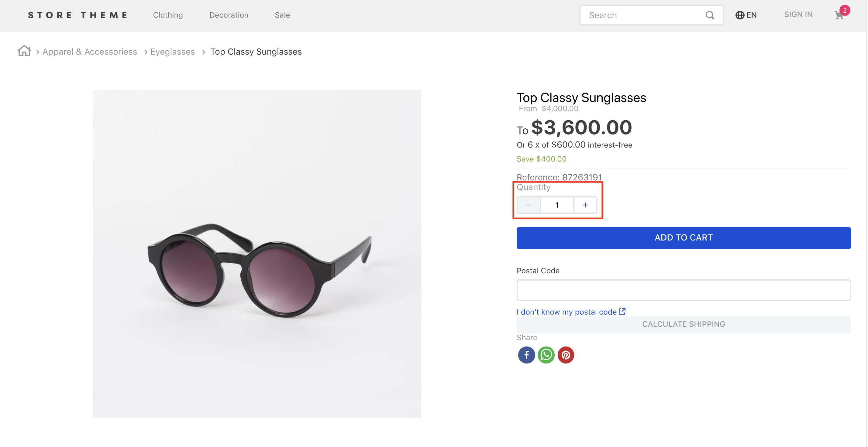
product-quantity | Displays a quantity selector on the product details page. This block must be declared in the theme's store.product page template. |
product-summary-quantity | Displays a quantity selector on Product Summary's blocks. This block must be declared as a children of the product-summary.shelf block. |
- According to your desired scenario, add the
product-quantity/product-summary-quantityblocks to your theme. For example:
_23 "flex-layout.col#product-price": {_23 "props": {_23 "preventVerticalStretch": true,_23 "rowGap": 0_23 },_23 "children": [_23 "product-name",_23 "product-price#product-details",_23 "product-separator",_23+ "product-quantity",_23 "sku-selector",_23 "flex-layout.row#buy-button",_23 "availability-subscriber",_23 "shipping-simulator",_23 "share"_23 ]_23 },_23 "product-quantity": {_23 "props": {_23 "warningQuantityThreshold": 9999999,_23 "showUnit": true_23 }_23 },
In the example above a Product Details Page is built using Flex Layout and the product-quantity block.
product-quantity and product-summary-quantity props
| Prop name | Type | Description | Default Value |
|---|---|---|---|
warningQuantityThreshold | number | Displays the quantity of remaining items in stock if the available quantity is less than or equal to the value given to this property. | 0 (the quantity is not displayed) |
showUnit | boolean | Whether the unit of measurement should be displayed (true) or not (false). | true |
size | enum | Preset size values for font-size and padding. You can check these value measures by accessing the VTEX Styleguide. Possible values are: small, regular, and large. | small |
showLabel | boolean | Whether a label should be displayed (true) or not (false). | true |
selectorType | enum | Defines how the quantity selector should initially behave. Possible values are: stepper (displays an input field where the quantity can be directly defined, in addition to side buttons to increase or decrease the value) and dropdown (shows a list of predefined-quantity options. In case the last quantity option is selected by users, the component is replaced with an input). | stepper |
quantitySelectorStep | enum | Defines how the number of products that have unitMultiplier will works. Possible values are: singleUnit (the quantity will be not affected with the unitMultiplier) and unitMultiplier (the quantity will be affected with the unitMultiplier). | unitMultiplier |
Customization
In order to apply CSS customizations in this and other blocks, follow the instructions given in the recipe on Using CSS Handles for store customization.
| CSS Handles |
|---|
availableQuantityContainer |
quantitySelectorContainer |
quantitySelectorDropdownContainer |
quantitySelectorDropdownMobileContainer |
quantitySelectorInputContainer |
quantitySelectorInputMobileContainer |
quantitySelectorStepper |
quantitySelectorTitle |
summaryContainer |