Order Placed
The order-placed app comes already installed on all stores and with it, it's possible to build your own page with the blocks exported by the app.
After defining a order-placed block inside your store/blocks directory or in your blocks.json file, the page can be constructed with blocks and customized with CSS handles.
Note: this is the default order-placed layout implementation.
_115// store/blocks/order-placed.jsonc_115{_115 "order-placed": {_115 "blocks": ["op-header", "op-order"]_115 },_115 "op-header": {_115 "children": [_115 "op-section#confirmation",_115 "op-section#notices",_115 "op-summary-section",_115 "op-bank-invoice-section"_115 ]_115 },_115 "op-section#confirmation": {_115 "props": {_115 "name": "confirmation",_115 "marginBottom": 9,_115 "borderless": true_115 },_115 "children": [_115 "op-confirmation-icon",_115 "op-confirmation-title",_115 "op-confirmation-message",_115 "flex-layout.row#confirmation-buttons"_115 ]_115 },_115 "flex-layout.row#confirmation-buttons": {_115 "props": {_115 "blockClass": "confirmationButtons",_115 "marginTop": 8,_115 "marginBottom": 8,_115 "horizontalAlign": "center",_115 "preventHorizontalStretch": true_115 },_115 "children": ["flex-layout.col#confirmation-buttons"]_115 },_115 "flex-layout.col#confirmation-buttons": {_115 "children": ["op-print-button"]_115 },_115 "op-section#notices": {_115 "props": {_115 "name": "notices",_115 "marginBottom": 9,_115 "borderless": true_115 },_115 "children": ["op-notices"]_115 },_115 // each order section_115 "op-order": {_115 "children": [_115 "flex-layout.row#order-header",_115 "op-order-split-notice",_115 "op-order-customer",_115 "op-section#payments",_115 "op-section#pickup-packages",_115 "op-section#delivery-packages",_115 "op-order-takeaway-packages",_115 "op-order-total"_115 ]_115 },_115 // each order header_115 "flex-layout.row#order-header": {_115 "props": {_115 "fullWidth": true,_115 "colSizing": "auto",_115 "colGap": 5,_115 "marginBottom": 5_115 },_115 "children": [_115 "flex-layout.col#order-header-info",_115 "flex-layout.col#order-header-options"_115 ]_115 },_115 "flex-layout.col#order-header-info": {_115 "children": ["op-order-number", "op-order-datetime", "op-order-seller"]_115 },_115 "flex-layout.col#order-header-options": {_115 "children": ["responsive-layout.desktop#order-options-desktop"]_115 },_115 "responsive-layout.desktop#order-options-desktop": {_115 "children": ["op-order-options"]_115 },_115 // payment section_115 "op-section#payments": {_115 "props": {_115 "name": "paymentMethods"_115 },_115 "children": [_115 "op-order-payment",_115 "responsive-layout.mobile#order-options-mobile"_115 ]_115 },_115 // bottom of top section of order header_115 "responsive-layout.mobile#order-options-mobile": {_115 "children": ["op-order-options#mobile"]_115 },_115 "op-order-options#mobile": {_115 "props": {_115 "blockClass": "mobile",_115 "fullWidth": true_115 }_115 },_115 "op-section#pickup-packages": {_115 "props": {_115 "name": "pickupPackages"_115 },_115 "children": ["op-order-pickup-packages"]_115 },_115 "op-section#delivery-packages": {_115 "props": {_115 "name": "deliveryPackages"_115 },_115 "children": ["op-order-delivery-packages"]_115 }_115}
Make sure you have the Order Placed page defined in your theme:
_10 "store.orderplaced": {_10 "children": ["order-placed"]_10 },
Blocks
order-placed
Main block, responsible for rendering the whole order placed page. It accepts the following blocks:
op-section
Splits your page into separate and semantic sections.
Composition: Accepts an array of any kind of children blocks.
Props:
| Prop name | Type | Description | Default value |
|---|---|---|---|
borderless | MaybeResponsiveInput<boolean> | boolean | Remove the bottom border of the section | false |
marginBottom | MaybeResponsiveInput<number> | number | Margin space below the section | 0 |
paddingBottom | MaybeResponsiveInput<number> | number | Padding space below the section | 0 |
width | MaybeResponsiveInput<string> | string | Width of the section | 100% |
name | string | Name of the section. Use it to have custom css handles for it. | undefined |
CSS Handles:
| CSS Handles | Description |
|---|---|
section | All section blocks |
section--{name} | Section named name |
op-header
Defines the header content of the page.
Composition: Accepts an array of any kind of children blocks.
Props: none.
CSS Handles:
| CSS Handles | Description |
|---|---|
orderPlacedHeader | The page header |
op-footer
Defines the footer content of the page.
Composition: Accepts an array of any kind of children blocks.
Props: none.
CSS Handles:
| CSS Handles | Description |
|---|---|
orderPlacedFooter | The page footer |
op-confirmation-icon
Renders the confirmation icon.
Composition: none.
Props: none.
CSS Handles:
| CSS Handle | Description |
|---|---|
confirmationIconWrapper | Icon wrapper |
| Default appearance |
|---|
 |
op-confirmation-title
Renders the confirmation title.
Composition: none.
Props: none.
CSS Handles:
| CSS Handle | Description |
|---|---|
confirmationTitle | Confirmation title h4 element |
| Default appearance |
|---|
 |
op-confirmation-message
Renders the confirmation message, containing the clients email.
Composition: none.
Props: none.
CSS Handles:
| CSS Handle | Description |
|---|---|
confirmationMessage | Confirmation message p element |
| Default appearance |
|---|
 |
op-print-button
Renders a button that triggers a full page print.
Composition: none.
Props: none.
CSS Handles:: none.
| Default appearance |
|---|
 |
op-notices
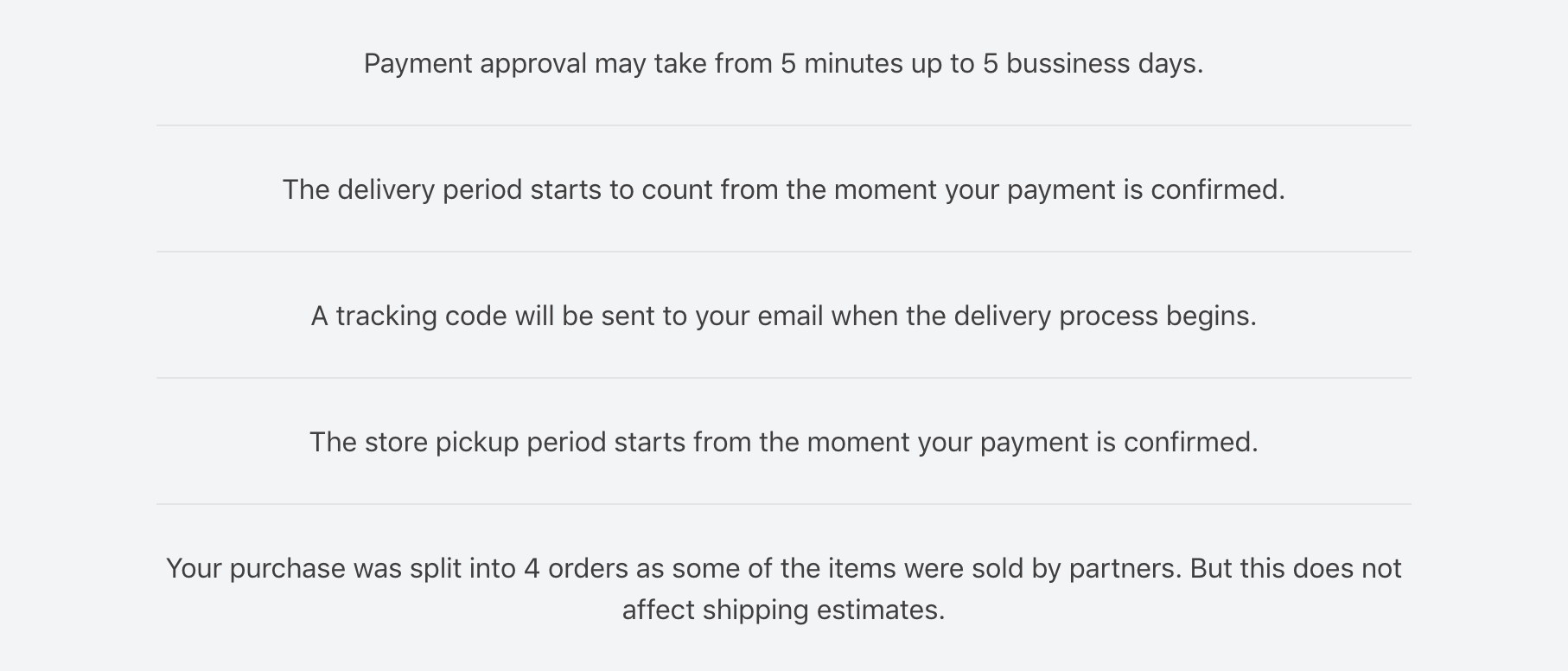
Renders a list of important informations relevant to the currently placed order. The messages may vary according to the type of order.
Composition: none.
Props: none.
CSS Handles:
| CSS Handle | Description |
|---|---|
noticesList | List ul element |
noticeListItem | Each list li item element |
| Default appearance |
|---|
 |
op-summary-section
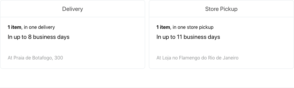
If a placed order is split between delivery and pickup, renders a summary of all pickup and delivery packages with informations such as number of items, packages, pickup/delivery address and pickup/delivery SLA.
Composition: none.
Props: none.
CSS Handles:
| CSS Handle | Description |
|---|---|
section--summary | Summary whole section |
summaryRow | Row wrapper of both summary boxes |
summaryCol | Column wrapper of each summary box |
summaryAddress | Wrapper of the pickup address |
summaryBox | Surrounding box of the summary |
summaryBox--delivery | Surrounding box of the delivery summary |
summaryBox--pickup | Surrounding box of the pickup summary |
summaryContent | Wrapper of the whole content of the box |
summaryItems | Wrapper of the number of items and packages |
summaryShippingSLA | Wrapper of the shipping SLA information |
summaryTitle | Box h5 title element |
| Default appearance |
|---|
 |
op-bank-invoice-section
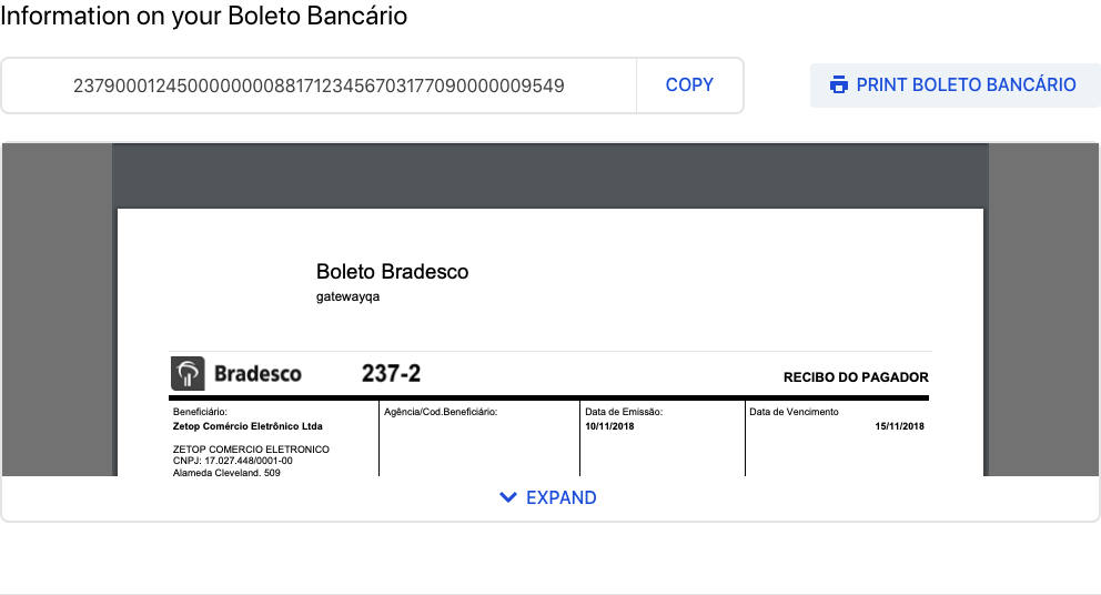
Renders the bank invoice section if payment method chosen was bank invoice.
Composition: none.
Props: none.
CSS Handles:
| CSS Handle | Description |
|---|---|
section--bankInvoice | Bank invoice whole section |
barCodeWrapper | Wrapper of the barcode number and copy button |
barCodeNumber | Barcode number element |
barCodeCopyButtonWrapper | Wrapper of the copy button |
bankInvoiceEmbedWrapper | Wrapper of the bank invoice iframe |
bankInvoiceEmbedBackground | Background of the bank invoice iframe |
bankInvoiceEmbed | Embed of the bank invoice PDF |
| Default appearance |
|---|
 |
op-order
Defines an order context to be able to render its meta information and packages. Must be used to display order data.
Composition: Accepts an array of any kind of children blocks.
Props: none.
CSS Handles:
| CSS Handle | Description |
|---|---|
orderWrapper | Wrapper of an order meta information and packages |
op-order-number
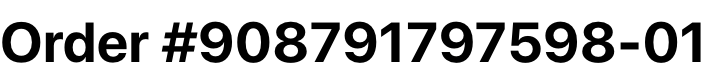
Renders the order id number. Must be placed inside an op-order block.
Composition: none.
Props: none.
CSS Handles:
| CSS Handle | Description |
|---|---|
orderNumber | Order number h3 element |
| Default appearance |
|---|
 |
op-order-datetime
Renders the date and time an order was placed. Must be placed inside an op-order block.
Composition: none.
Props: none.
CSS Handles:
| CSS Handle | Description |
|---|---|
orderDatetime | Order date and time small element |
| Default appearance |
|---|
 |
op-order-seller
Renders the seller of an order. Must be placed inside an op-order block.
Composition: none.
Props: none.
CSS Handles:
| CSS Handle | Description |
|---|---|
orderSoldBy | Seller phrase small element |
orderSeller | Seller name span element |
| Default appearance |
|---|
 |
op-order-split-notice
Renders a message with the number of packages of an order if the order was split in more than one package. Must be placed inside an op-order block.
Composition: none.
Props: none.
CSS Handles:
| CSS Handle | Description |
|---|---|
splitNotice | Wrapper of the message element |
| Default appearance |
|---|
 |
op-order-customer
Renders the customer information. Must be placed inside an op-order block.
Composition: none.
Props: none.
CSS Handles: none.
| Default appearance |
|---|
 |
op-order-options
Renders the customer information. Must be placed inside an op-order block.
Composition: none.
Props:
| Prop name | Type | Description | Default value |
|---|---|---|---|
fullWidth | boolean | Make the options wrapper take full horizontal space | false |
myAccountPath | string | The path to redirect a user to their profile page (rendered by the vtex.my-account app). | /account |
CSS Handles:
| CSS Handles | Description |
|---|---|
orderOptionsWrapper | Wrapper of the option buttons |
| Default appearance |
|---|
 |
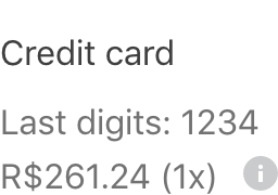
op-order-payment
Renders the customer information. Must be placed inside an op-order block.
Composition: none.
CSS Handles:
| CSS Handles | Description |
|---|---|
orderPaymentWrapper | Wrapper of the payment methods list |
orderPaymentItem | Wrapper of each payment method item |
| Default appearance |
|---|
 |
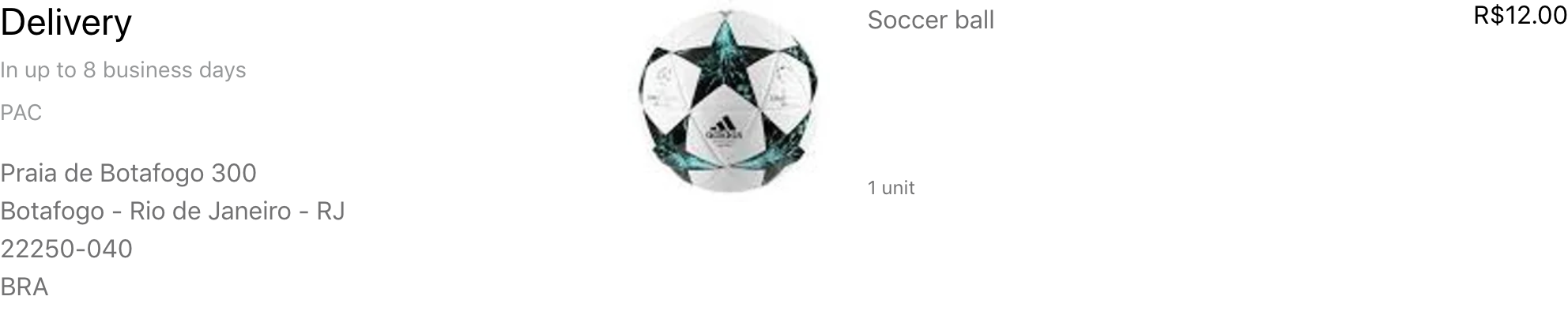
op-order-delivery-packages
Renders an order delivery packages information and product list. Must be placed inside an op-order block.
Composition: none.
CSS Handles:
| CSS Handles | Description |
|---|---|
package | All package sections |
package--delivery | The delivery package section |
packageHeaderColumn | Column of header of a package section |
packageHeader | Header of a package section |
packageHeader--delivery | Header of the delivery package section |
packageShippingEstimate | Delivery estimate small element |
packageAddressWrapper | Wrapper of the package shipping address |
packageAddressTitle | Wrapper of the address title |
packageDeliveryTitle | Wrapper of the delivery title |
productList | Product list ul element |
productListItem | Product list li item element |
productWrapper | Wrapper of a single product |
productImageColumn | Column of a product's image |
productImageWrapper | Wrapper of a product's image |
productInfoColumn | Column of a product's information |
productName | Product's a element |
productMeasurementUnit | Product's measurement unit small element |
productQuantity | Product's quantity small element |
productPrice | Product's price |
attachmentWrapper | Wrapper for a product's attachment |
attachmentHeader | Header of an attachment |
attachmentTitle | Title of a attachment |
attachmentToggleWrapper | Wrapper of the toggle button of an attachment |
attachmentToggleButton | Button for toggling the attachment's accordion |
attachmentToggleLabel | Attachment's toggle label |
attachmentContent | Attachment's content wrapper |
attachmentContentItem | Each attachment's content paragraph |
| Default appearance |
|---|
 |
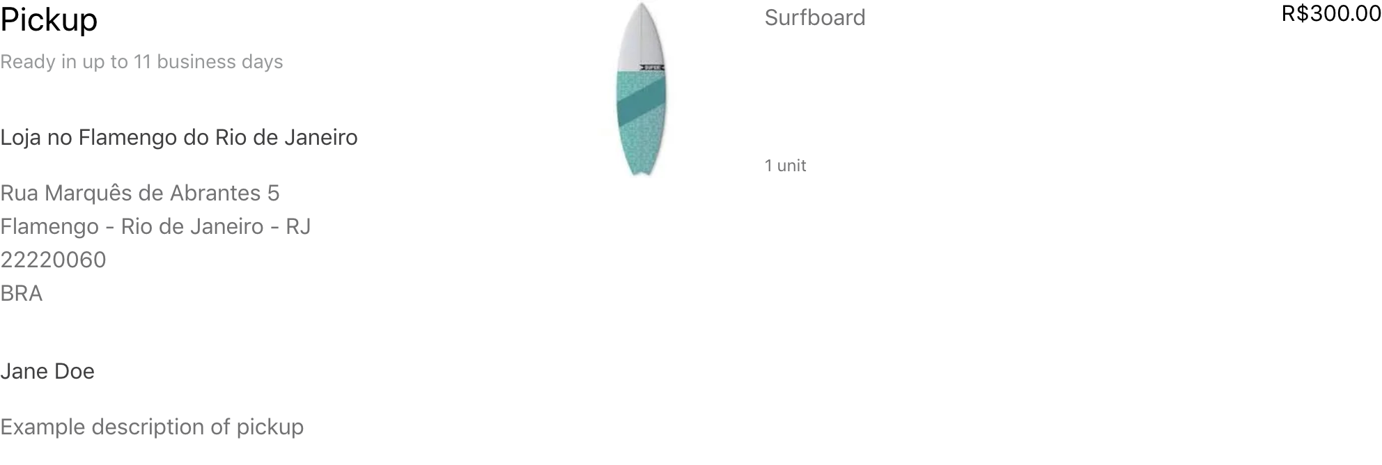
op-order-pickup-packages
Renders an order pickup packages information and product list. Must be placed inside an op-order block.
Composition: none.
CSS Handles:
Note: Include the same CSS handles as op-order-delivery-packages
| CSS Handles | Description |
|---|---|
package | All package sections |
package--pickup | The pickup package section |
packageInfoWrapper | Wrapper of a pickup package's information |
packageReceiver | Package's pickup receiver information container |
packageReceiverName | Name of the package's pickup receiver |
packageAdditionalInfo | Wrapper of additional information about a pickup package |
| Default appearance |
|---|
 |
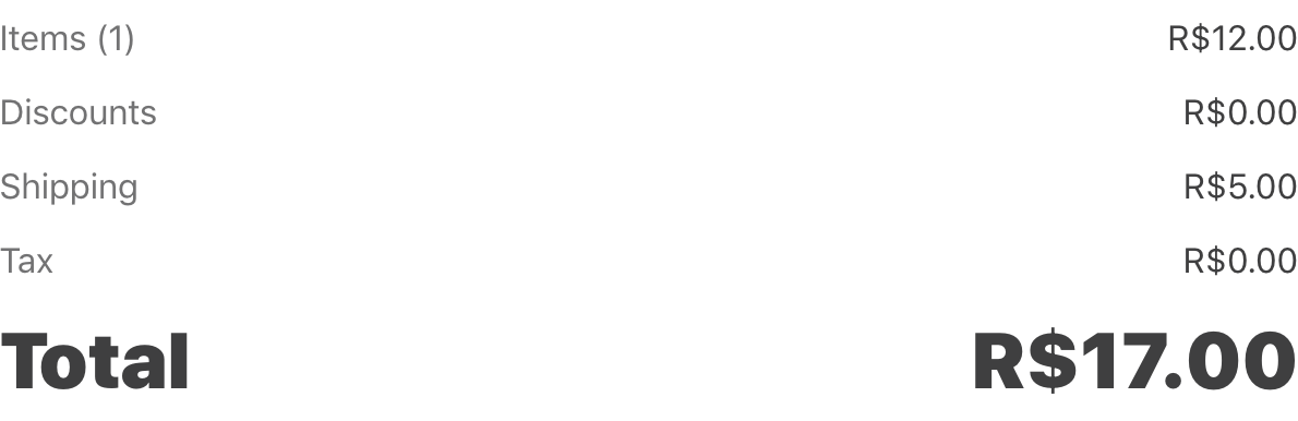
op-order-total
Renders an order delivery packages information and product list. Must be placed inside an op-order block.
Composition: none.
CSS Handles:
| CSS Handles | Description |
|---|---|
totalListWrapper | Wrapper of the total price list of an order |
totalList | An order's total list ul element |
totalListItem | An order's total item li element |
totalListItemLabel | Label of a price item |
totalListItemValue | Value of a price item |
| Default appearance |
|---|
 |
API
The order-placed app exports two hooks to allow customization using the current order data: useOrderGroup and useOrder.
useOrderGroup: used to get the data of the current order group. An order group is the collection of all orders created by an users's purchase.
_10import { useOrderGroup } from "vtex.order-placed/OrderGroupContext";_10_10//..._10const orderGroup = useOrderGroup();
useOrder: used to get the data of the current order being accessed in the order loop.
_10import { useOrder } from "vtex.order-placed/OrderContext";_10_10//..._10const order = useOrder();
Customization
In order to apply CSS customizations in this and other blocks, follow the instructions given in the recipe on Using CSS Handles for store customization.
| CSS Handles |
|---|
attachmentContent |
attachmentContentItem |
attachmentHeader |
attachmentTitle |
attachmentToggleButton |
attachmentToggleLabel |
attachmentToggleWrapper |
attachmentWrapper |
bankInvoiceEmbed |
bankInvoiceEmbedBackground |
bankInvoiceEmbedWrapper |
barCodeCopyButtonWrapper |
barCodeContainer |
barCodeNumber |
barCodeWrapper |
confirmationIconWrapper |
confirmationMessage |
confirmationTitle |
errorMessage |
errorTitle |
errorWrapper |
noticeListItem |
noticesList |
orderDatetime |
orderList |
orderListItem |
orderNumber |
orderOptionsWrapper |
orderPaymentItem |
orderPaymentWrapper |
orderPlacedFooter |
orderPlacedHeader |
orderPlacedMainWrapper |
orderPlacedWrapper |
orderSeller |
orderSoldBy |
orderWrapper |
package--delivery |
package--pickup |
package |
packageAdditionalInfo |
packageAddressWrapper |
packageGiftDescription |
packageHeader--delivery |
packageHeader--pickup |
packageHeader |
packageHeaderColumn |
packageInfoWrapper |
packageReceiver |
packageReceiverName |
packageShippingEstimate |
packageSLA |
printButtonWrapper |
printHintWrapper |
productImageColumn |
productImageWrapper |
productInfoColumn |
productName |
productListItem |
productList |
productMeasurementUnit |
productPrice |
productQuantity |
productWrapper |
section--bank-invoice |
section--confirmation |
section--deliveryPackages |
section--notices |
section--paymentMethod |
section--pickupPackages |
section--summary |
section |
splitNotice |
summaryRow |
summaryCol |
summaryAddress |
summaryBox--delivery |
summaryBox--pickup |
summaryBox |
summaryContent |
summaryItems |
summaryShipping |
summaryTitle |
totalList |
totalListItem |
totalListItemLabel |
totalListItemValue |
totalListWrapper |