Minicart v1 block has been deprecated in favor of Minicart v2, which can be customized using the blocks defined by Product List and Checkout Summary. If you still use Minicart v1, see the Minicart v1 documentation.
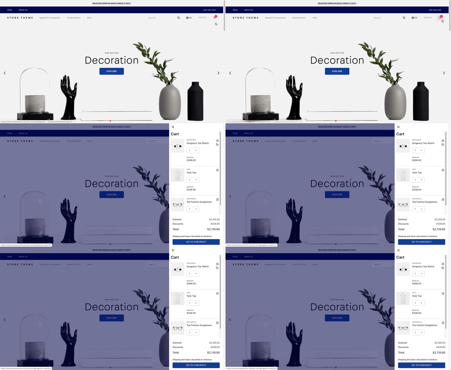
The Minicart is a block that displays a summary list of all items added to the shopping cart, fetched from the Checkout OrderForm API.

Configurating Minicart
- Import the Minicart app to your theme dependencies in the
manifest.json, as shown below:
_10"dependencies": {_10 "vtex.minicart": "2.x"_10}
- Add the
minicart.v2block to yourheader. For example:
_13"header.full": {_13 "blocks": ["header-layout.desktop", "header-layout.mobile"]_13 },_13_13 "header-layout.desktop": {_13 "children": [_13 "header-row#1-desktop",_13 ]_13 },_13_13 "header-row#1-desktop": {_13 "children": ["minicart.v2"],_13 },
Minicart v2 will only effectively function if the store uses the
add-to-cartapp instead of thebuy-buttonblock in blocks such as the Shelf and the Product Details page. This is because Minicart v2 was built based on an indirect dependency on the Add to Cart button. This means that even if Minicart v2 is correctly configured in the code, it cannot be rendered by other shopping buttons, such as the Buy button.
| Prop name | Type | Description | Default value |
|---|---|---|---|
variation | enum | Minicart behavior when rendered. Possible values for displaying the VTEX Minicart are: popup (appears as a pop-up window on the homepage), drawer (appears as a sidebar), link (redirects the user to the Checkout page when clicked), popupWithLink (combines link and popup functionalities), and block (displays the Minicart as a fixed block on the page). | drawer |
drawerSlideDirection | enum | Slide direction for the drawer Minicart opening. Possible values are: rightToLeft or leftToRight. | rightToLeft |
linkVariationUrl | string | Link associated with the link Minicart. | undefined |
maxDrawerWidth | number | Maximum width (in pixels) for the drawer Minicart when opened. | 440 |
openOnHover | boolean | Indicates whether the popup Minicart should open when the user hovers over it. | false |
quantityDisplay | enum | Shows the quantity badge even when the amount of products in the cart is zero. Possible values are: always or not-empty or never. | not-empty |
itemCountMode | enum | Quantity badge behavior when displaying the total items added to Minicart. Possible values are: total (quantity badge displays the number of items added to the cart), distinct (only displays the number of different products added to the cart), totalAvailable (displays the number of available items added to the cart), and distinctAvailable (displays the number of different and available products added to the cart). | distinct |
backdropMode | enum | Controls whether the backdrop should be displayed when the drawer Minicart is opened or not. Possible values are: visible (renders the backdrop) or none (renders the drawer without backdrop). | none |
MinicartIcon | block | Icon displayed on the Minicart button. This prop value must match the block name responsible for rendering the desired icon. | icon-cart (from the Store Icons app) |
customPixelEventId | string | Store event ID responsible for triggering the minicart.v2 to automatically open on the interface. | undefined |
customPixelEventName | string | Store event name responsible for triggering the minicart.v2 to automatically open on the interface. Some examples are: 'addToCart' and 'removeFromCart'. Note that using this prop will make the minicart.v2 open in every event with the specified name if no customPixelEventId is specified. | undefined |
classes | CustomCSSClasses | Used to override default CSS handles. To better understand how this prop works, we recommend reading about it here. Note that this is only useful when importing this block as a React component. | undefined |
Advanced configurations
The default implementation for minicart.v2 can be highly customizable by using other blocks. Currently, its default implementation is as follows:
_82// This is the default block implementation for the minicart-layout_82{_82 "minicart.v2": {_82 "props": {_82 "MinicartIcon": "icon-cart#minicart-icon"_82 },_82 "children": ["minicart-base-content"]_82 },_82 "icon-cart#minicart-icon": {_82 "props": {_82 "size": 24_82 }_82 },_82 "minicart-base-content": {_82 "blocks": ["minicart-empty-state"],_82 "children": ["minicart-product-list", "flex-layout.row#minicart-footer"]_82 },_82 "flex-layout.row#minicart-footer": {_82 "props": {_82 "blockClass": "minicart-footer"_82 },_82 "children": ["flex-layout.col#minicart-footer"]_82 },_82 "flex-layout.col#minicart-footer": {_82 "children": ["minicart-summary", "minicart-checkout-button"]_82 },_82 "minicart-product-list": {_82 "blocks": ["product-list#minicart"]_82 },_82 "product-list#minicart": {_82 "blocks": ["product-list-content-mobile"]_82 },_82 "minicart-summary": {_82 "blocks": ["checkout-summary.compact#minicart"]_82 },_82 "minicart-checkout-button": {_82 "props": {_82 "finishShoppingButtonLink": "/checkout/#/orderform"_82 }_82 },_82_82 "checkout-summary.compact#minicart": {_82 "children": ["summary-totalizers#minicart"],_82 "props": {_82 "totalizersToShow": ["Items", "Discounts"]_82 }_82 },_82 "summary-totalizers#minicart": {_82 "props": {_82 "showTotal": true,_82 "showDeliveryTotal": false_82 }_82 },_82 "minicart-empty-state": {_82 "children": ["flex-layout.row#empty-state"]_82 },_82 "flex-layout.row#empty-state": {_82 "children": ["flex-layout.col#empty-state"]_82 },_82 "flex-layout.col#empty-state": {_82 "children": [_82 "icon-cart#minicart-empty-state",_82 "rich-text#minicart-default-empty-state"_82 ],_82 "props": {_82 "horizontalAlign": "center",_82 "verticalAlign": "middle",_82 "rowGap": 5_82 }_82 },_82 "icon-cart#minicart-empty-state": {_82 "props": {_82 "size": 64,_82 "blockClass": "minicart-empty-state"_82 }_82 },_82 "rich-text#minicart-default-empty-state": {_82 "props": {_82 "text": "Your cart is empty."_82 }_82 }_82}
The default implementation of minicart.v2 consists of the JSON code shown above, which is used behind the scenes whenever you use this block in your store.
To customize the Minicart configuration, you can copy the code and modify it to your needs.
For detailed instructions on how to configure each of the blocks that make up minicart.v2, read the Product List and Checkout Summary documentations.
Customization
To apply CSS customizations to this and other blocks, follow the instructions given in the recipe on Using CSS handles for store customization.
| CSS handles |
|---|
arrowUp |
minicartCheckoutButton |
minicartContainer |
minicartContentContainer |
minicartFooter |
minicartIconContainer |
minicartProductListContainer |
minicartQuantityBadge |
minicartSideBarContentWrapper |
minicartTitle |
minicartWrapperContainer |
popupChildrenContainer |
popupContentContainer |
popupWrapper |
